
Commission Painting Process | Albert Bridge Over A Silvery Thames

My client commissioned me to paint Albert Bridge at dusk to commemorate her time living in London, as she prepared to move back to Spain. She wanted to capture the lights of the bridge against the grey evening, with the river, its boats and the classic street lights. She was inspired by a painting I did a few years ago of the same scene, which we used as a starting point.
Click the image above to watch the full time-lapse of this painting.
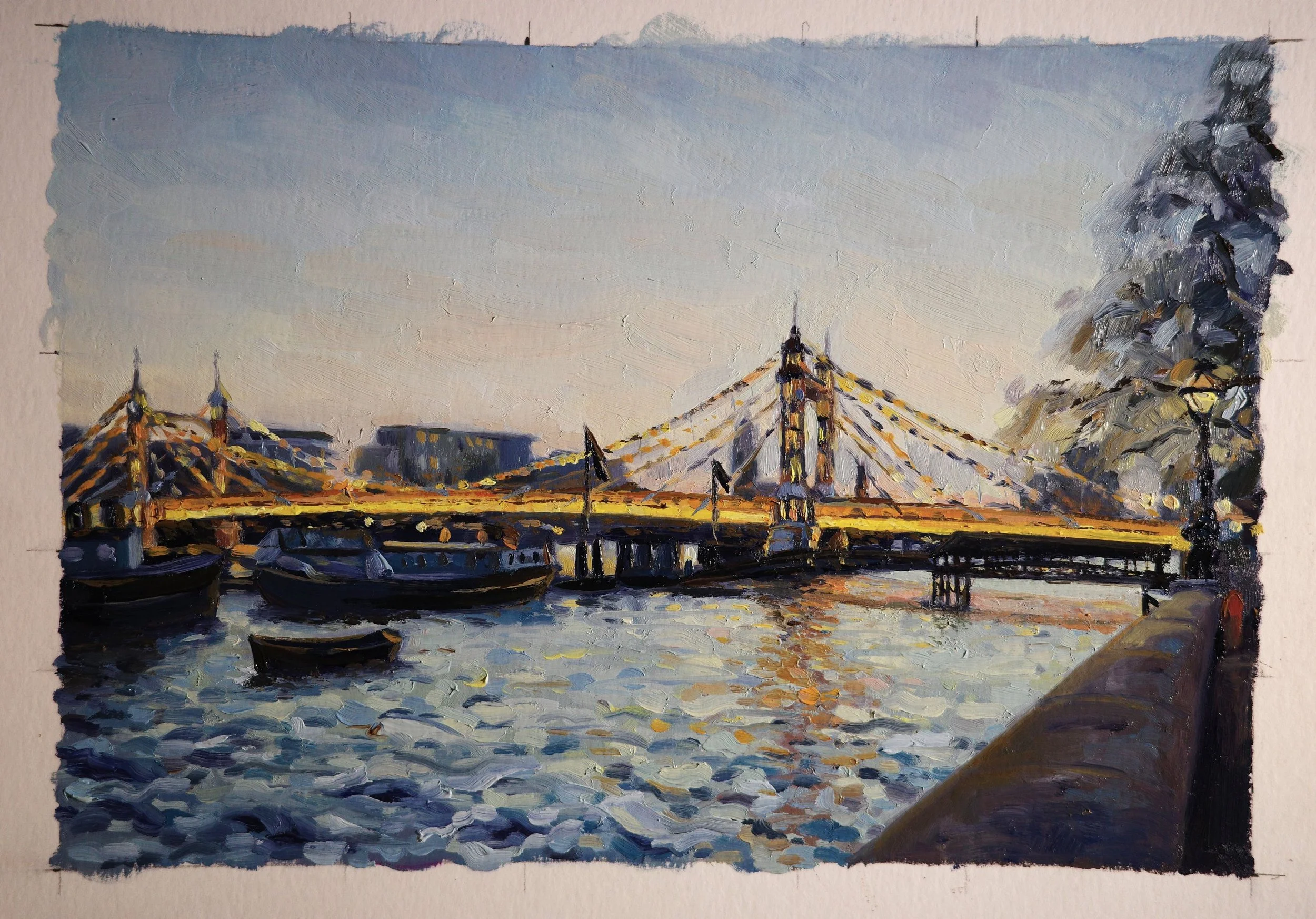
Preliminary sketches and studies
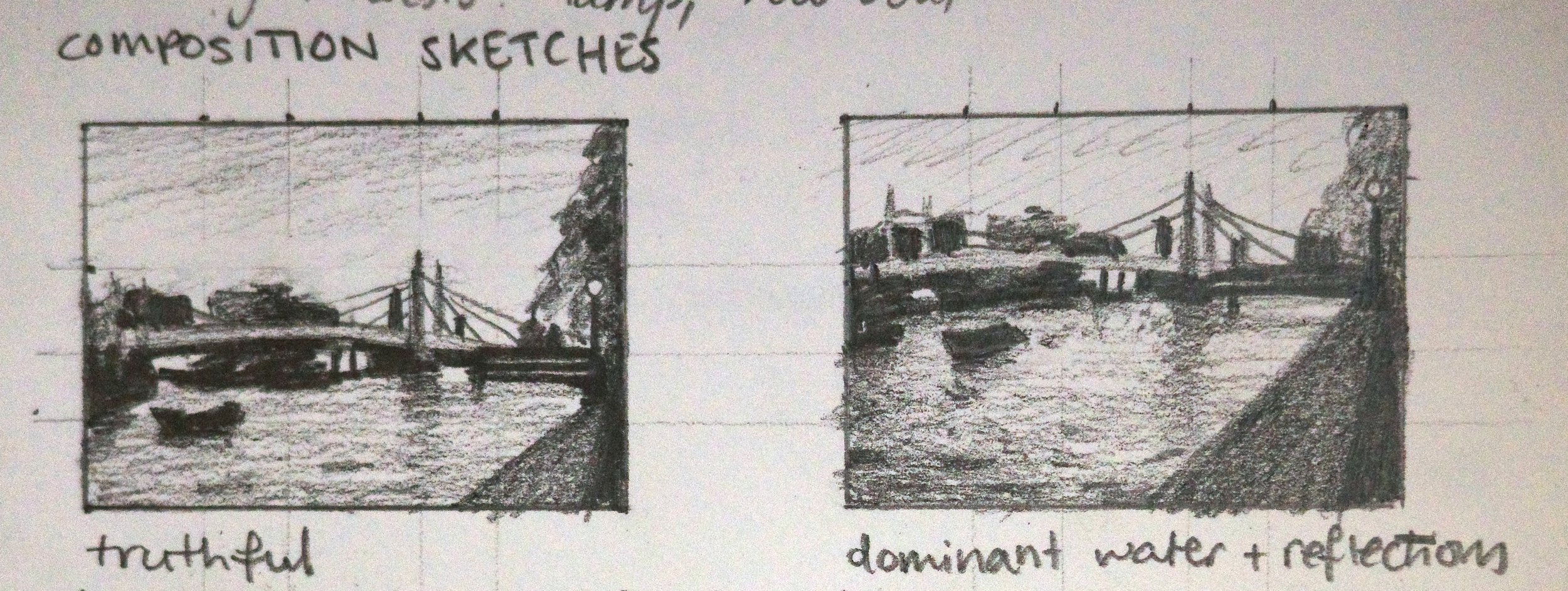
To start, I played around with the composition. On the left is a design with a fairly equal split between the sky and the water. On the right, the design emphasises the water and reflections by lifting the horizon and reducing the sky.
My clients liked the balance that the first composition brought to the scene, with the bridge halfway.
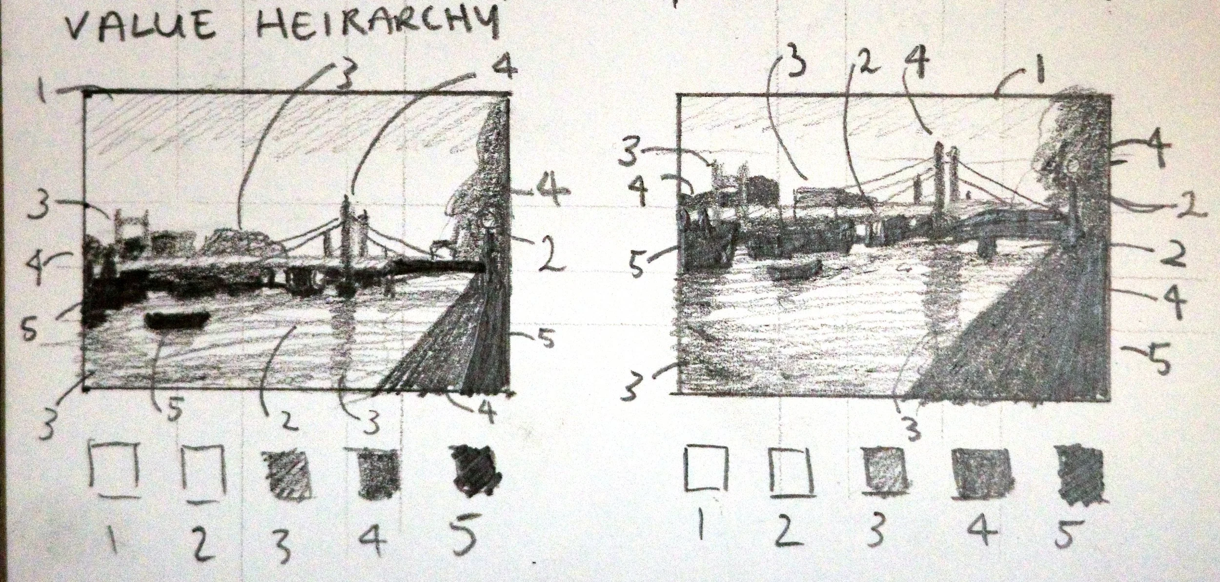
Next, I focused on value, working out the hierarchy of lights and darks through small studies.
I then painted these small value studies to determine the relationship between the values. The bottom right sketch was the final one.
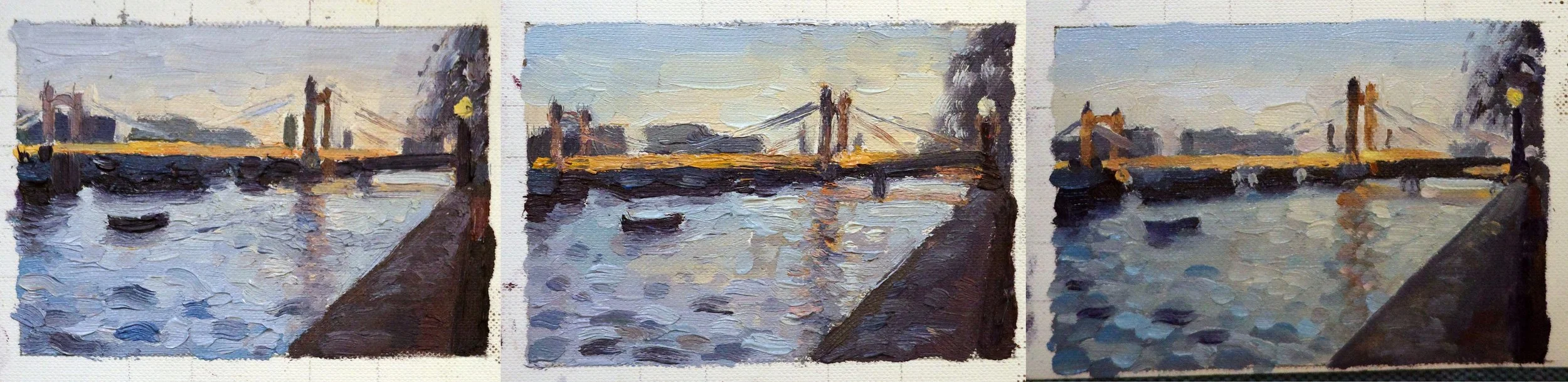
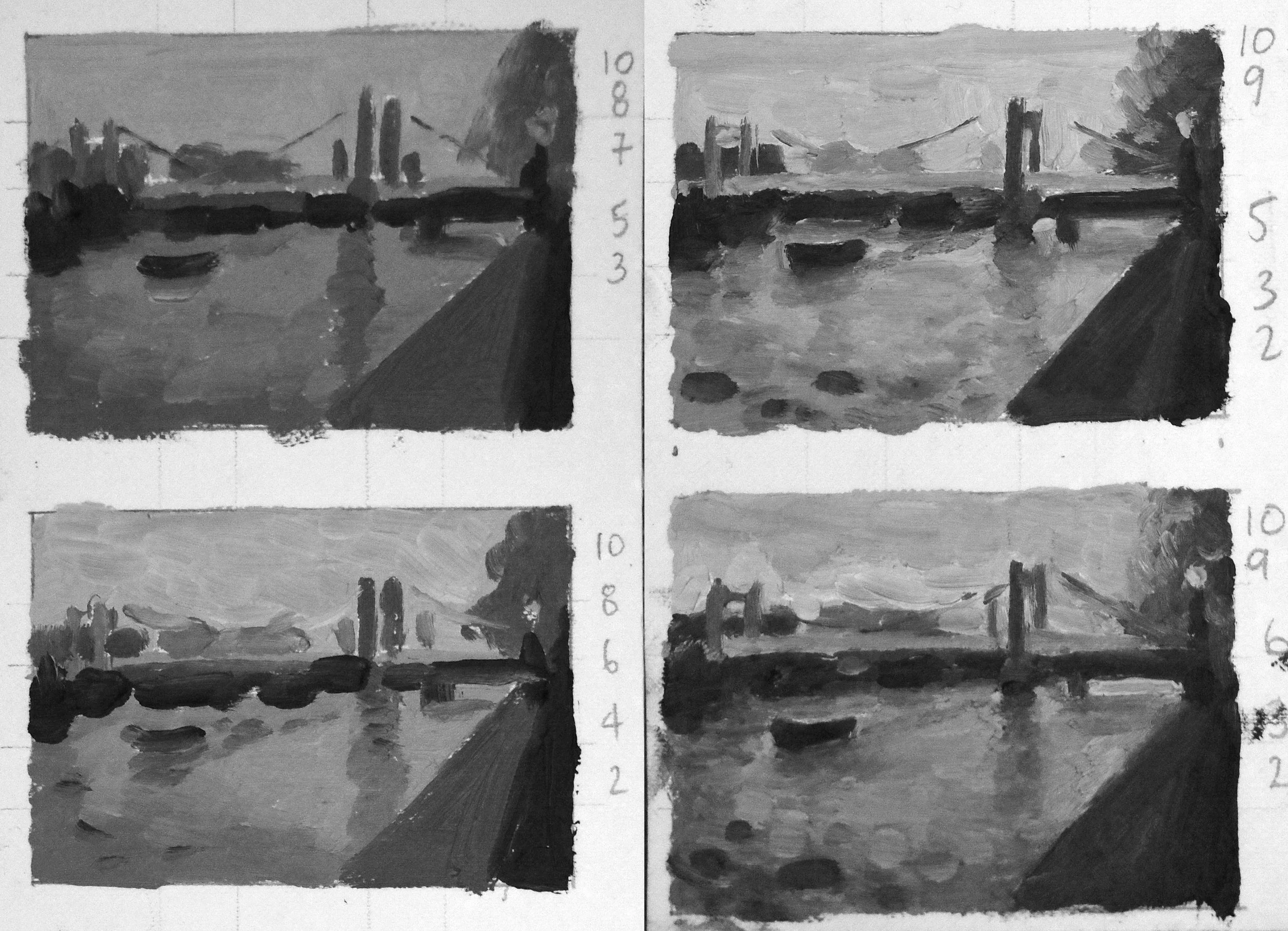
I then started translating the sketches into colour. I did three versions, all with slightly different interpretations of the colours. The first has a warmer purpley sky and water. The middle has a cooler sky and more yellows in the water. The last one keeps the cool blue sky and adds more greens to the water.
I did one last study, using a cool blue sky and water. My client asked to remove the platform that leads to the pier. After some experimenting we decided to move it down instead, so it does not obstruct the bridge.
The painting process
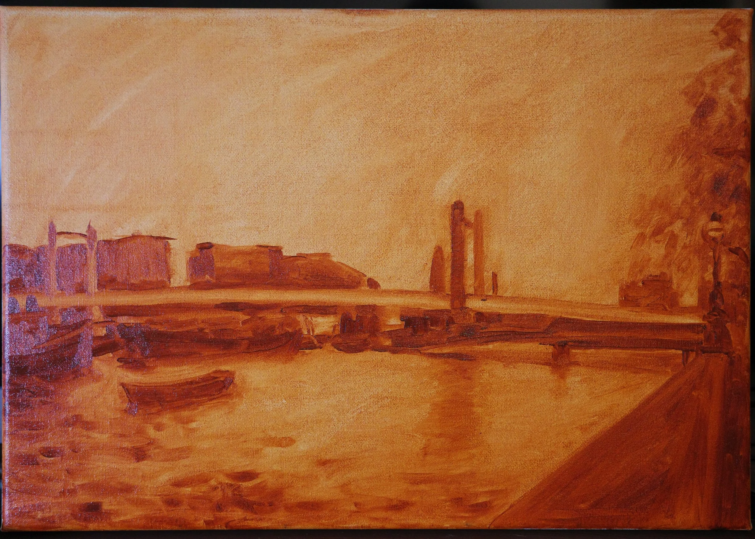
This is the drawing of the painting onto the canvas, using burnt sienna. I was precise with the perspective but kept the shapes big and the detail low.
This is the painting fully blocked in with colour, just focusing on big shapes and no detail.
At this stage I wanted to add texture to the sky, which I ended up getting rid of as it worked against the stillness that made the scene feel so serene.
I added details to the painting while trying to keep it fresh and loose. I softened the edges of the buildings and tree so they bring atmosphere by melting into the sky.
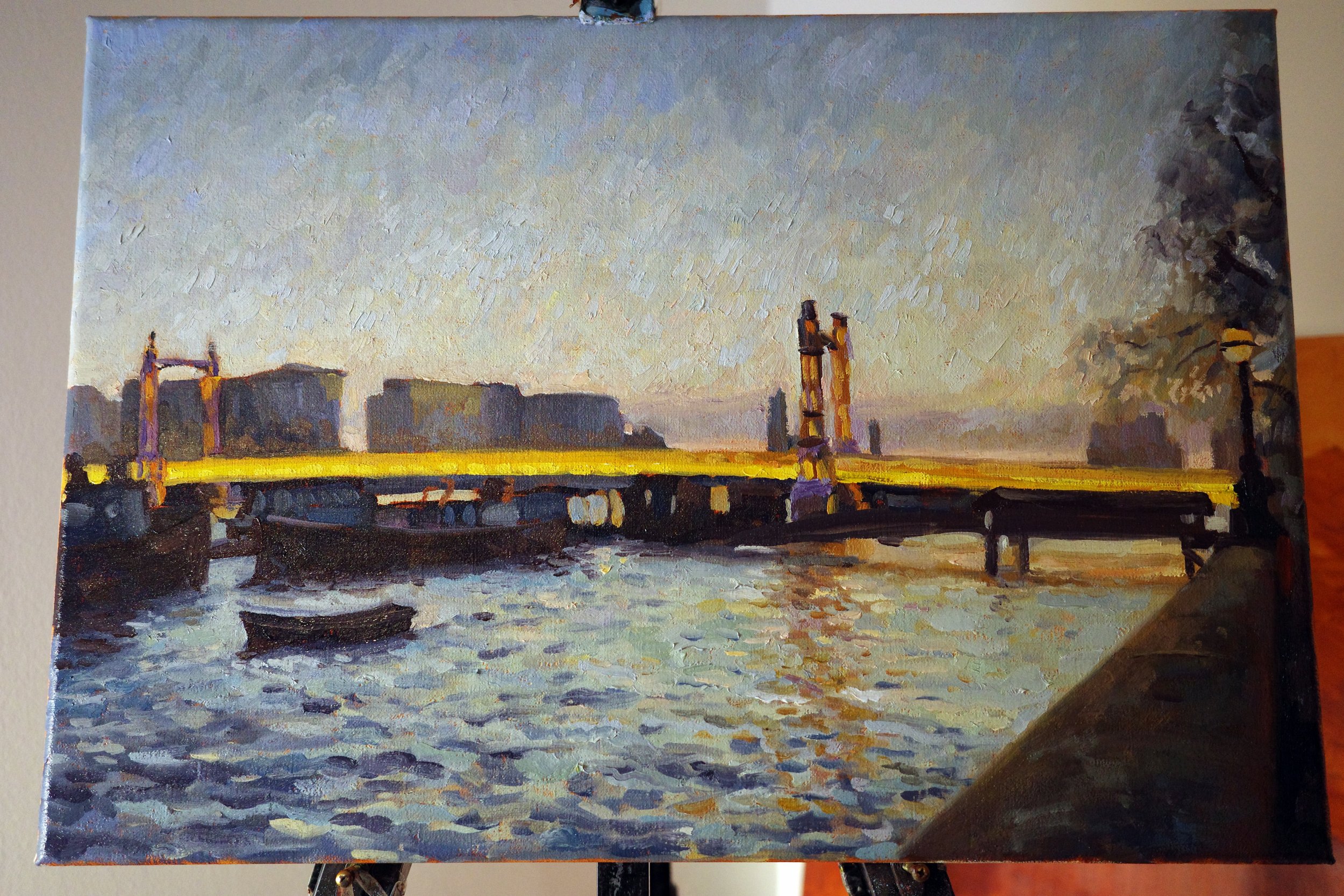
This stage still felt too dark, and my client wanted more contrast and sharper edges for a more silhouetted impression.
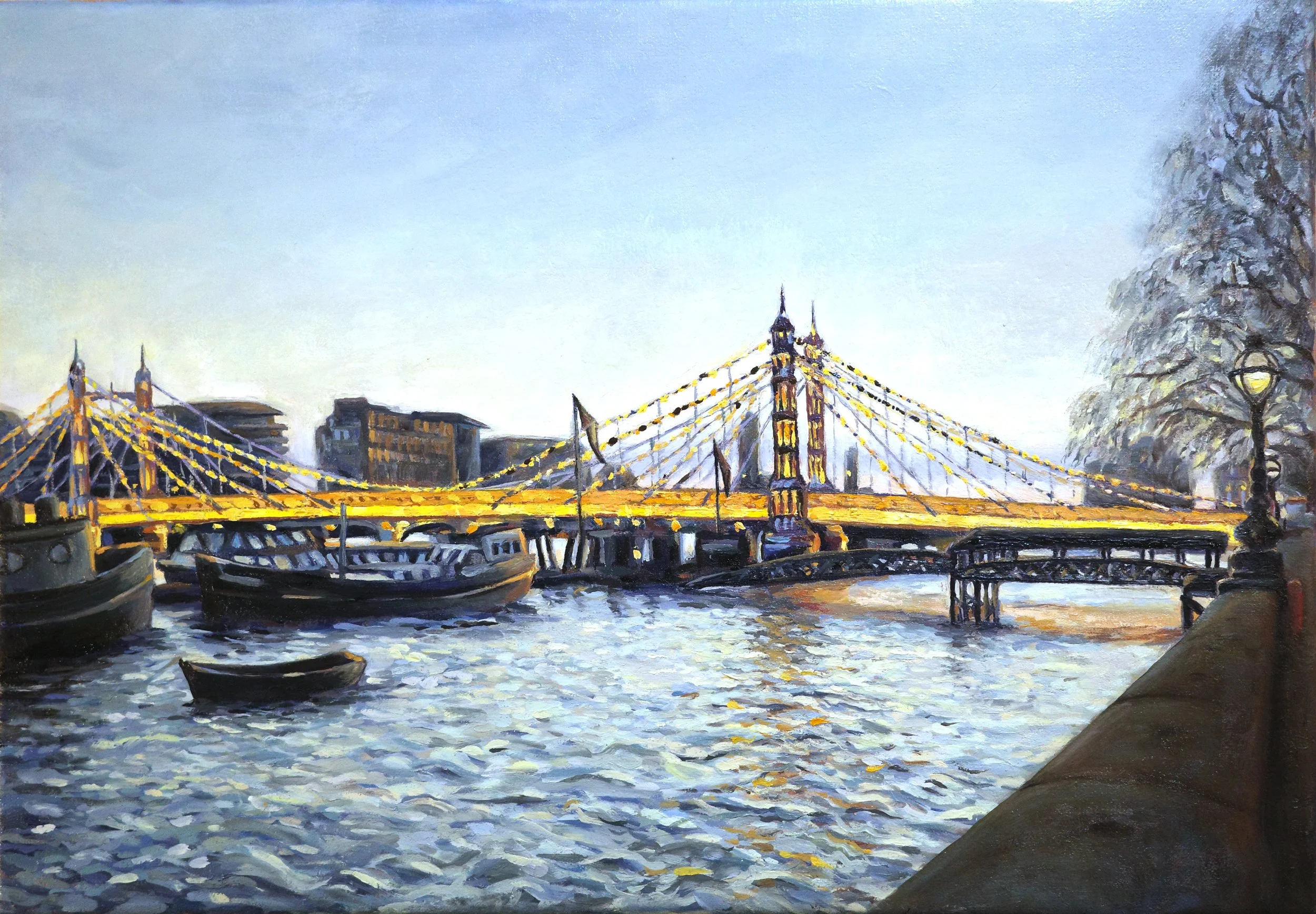
I lifted the overall light by bringing back more silvery highlights in the water. I lightened the middle section of the bridge to make it glow. I also lightened and evened the sky so it felt brighter and unified the whole scene.
I sharpened the edges of the tree, buildings and boats, but not to a level that made them silhouetted against the sky. I ended up taking this further for the final painting.
My client's feedback was that the cool blue in the sky and water gave the scene the feeling of dawn instead of dusk, so we decided to bring in more purples and greys instead of the blue.
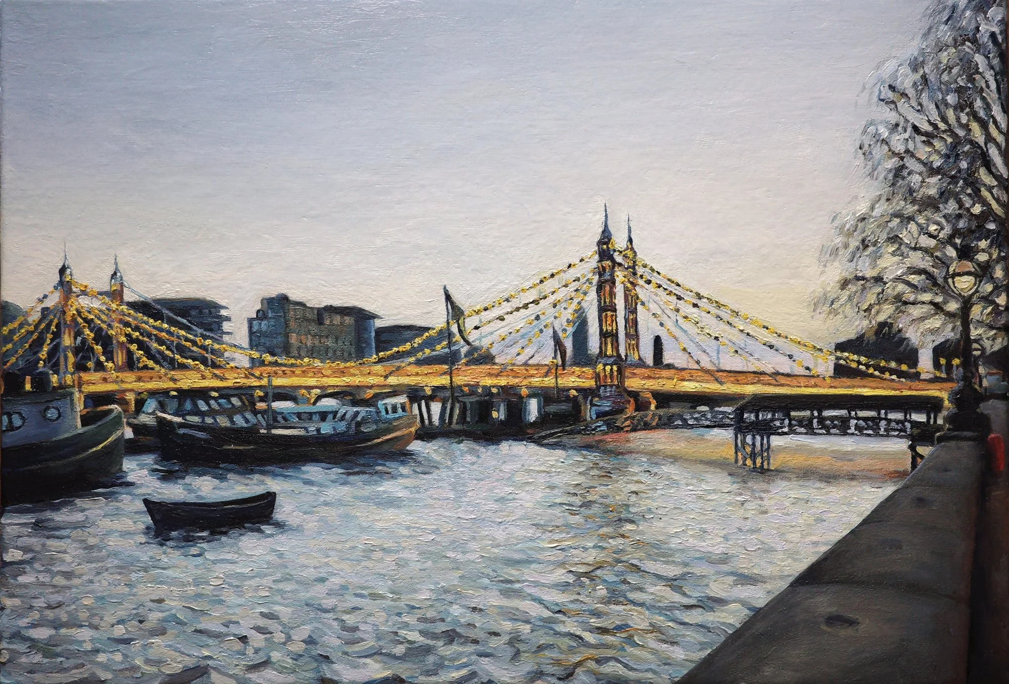
To change the colouring from cool blue-green to silver-grey, I mixed pink and purple-greys and painted them into the sky and water. I darkened and sharpened the edges of the tree, background buildings and boats so that they became a stronger silhouette. I reduced the contrast in the dark platform and thinned its legs, so it didn’t visually dominate in front of the bridge.
My client’s feedback was that she wanted to push the silvery white reflections in the water even further and to make the second peaks of the bridge more prominent.
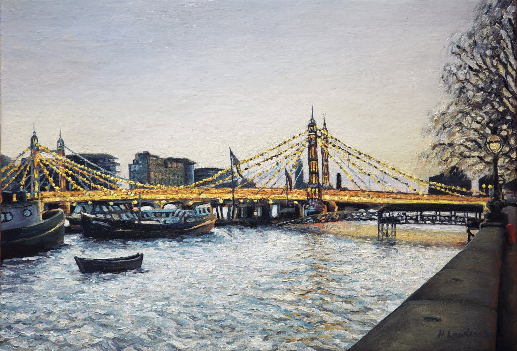
I added more light purple, silvery tones to the water to push that reflective, luminous quality further. I added more detail to the little foreground boat to pull it forward visually. I also made sure all the edges were sharp and I defined the edges of the leftmost columns of the bridge to match the rest of the painting.
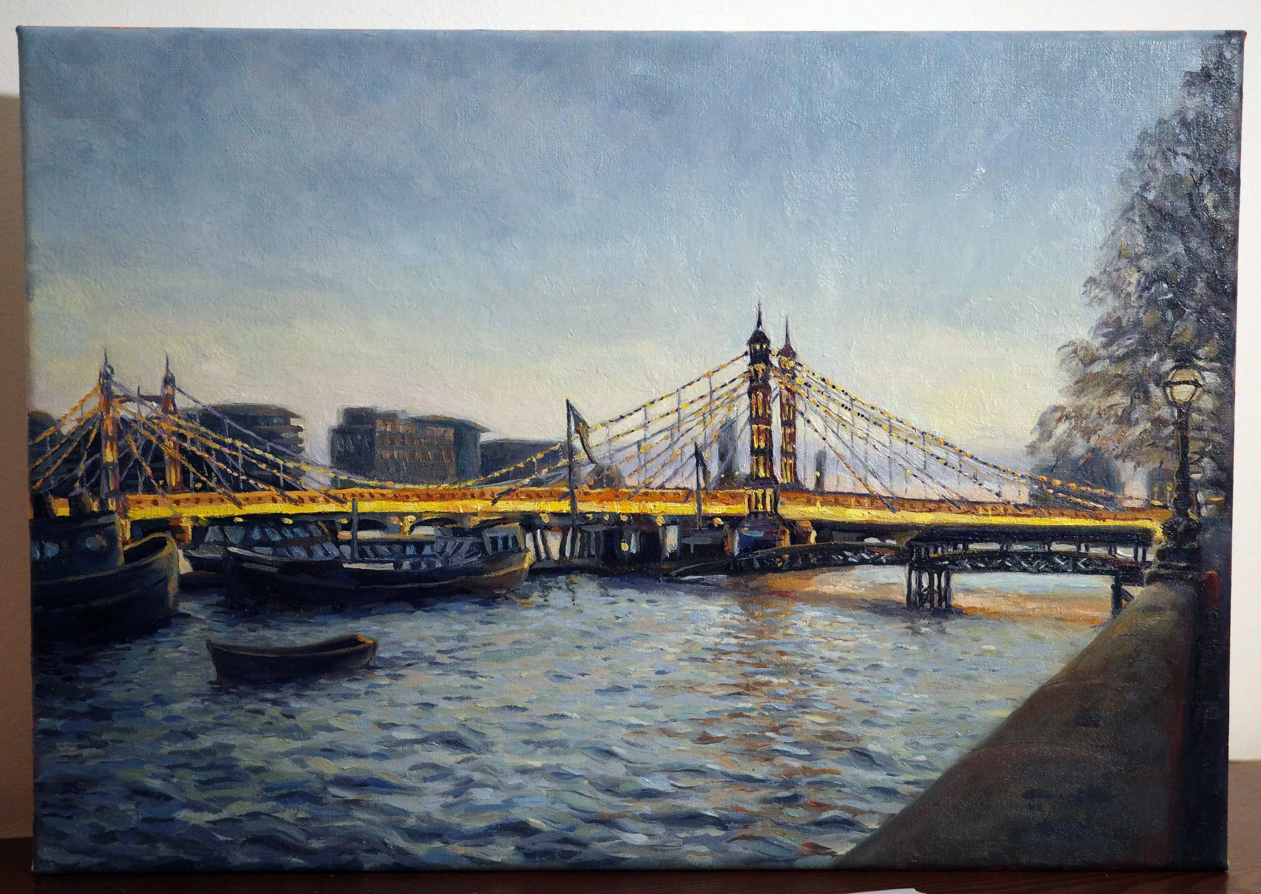
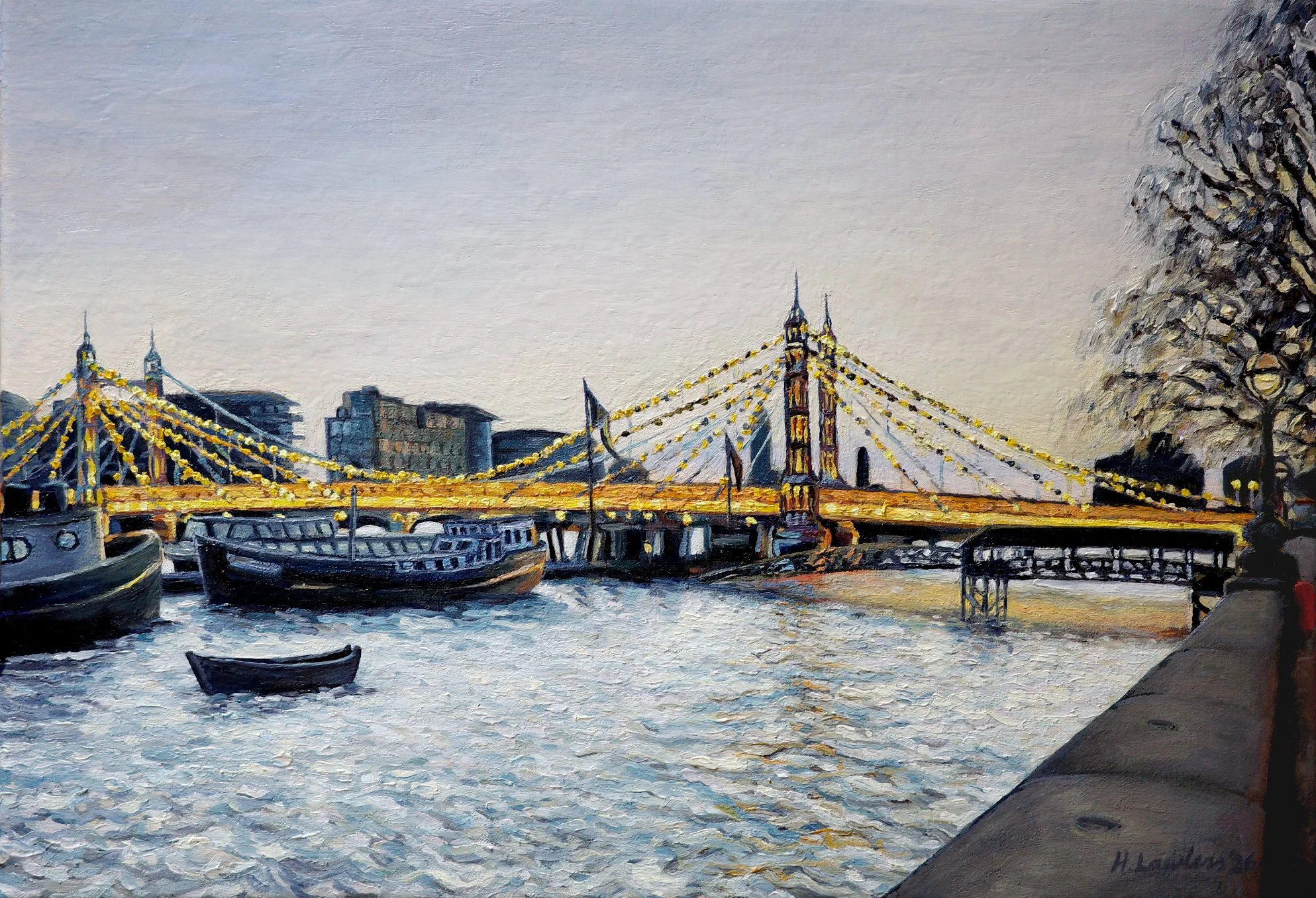
Finished!
"Albert Bridge Over A Silvery Thames"
50 × 35cm, oil on linen
I loved how involved my client was, so it truly felt like a collaboration. She had a clear vision and gave thoughtful feedback at every stage. We worked together to create a painting that captured how she wanted to remember London.
Details
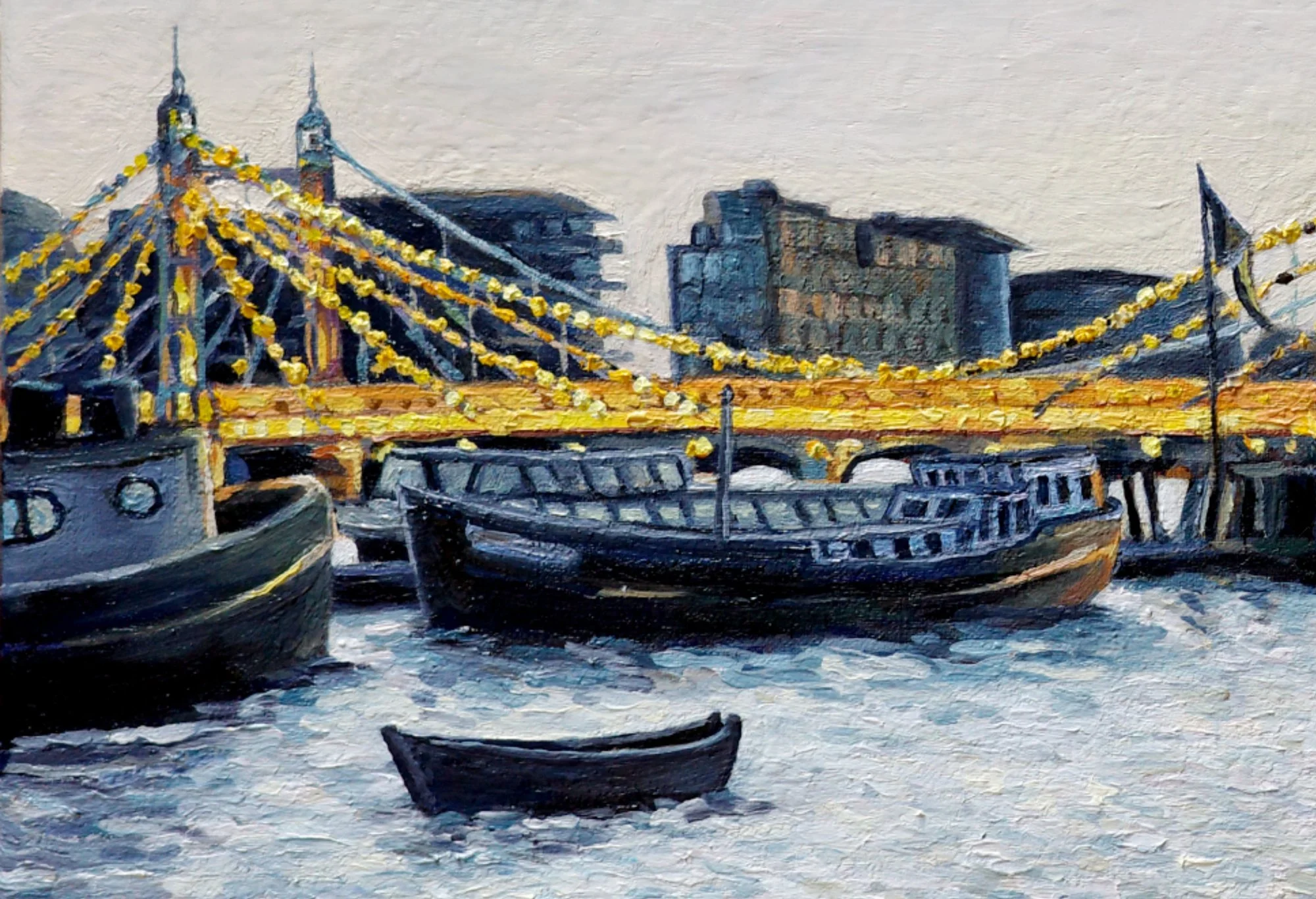
The last thing I worked on was giving the middle boats more definition from each other and clearly identifiable windows. The one in front is slightly more purple and the one behind is slightly more green.
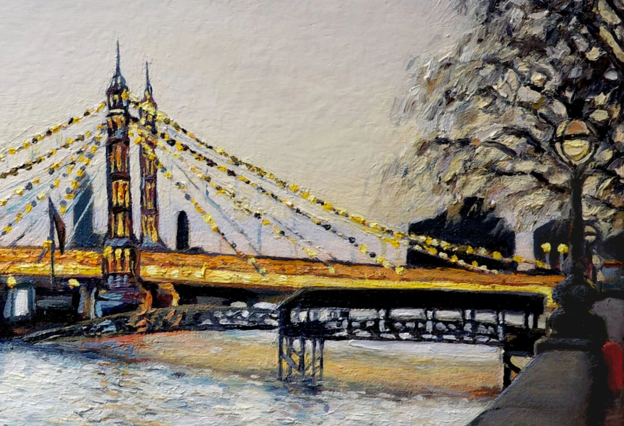
I love how the blue and orange complement each other in such a striking way that makes the bridge look like it is glowing. I painted the cables on the bridge with dots of different shades of blue and yellow.
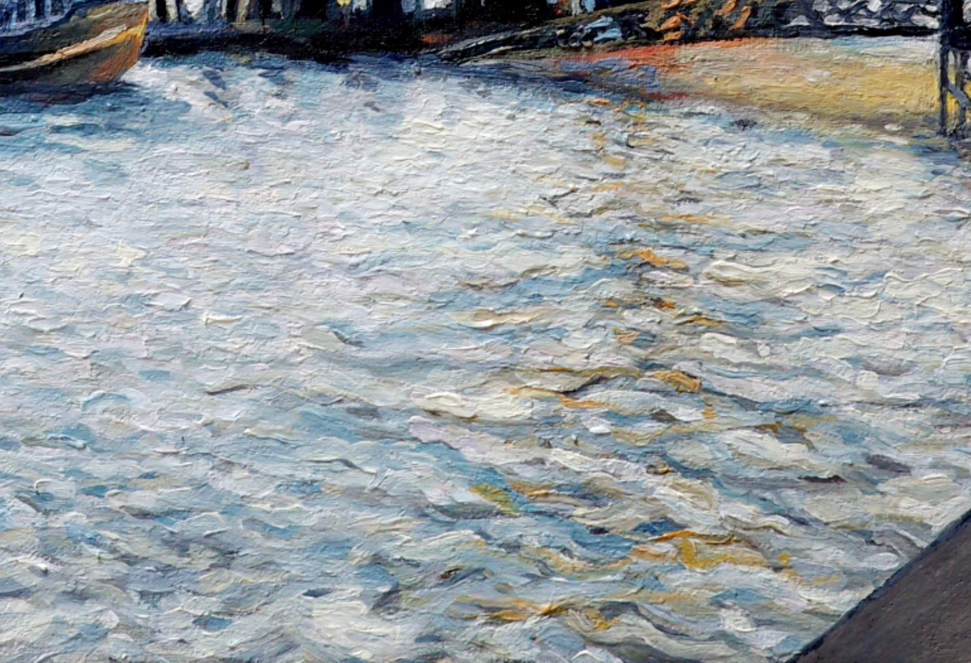
Here you can see the texture in the water. It is built up with many, many layers of different colours, so you cannot distinguish each brush stroke, but the colours shimmer through the final silvery layer.
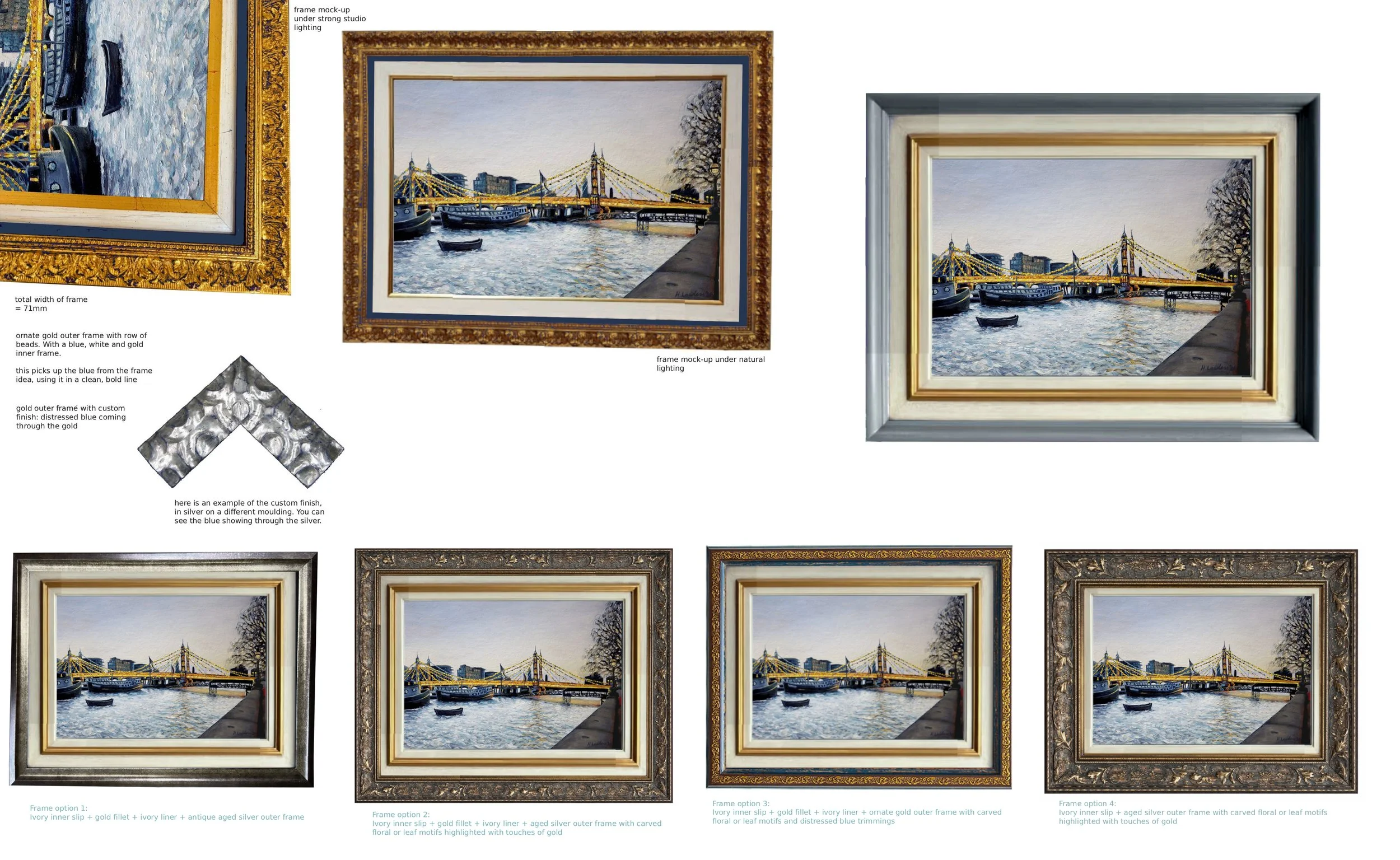
Framing
Here you can see the framing ideas that my clients and I explored.
This painting now lives in its new home in Spain. I hope it brings back wonderful memories of London and acts as a way to share them with friends and family back home.