
Painting process | Cypress Trees on the Peloponnese

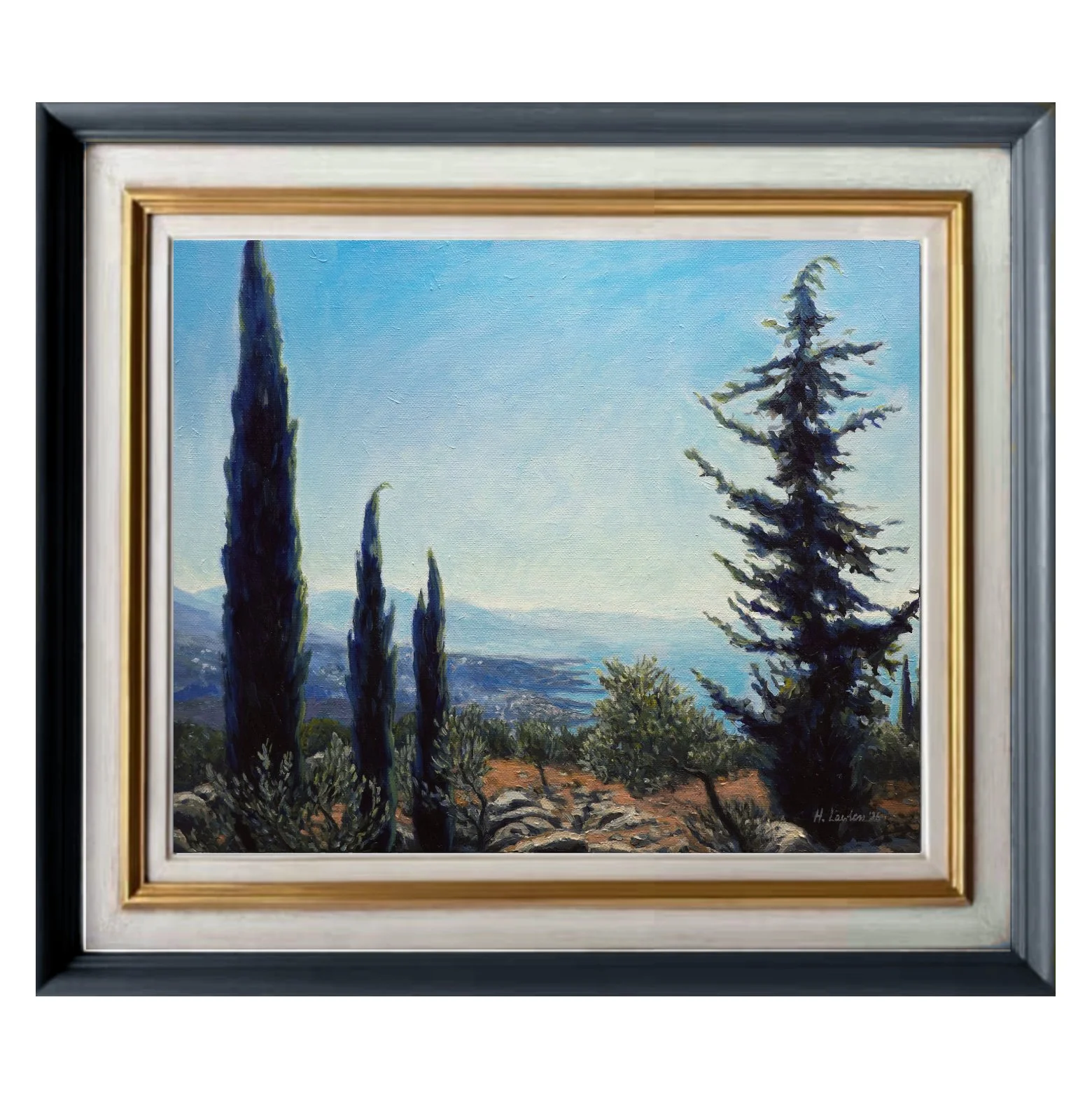
On a road trip through the Peloponnese last year, I spotted this view from the car window outside Kalamata. I instantly saw a painting in it. The strong, dark vertical shapes of the trees were strikingly contrasted against the hazy blue distance. The Greek-ness of the scene was overwhelming, with the cypress trees standing amongst the olive grove, baking in the midday sun while overlooking the sparkling Mediterranean.
This painting was a tricky one because I kept painting over my choices. I wanted the shapes and colours to go beyond pure reality, with crisply silhouetted deep-blue cypress trees. But I kept automatically bringing detail and highlights back in, which undermined the effect.
So, in the final stages I put my references away completely and started making decisions based on what the painting needed instead. It was the first time I'd ever finished a painting without a reference, and it was surprisingly freeing.
The final painting kind of shimmers the way the landscape does in the midday summer heat. It's bright and clear, but no detail is exactly crisp.
You can watch the full time-lapse of this painting by clicking the image above.
Preliminary sketches and studies
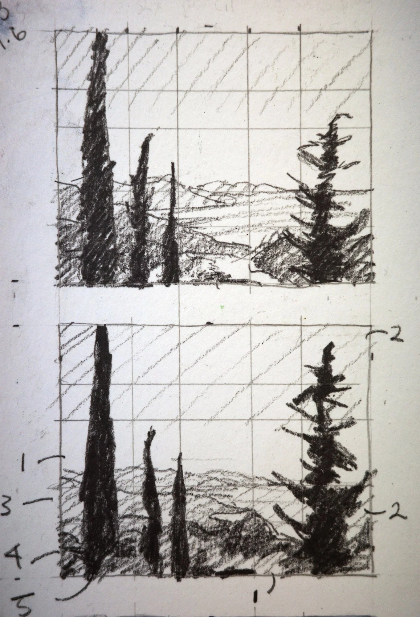
I was really unsure how to place the trees in relation to the distance. I had this big panoramic view but the interest lay in the space between these two groups of trees. I did some research and I found a Sargent watercolour painting (Cypress Trees at San Vigilio) that inspired the final composition.
I considered the size of the right-hand tree and decided to make it taller, to make the trees a bold vertical statement on either side of the painting.
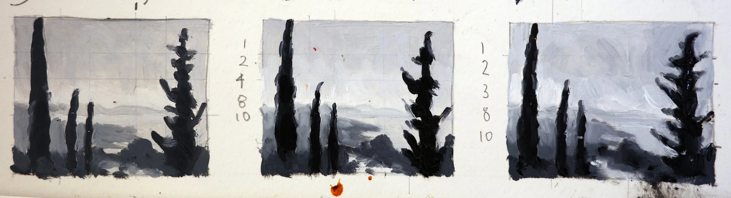
These value studies were particularly useful in working out the graduation from dark to light from the foreground to the background. I wanted the very distant hills to bleed into the sky as a similar value with very soft edges. The trees in the foreground are almost black as they are lit from behind.
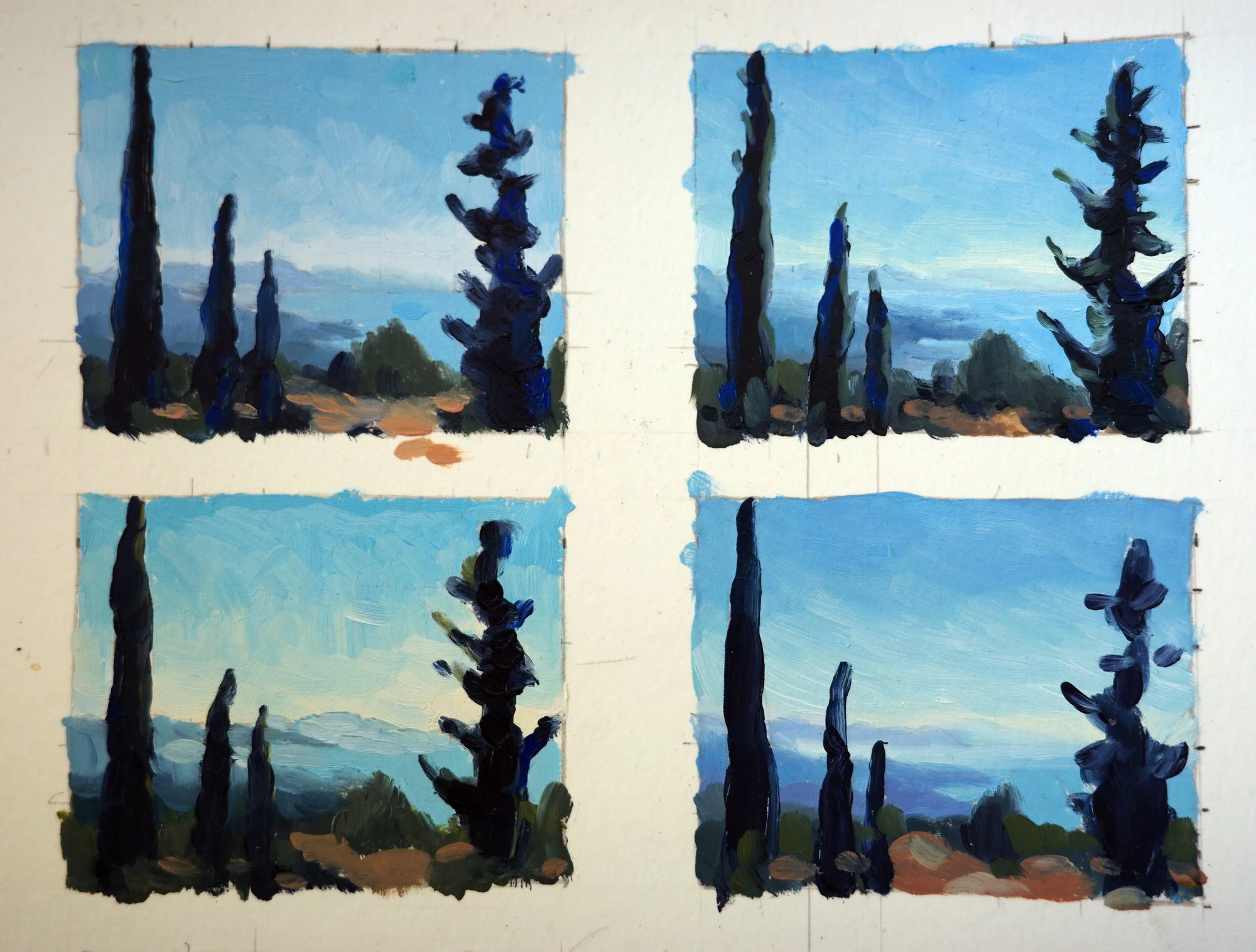
These colour studies at first glance look exactly the same to each other! But there are subtle differences that I was exploring. I was particularly interested in the colours in the sky, whether they should be more purple-leaning or more green, and decided on a graduation between the two. I pushed colours in the cypress trees towards a deep true cobalt blue, with light green highlights to create visual interest and contrast with the background.
The painting process
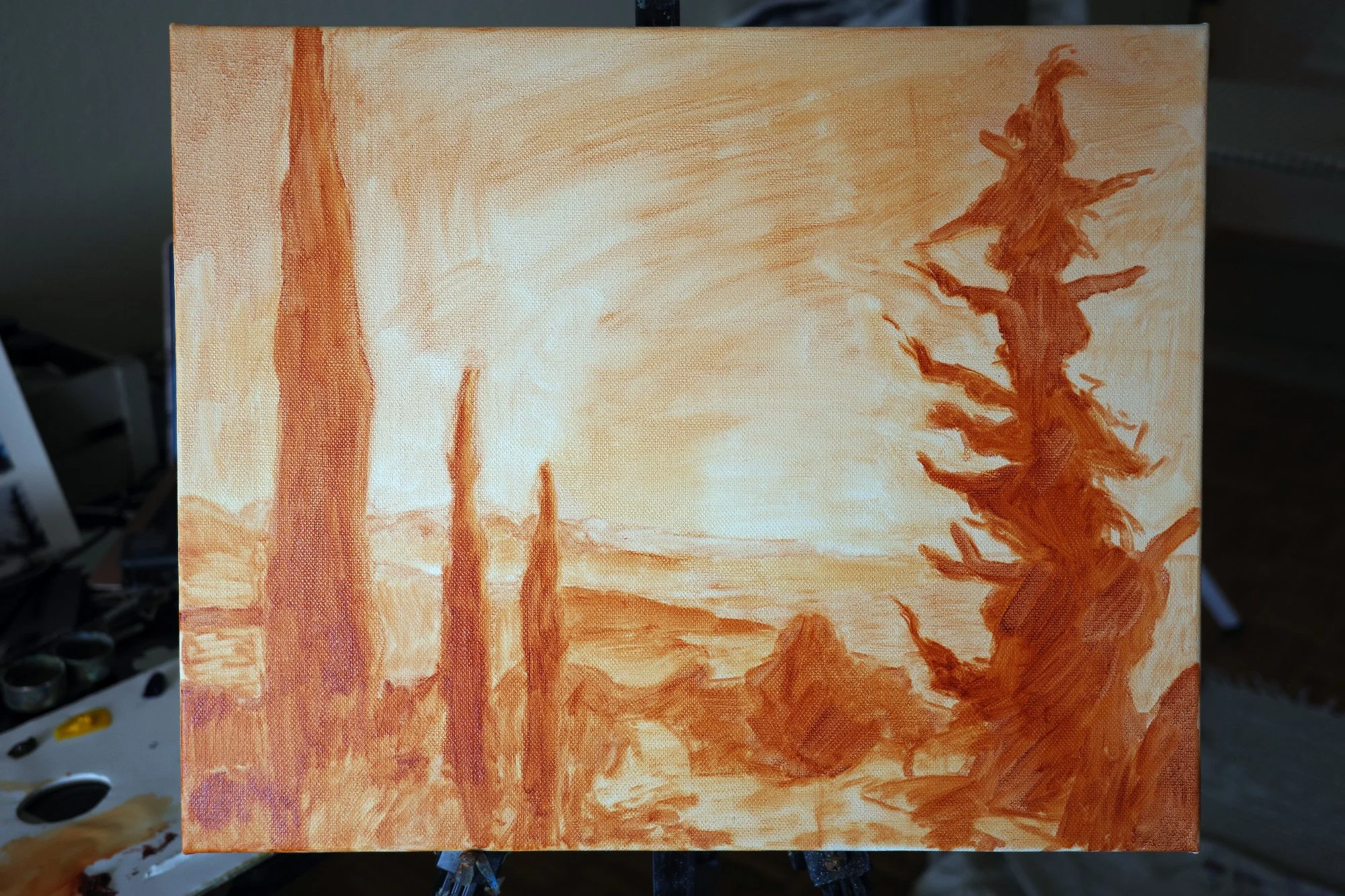
Drawing in the underpainting was quick for this one because the composition has such bold defined shapes. But I should have been more precise with the shape of the tree on the right-hand side because it was too bulky and needed correcting later.
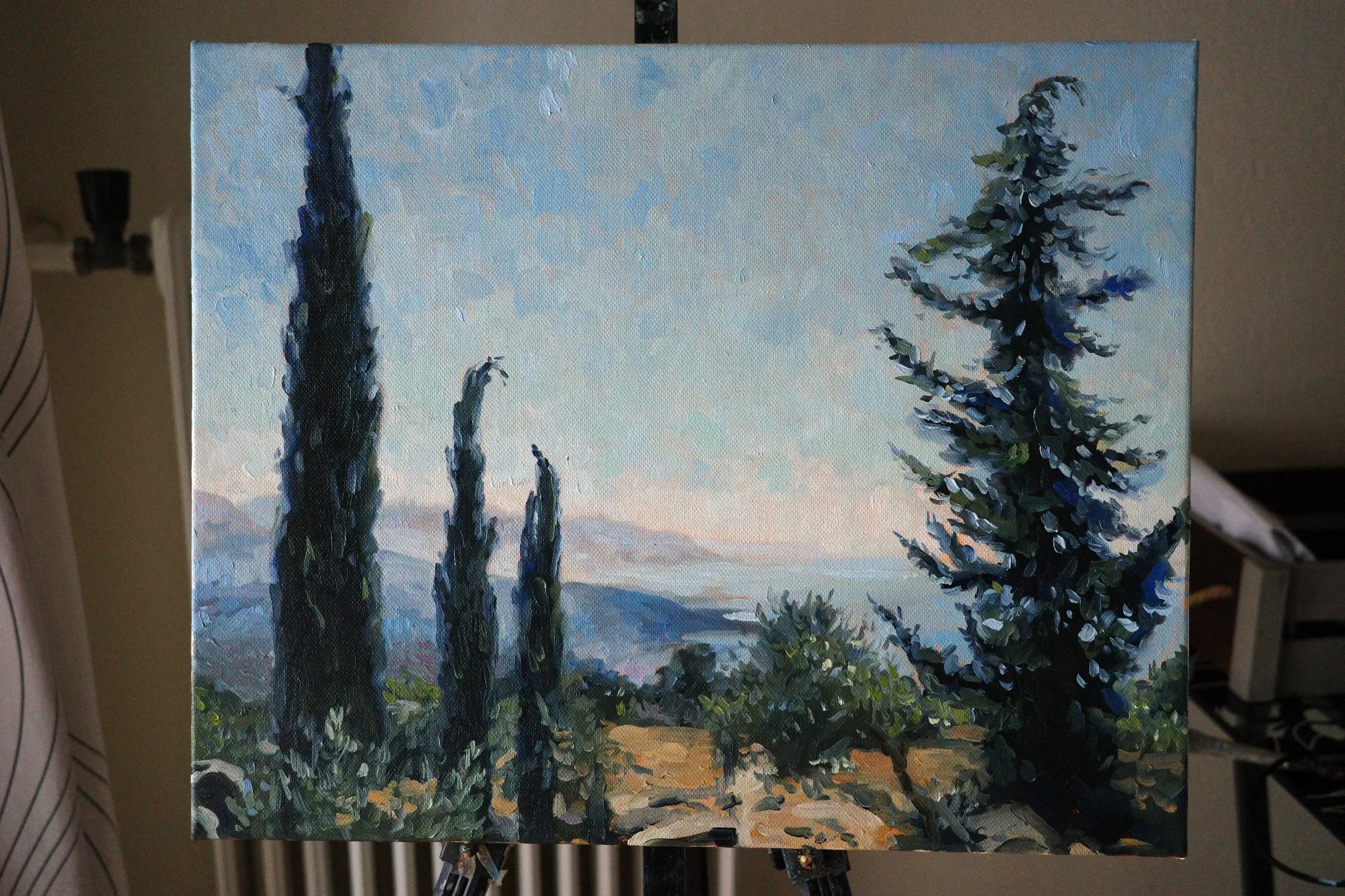
Here's the painting with its first layers on.
I built the sky up with short brush strokes of paint which had a painterly effect that I enjoyed, but ultimately I decided it distracted from the graphic nature of the dark trees silhouetted against it.
I started bringing gaps and light into the perimeter of the trees but, this made them look a lot like a Christmas tree with snow.
Here, I toned down the texture in the sky and carved out the shape of the right-hand tree more precisely.
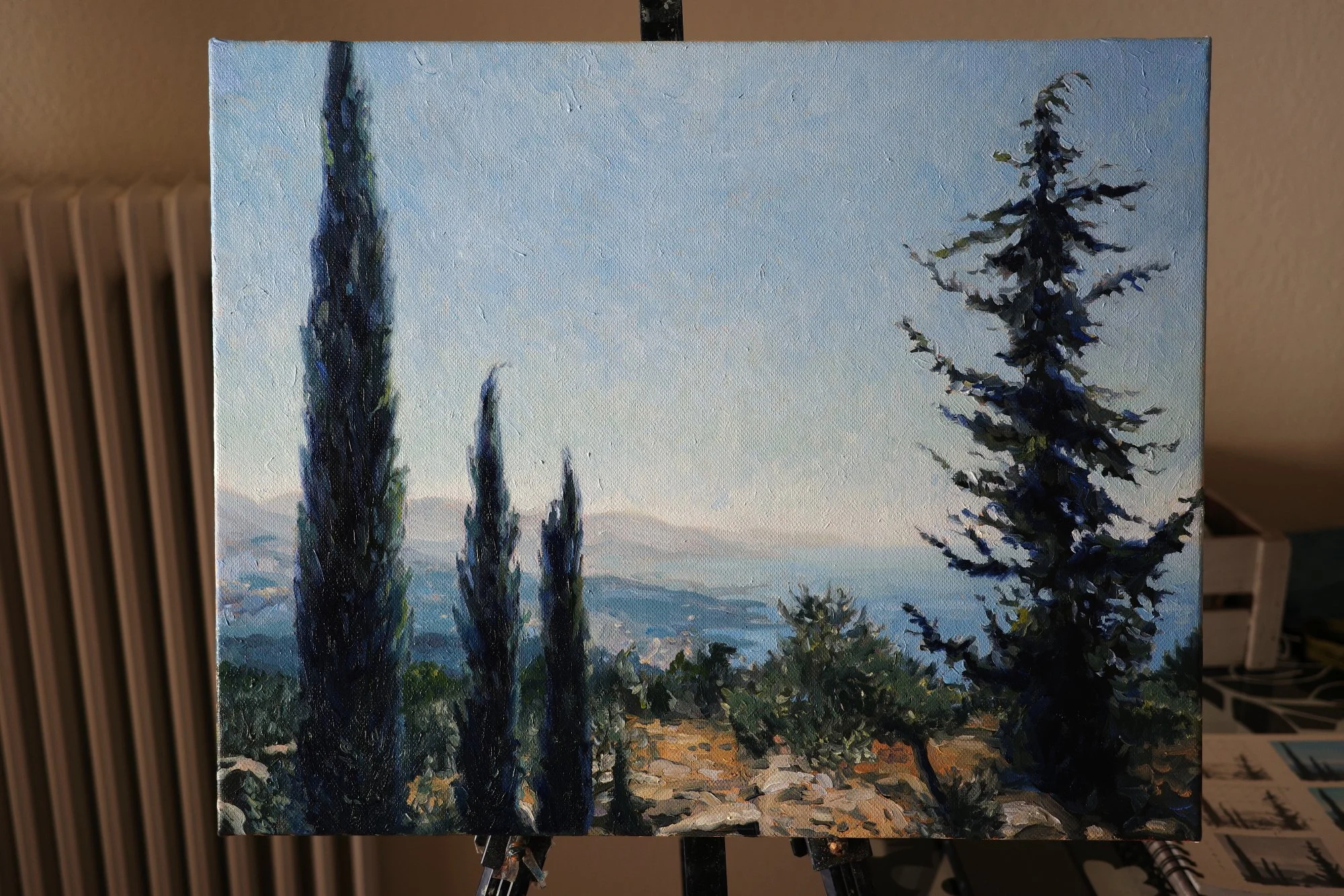
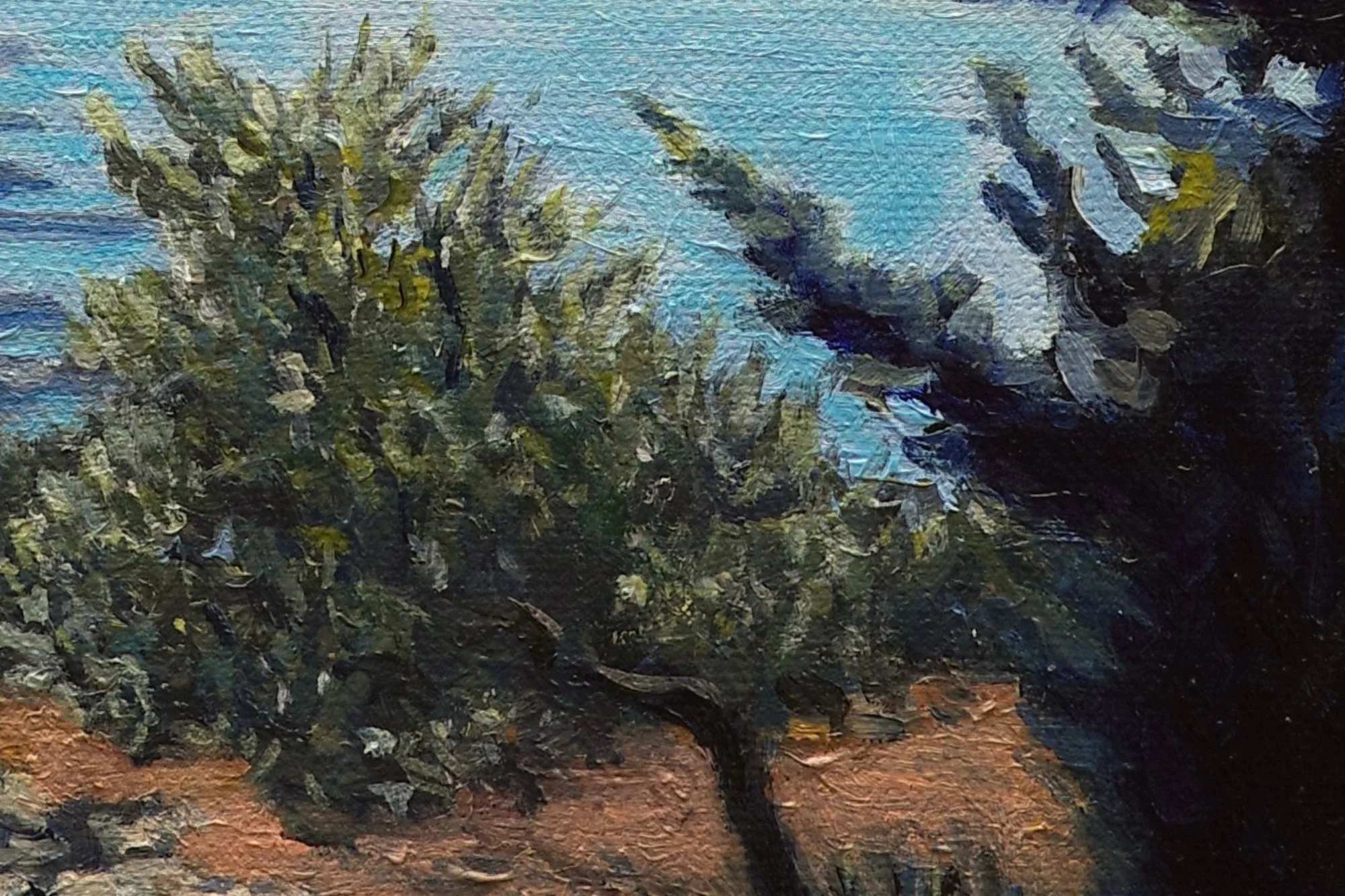
I painted over the olive foliage in front of the cypress trees because I didn't like how they were muddying into the darks at the base. I also lightened the blues of the distant hills to push them back in space.
The orange in the foreground provides contrast with the blues and greens that dominate the painting, but I didn’t want it to distract. I experimented with what chroma to go for for the orange and here, I'd made it too dark and dull. I ended up using a lighter cool pink to bring some vibrancy and light back in.
I bought some new paint shades and was struggling to get the intensity of the sky that I wanted. So the very last thing I did for this painting was to dig out my original tube of cerulean blue to get that proper cool bright blue sky. Why on earth did I fight against that right until the end...!?
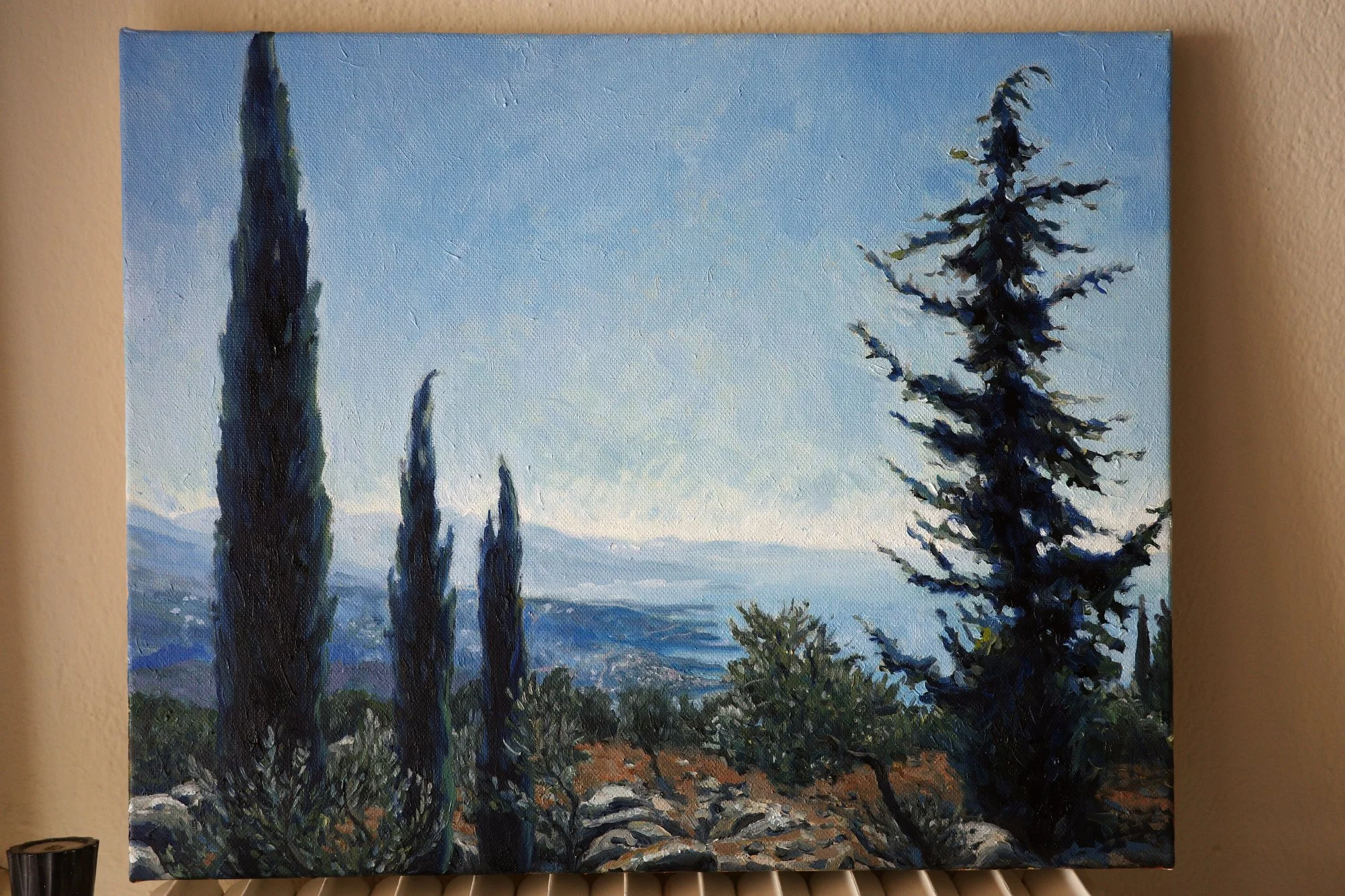
Finished!
"Cypress Trees on the Peloponnese"
50 × 40cm, oil on linen
I loved pushing my colour choices in this painting, and I think the final effect is both believable and interesting. Ending up with a painting that follows my ideas, rather than exactly adhering to reality, is exactly where I want to be.
Details
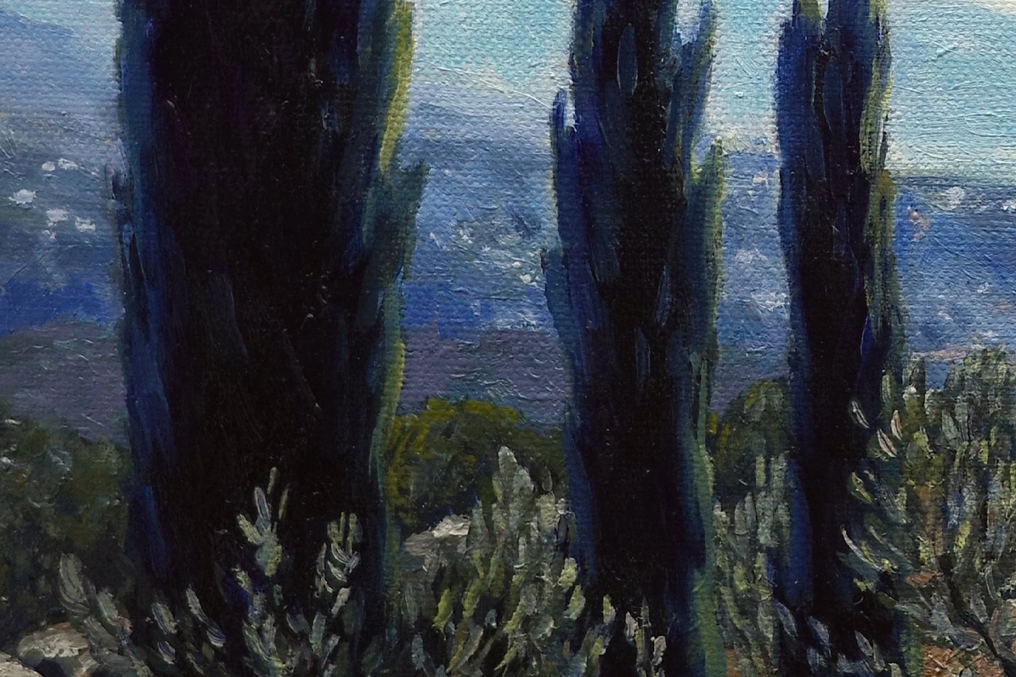
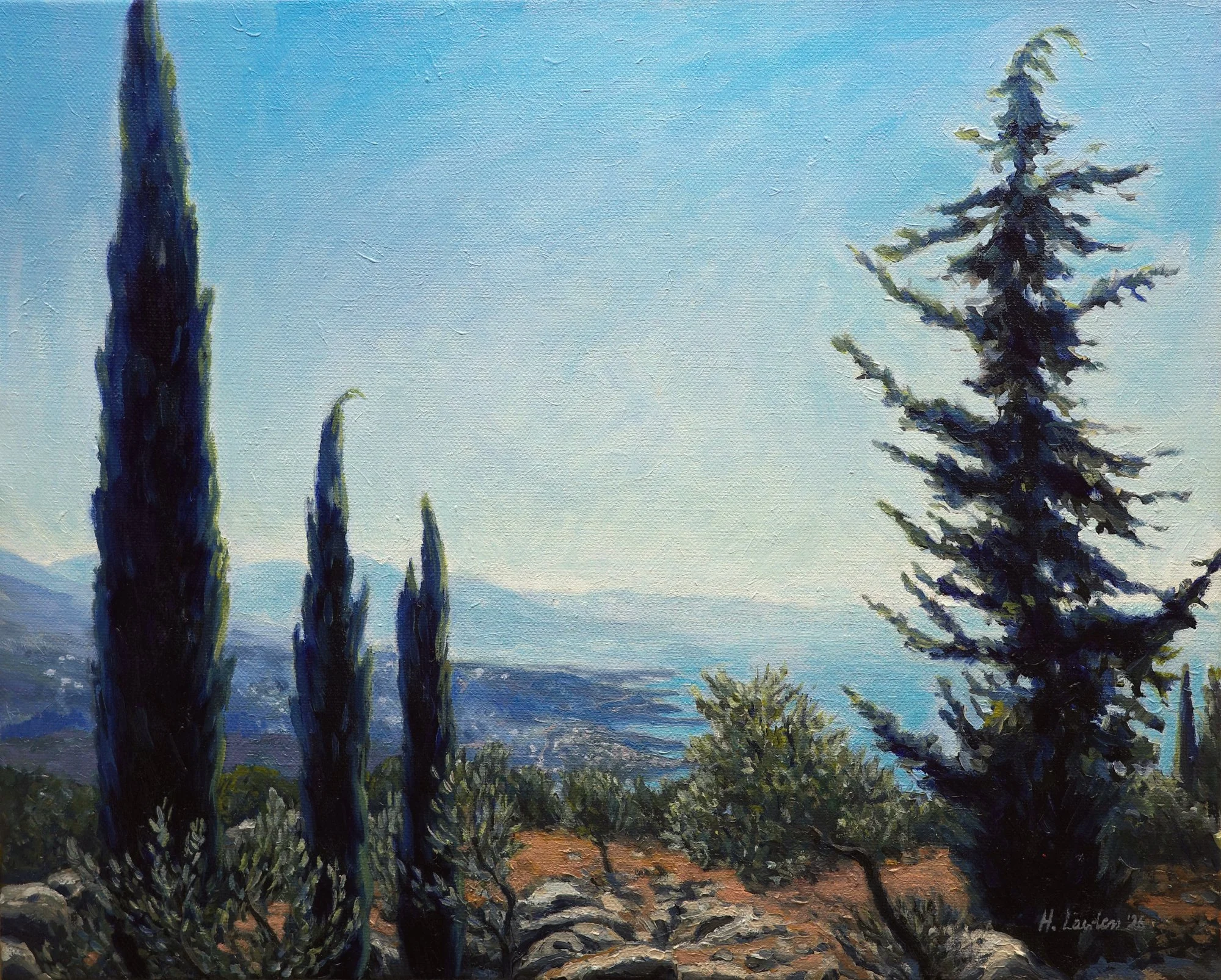
That final splash of blue and yellow-green on the cypress trees is exactly what I was going for. It's colourful, yet believable.
I focused on keeping my colours bright and clear, which took a few re-dos when they started muddying into each other.
I want to create paintings that are instantly recognisable and true to the world around me, but play up colour in a bold, interesting way that says more than a photo ever could.
Painting the back-lit trees was difficult. The halo effect makes them have soft, glowing edges while they’re also silhouetted against the bright background. Those were some quick value transitions to capture!
I made the sky and water fade towards the trees to create a subtle glowing effect around the leaves. And I used tiny dabs of paint to introduce highlights at the edges without disturbing the big dark shapes.
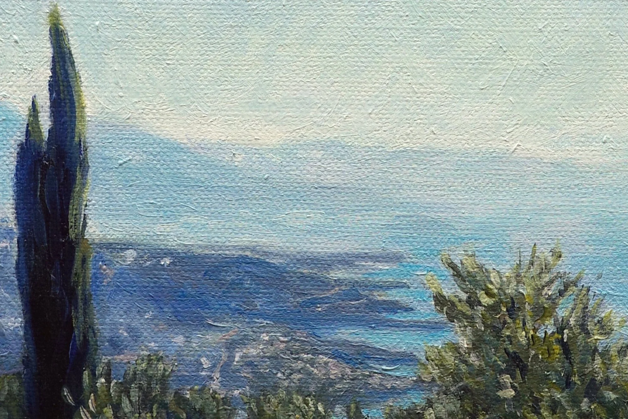
I painted a little town and roads on the distant headlands. I used a light peachy colour to give the impression of the sun hitting the roofs. As the coastline recedes, the edges get softer and almost lost into the sky and water.
This painting will be available in my release of new paintings on August 6th. Sign up to my Collector Preview list to get early access.