
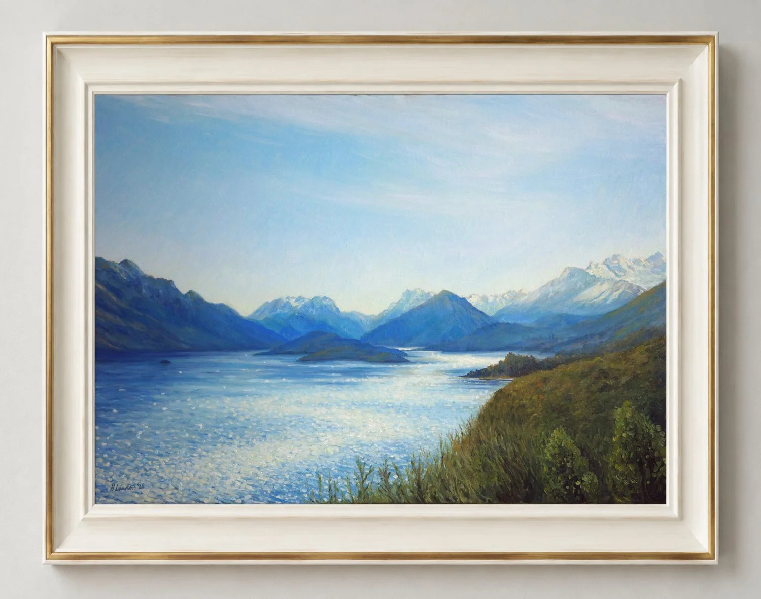
This commission began as a birthday surprise. My client’s husband got in touch to arrange it. I made up a beautiful card to be gifted to her on the day, and then once she opened it, she could choose what I would paint! This was a first for me, but I loved designing the gift card, the anticipation and the unknown of what I would even be painting for this commission.
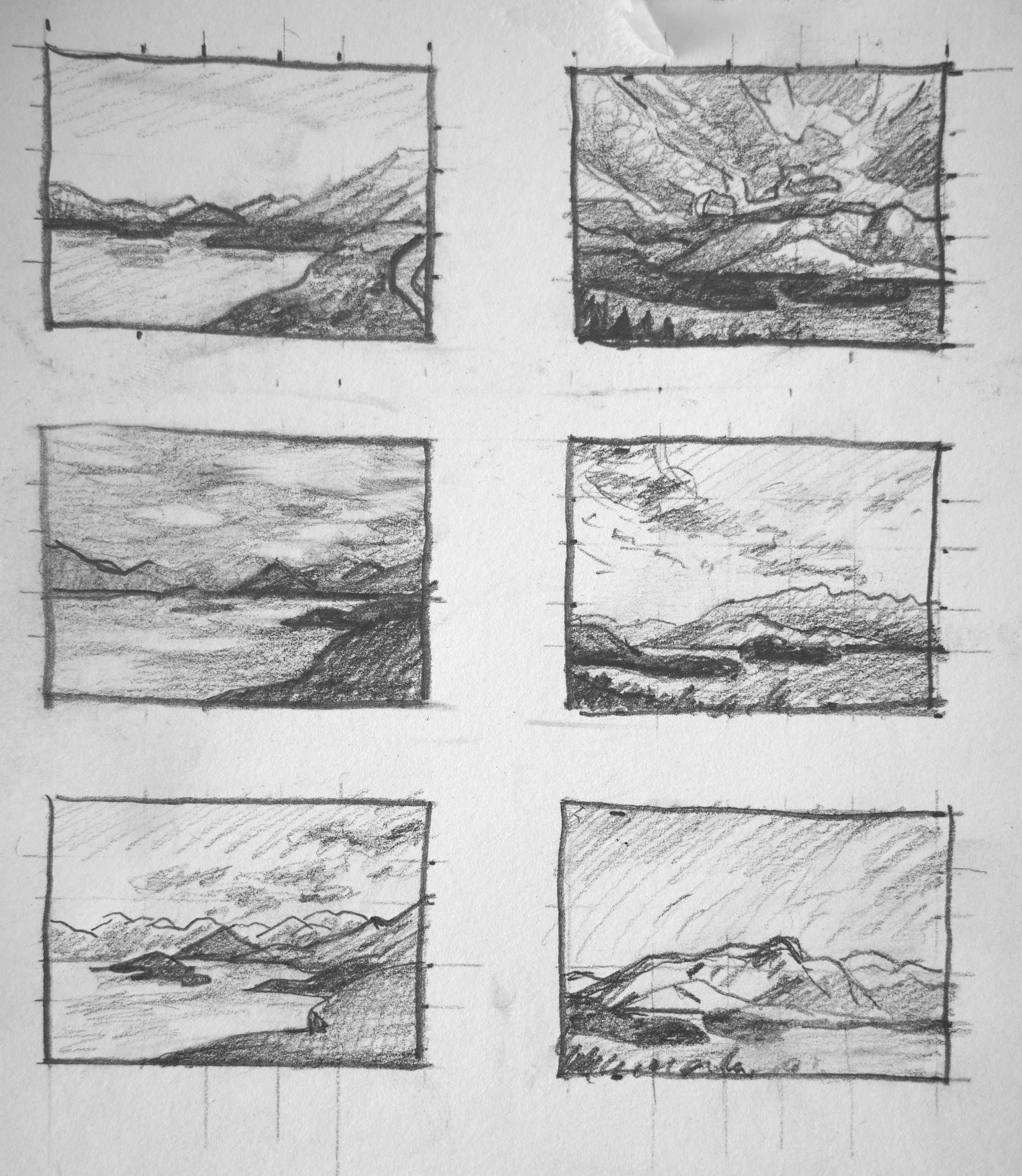
She wanted a painting of Queenstown, New Zealand, as it held a special family connection for her. She wanted a painting that captured a sense of the magical, mystical, unpopulated and dramatic landscape.
She had two views in mind: the outlook from their apartment in Queenstown, or her favourite view on the drive to Glenorchy. I painted three small colour studies of each, exploring different light and weather.
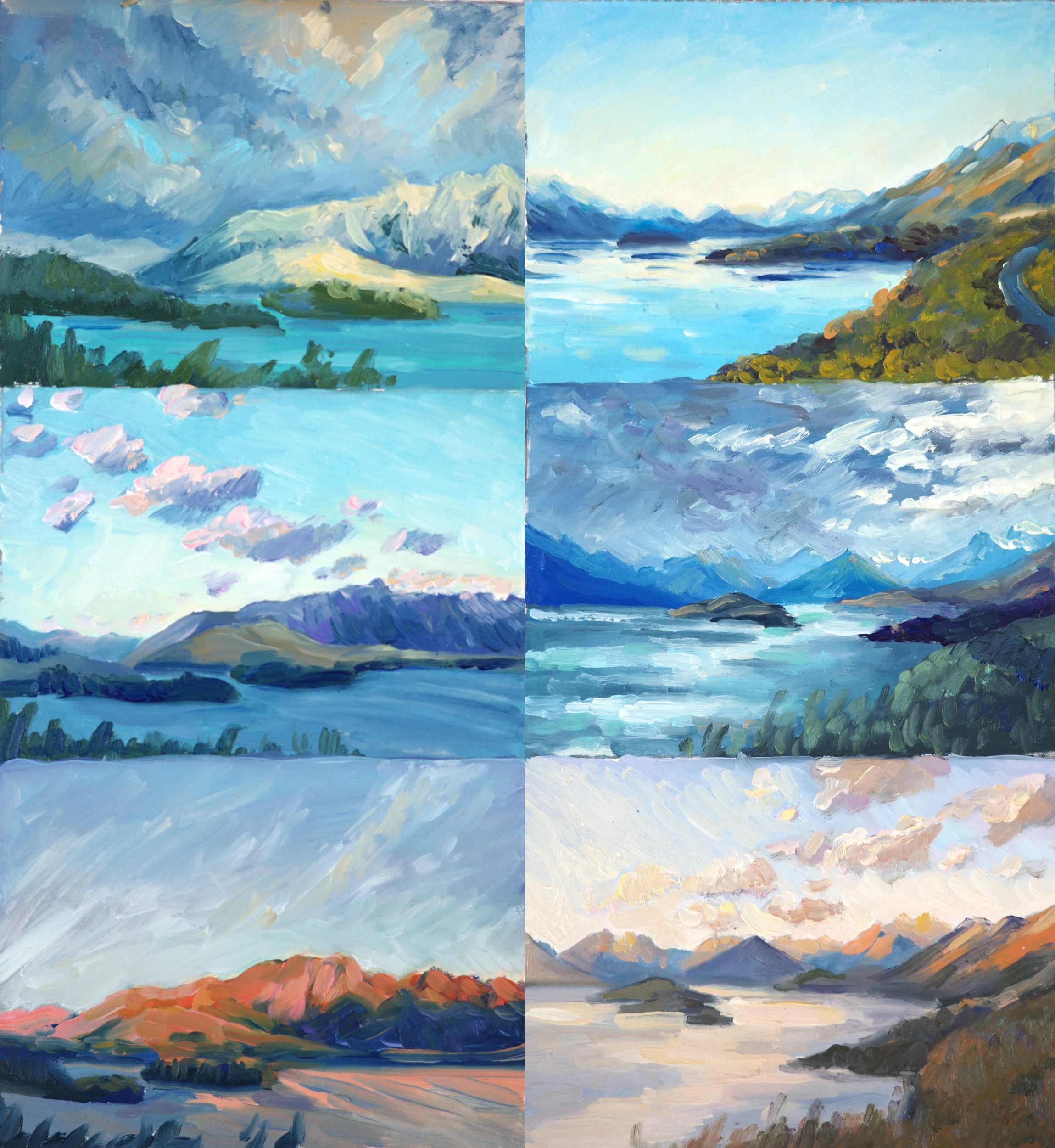
I had a lot of fun sourcing the reference photos and seeing how differently I could paint the same place. Six colourful little paintings, each with quite a different feeling.
My client chose the Glenorchy view. She wanted the composition of the middle stormy one, but with the colouring and feel of the top sketch. She wanted it to feel like a summer’s day, as that was how she had experienced the drive herself.
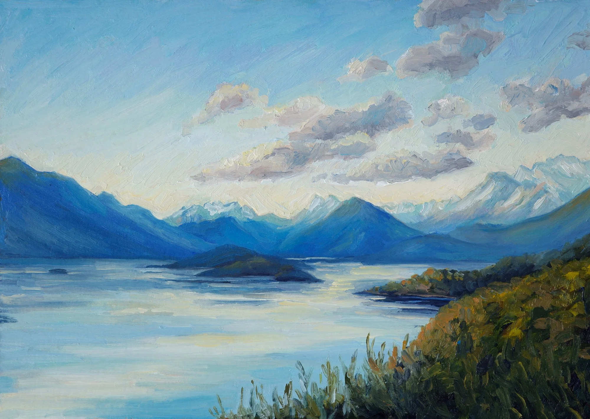
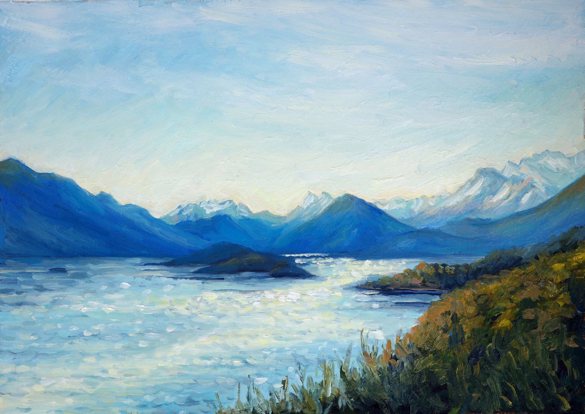
In the final sketch, I initially included fluffy clouds, but we decided that subtle wispy clouds were less distracting.
I wanted to keep the mountains as the focus, with the light on the water drawing you towards them. The wispy clouds mirror the shape of the sparkling sunlight on the lake, leading in towards the mountains. I like how these two directions bring movement into such a peaceful scene.
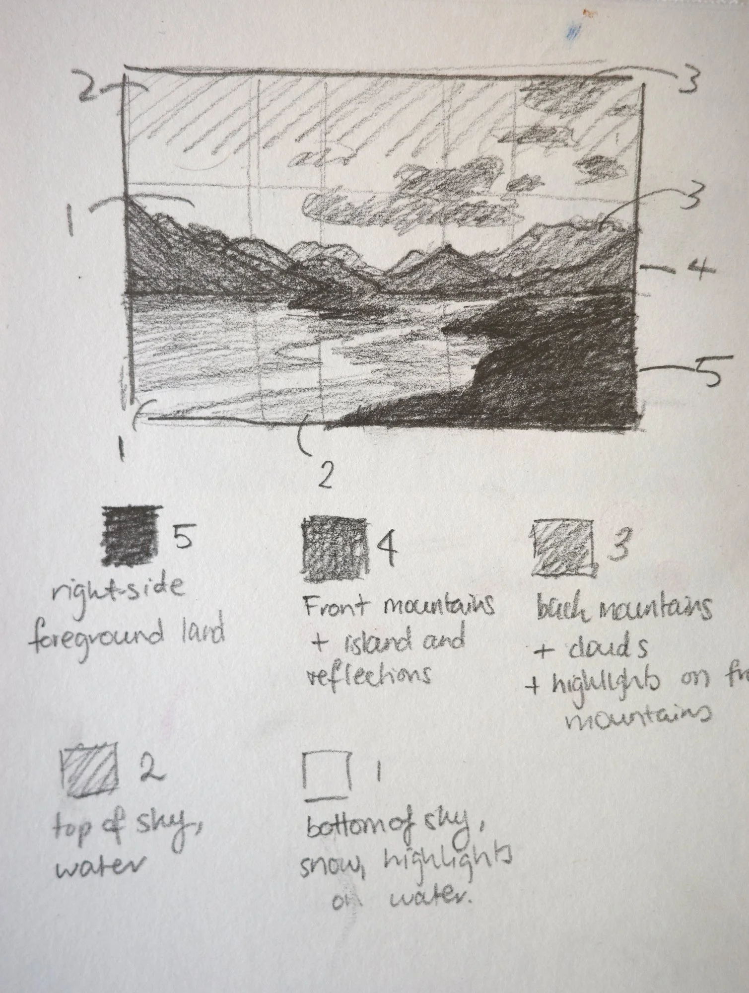
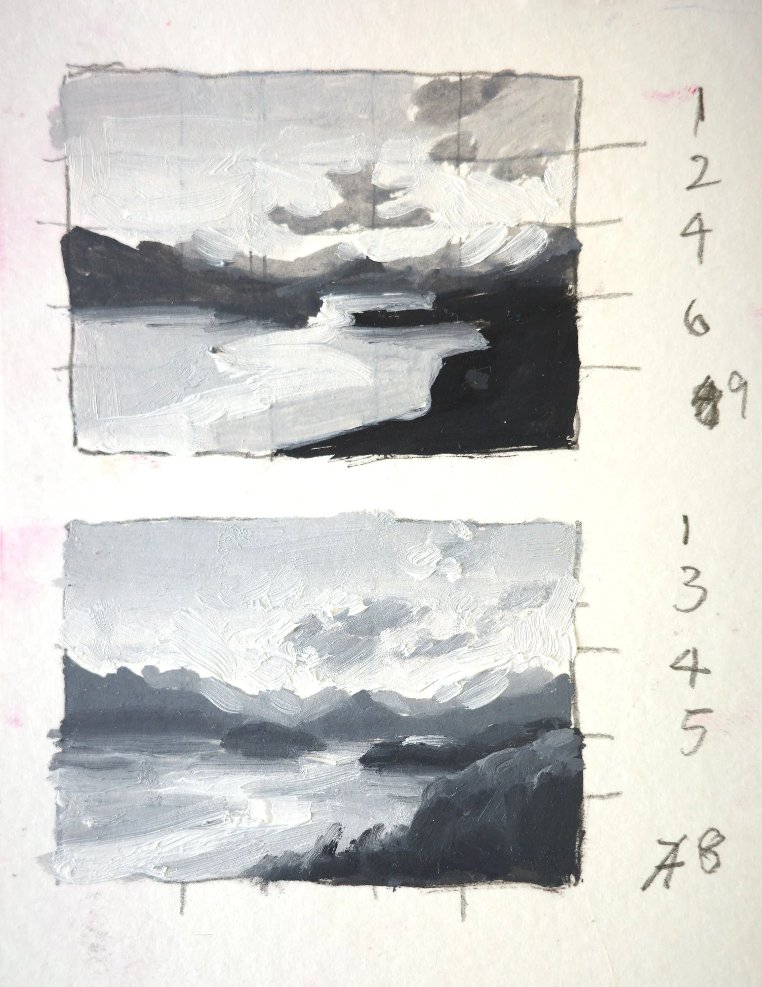
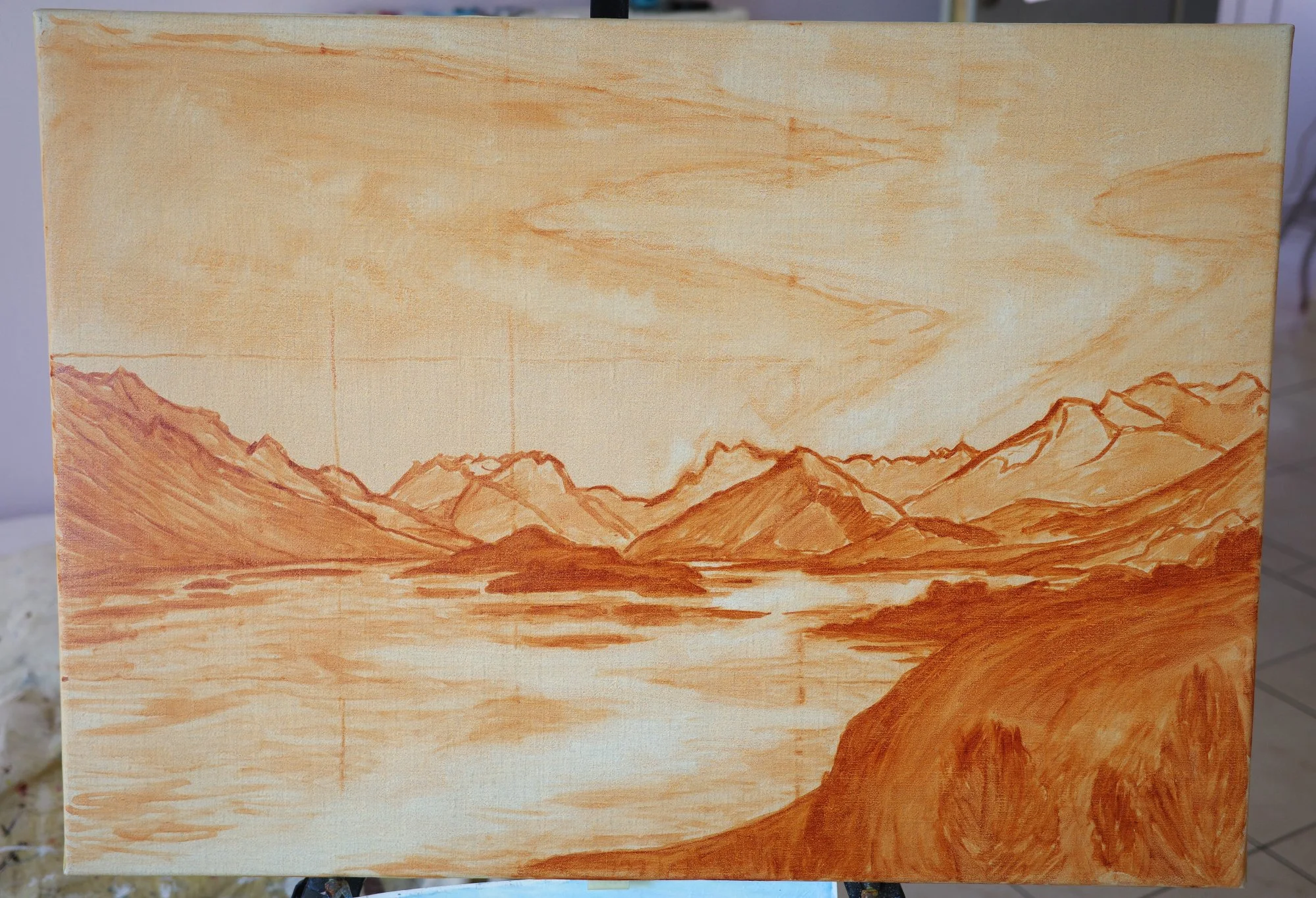
I mixed so, so many different shades of blue in this painting! On the mountains, I built them up in thin layers, letting the colours underneath show through to give them that luminous feeling.
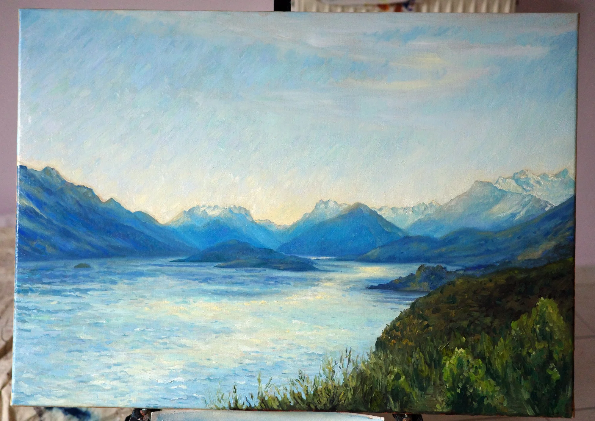
The sky needed to be soft enough that it didn’t distract from the mountains. But I also wanted it to have a subtle sparkle, rather than be a flat area of blue.
I built it up with small strokes of different blues, then kept layering until you could barely distinguish one stroke from the next. The colours read together as one sky, but those tiny variations give it movement and life. I particularly enjoyed finding that balance.
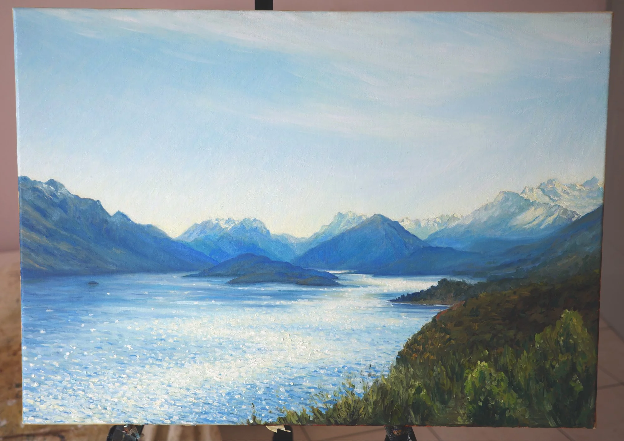
The foreground was much harder to get right!
It needed more detail, stronger colour and greater contrast to make the vegetation feel close to the viewer. But too much of any of those things pulled attention away from the mountains.
I tried quite a few versions. In one, I added far too much detail, which was distracting. Then I tried brighter colours, which changed the feeling of the time of day. It’s surprising how much one patch of vegetation can affect everything around it!
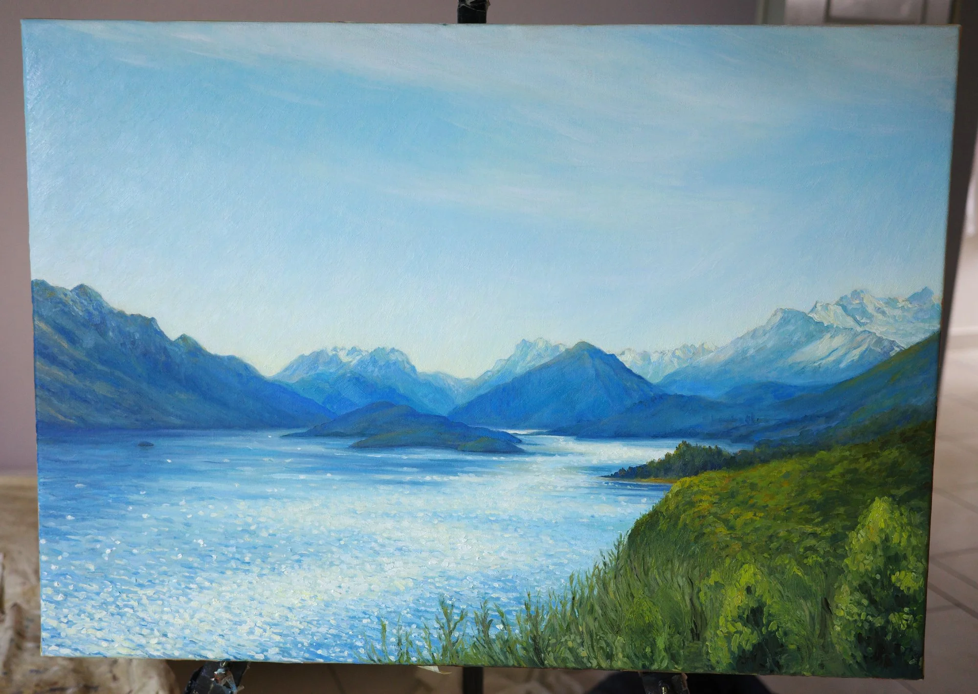
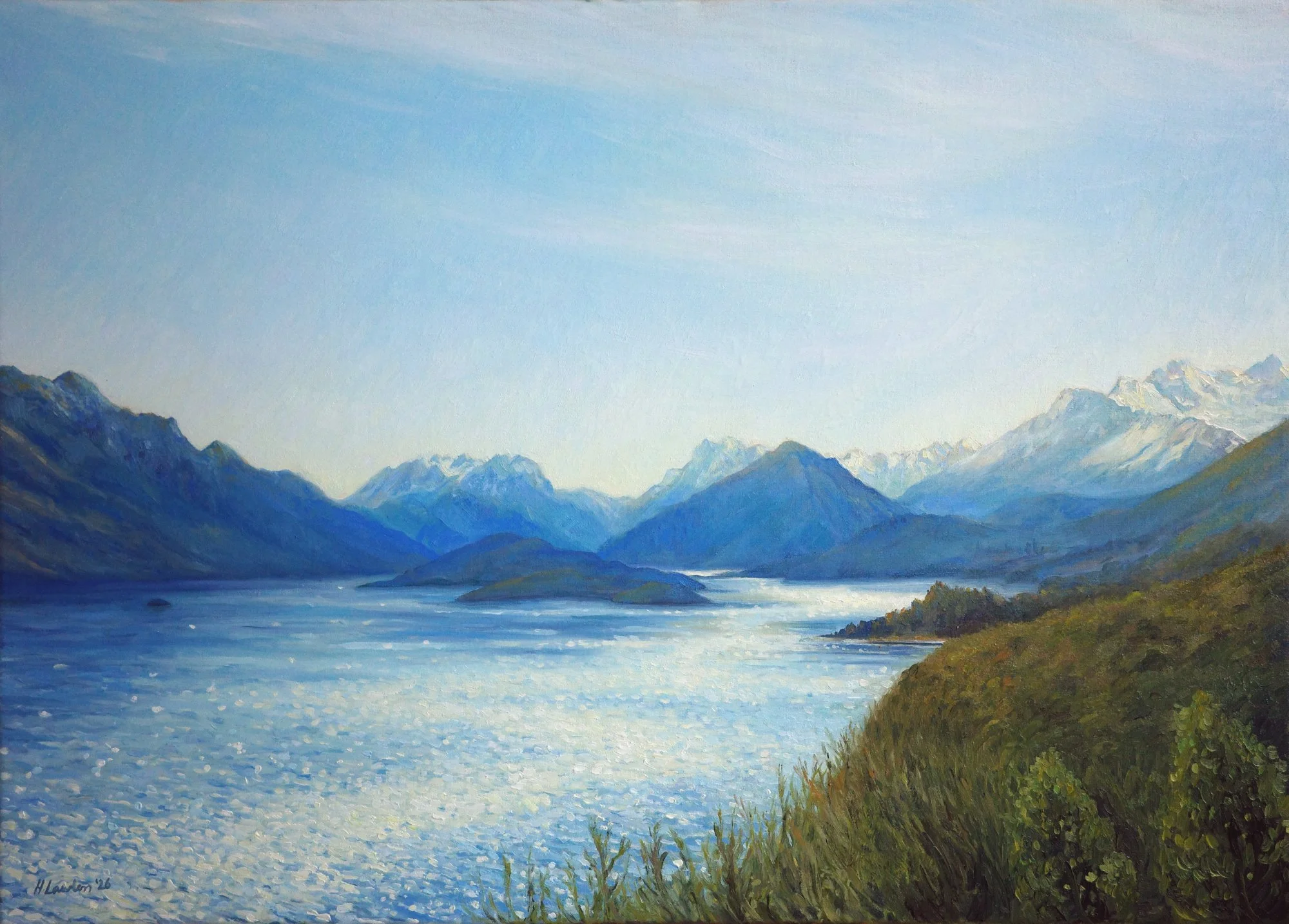
Eventually, I found a balance I was happy with. The trees have enough definition to show that they’re close to you, without describing every leaf and branch. They give the painting depth, but leave the mountains as the part your eye returns to.
I loved building up the blues across this painting, from the soft variations in the sky to the layers of mountains and little flashes of light on the lake. There’s so much colour within what at first looks like a very blue scene.
It was a pleasure to explore all those possibilities with my client and bring the view that is so special to her and her family into her finished painting.
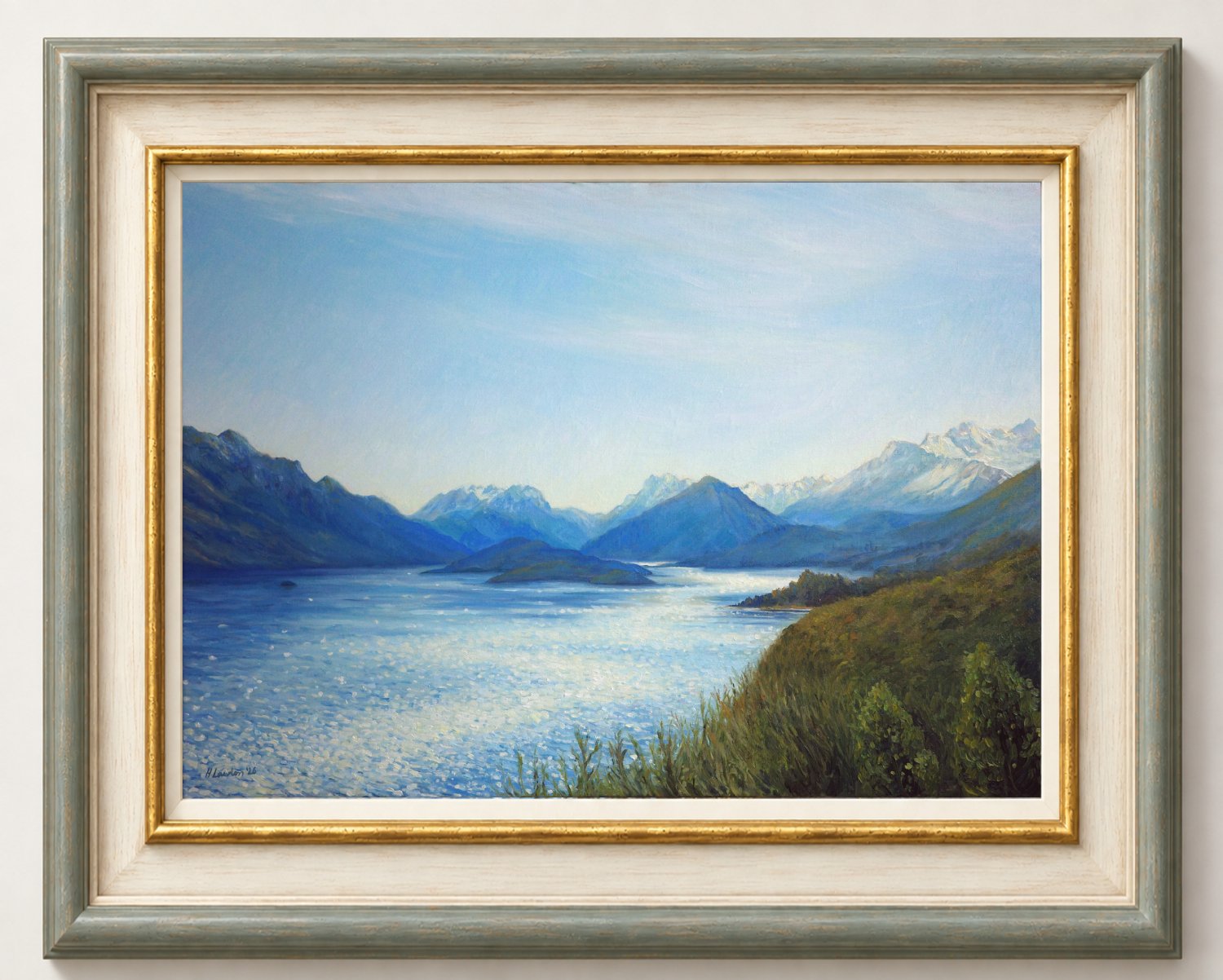
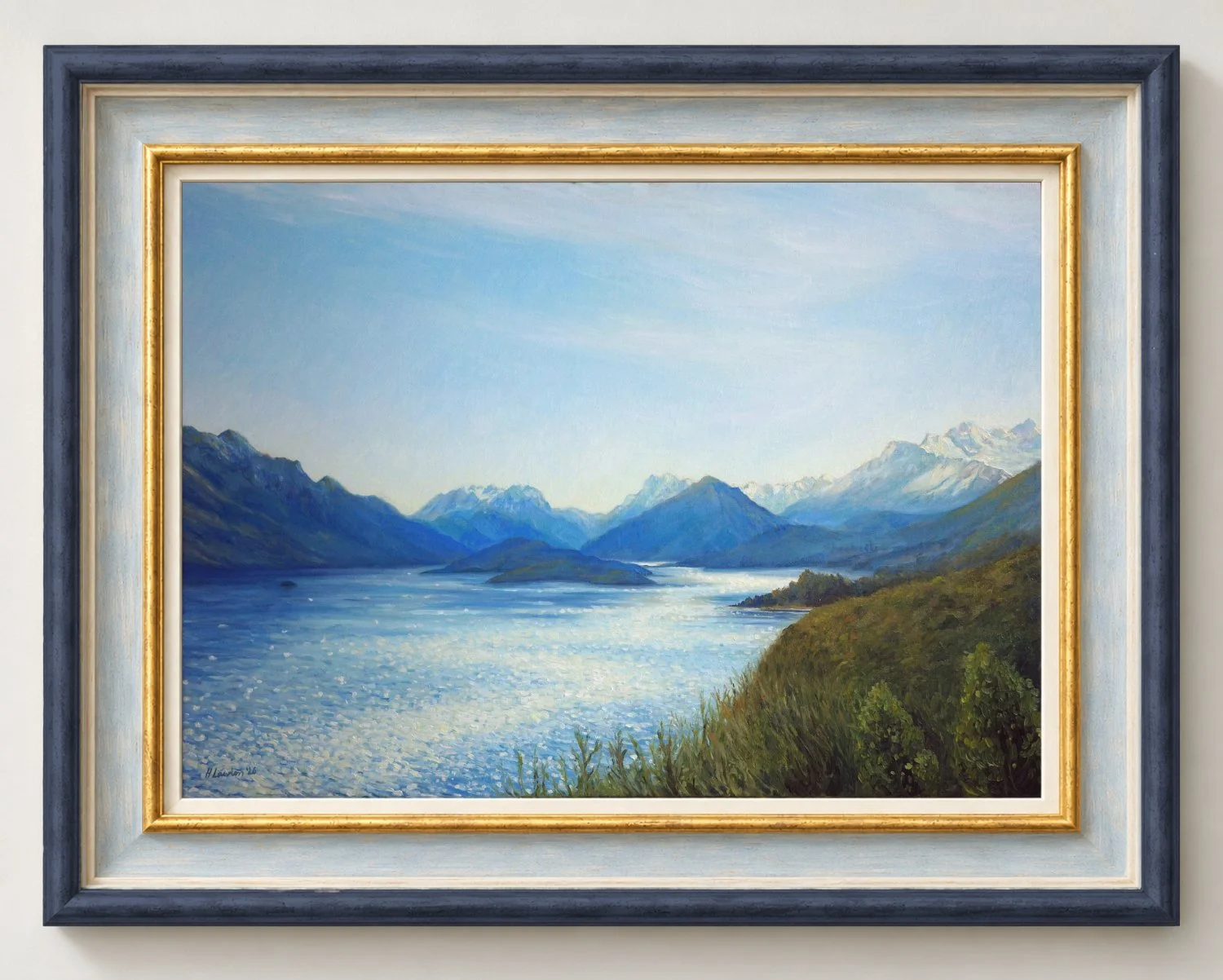
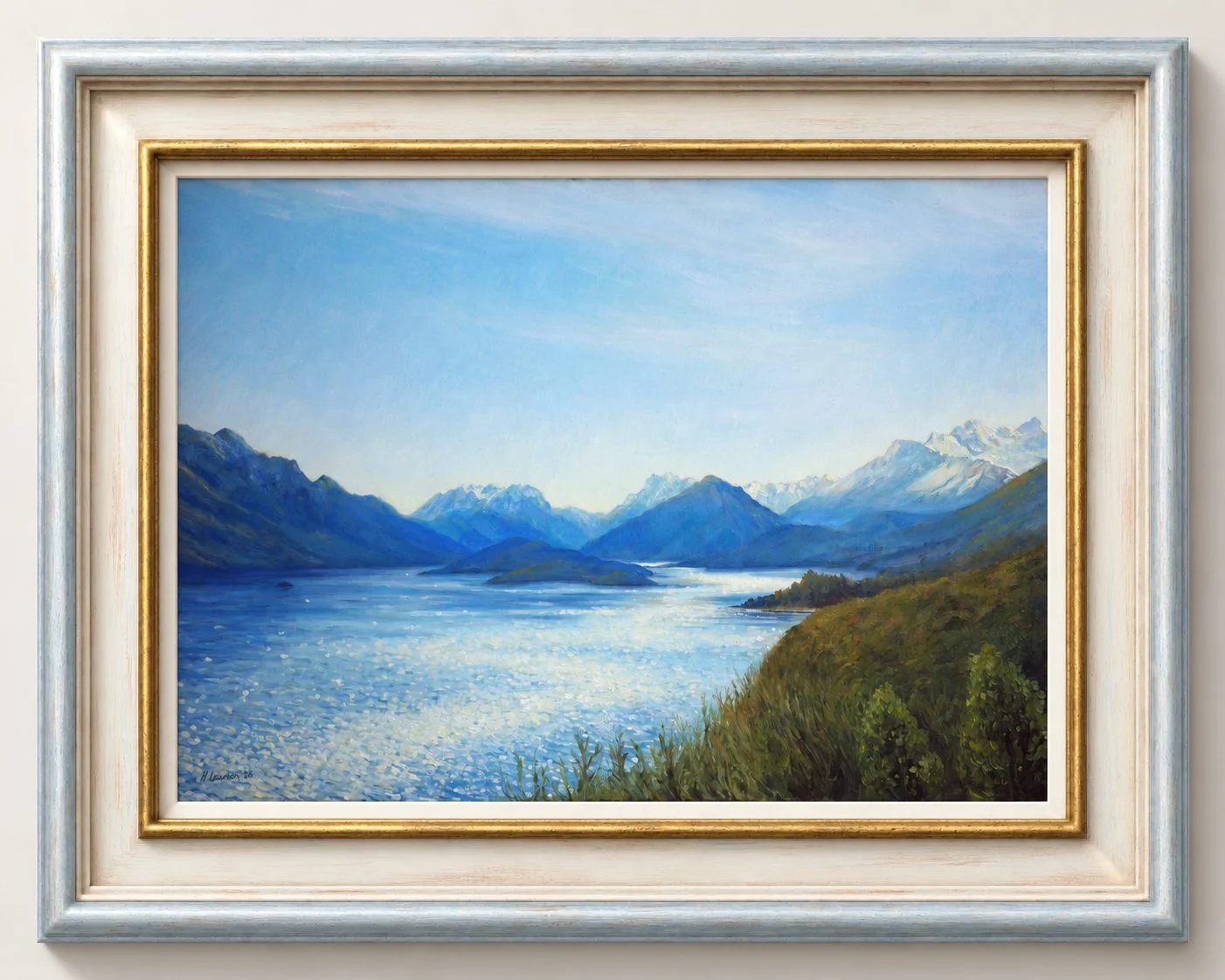
We explored a number of variations for framing this piece, all focused on pulling out and enhancing its luminosity and light. In the end, my client decided on an elegant cream and gold frame to let the painting shine.
The Journey To Glenorchy
50 × 70cm, oil on linen
Interested in commissioning a painting of a place that's special to you? Email me at harriet@harrietlawlessartist.com or click the button below to learn more.
