
Painting process | Last Light, Lake Wakatipu
This is the process for my painting of dusk over Lake Wakatipu in Queenstown, New Zealand.
I spent a wonderful week in Queenstown in April for my brother’s wedding. Other than indulging in many celebratory drinks, I spent the week admiring the breathtaking scenery. I was especially captivated by the way the sun lit up the mountains just before it dipped below the horizon.
In this painting I wanted to emphasise the finality of that glimpse of warmth, and how freezing it was in the shadows. And, I wanted my painting to make you feel how really, really cold it was, and how much you long for that warmth to return.
Preliminary sketches and studies
After working out what I wanted my painting to be about - what to focus on - the preliminary work was frictionless and all about getting my vision on the page.
The composition took a lot of back-and-forth to decide how much foreground garden to include in the painting, and conversely how much sky. I ended up choosing to exaggerate the sky and clouds which prompted me to add in additional foreground for balance.
Choosing to keep the two silhouetted trees centred in the picture breaks all the rules, but I instinctively felt like it was the right choice. I like how it directs the viewer to peer past and around them, drawing you into the distance.
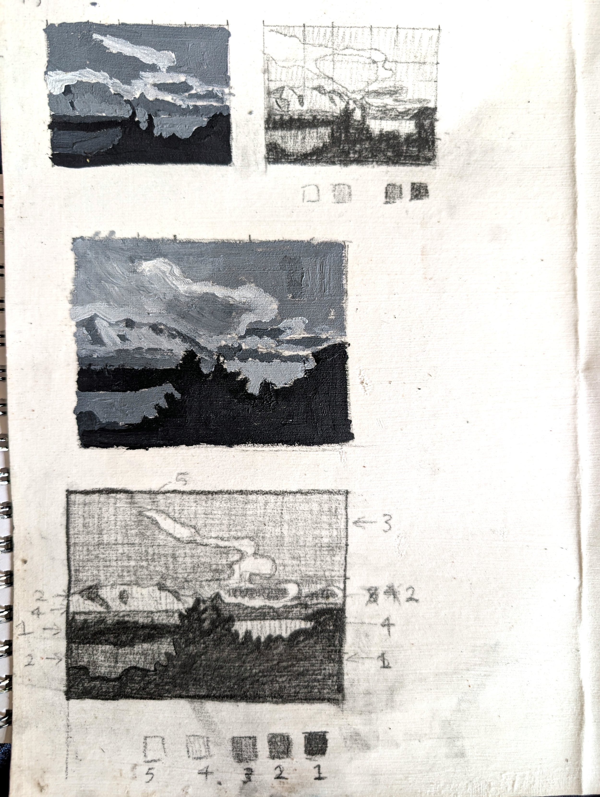
In these sketches I am organising and simplifying the values (shades of light and dark) in my composition. My emphasis is on the light hitting the clouds and mountains, so they are the lightest.
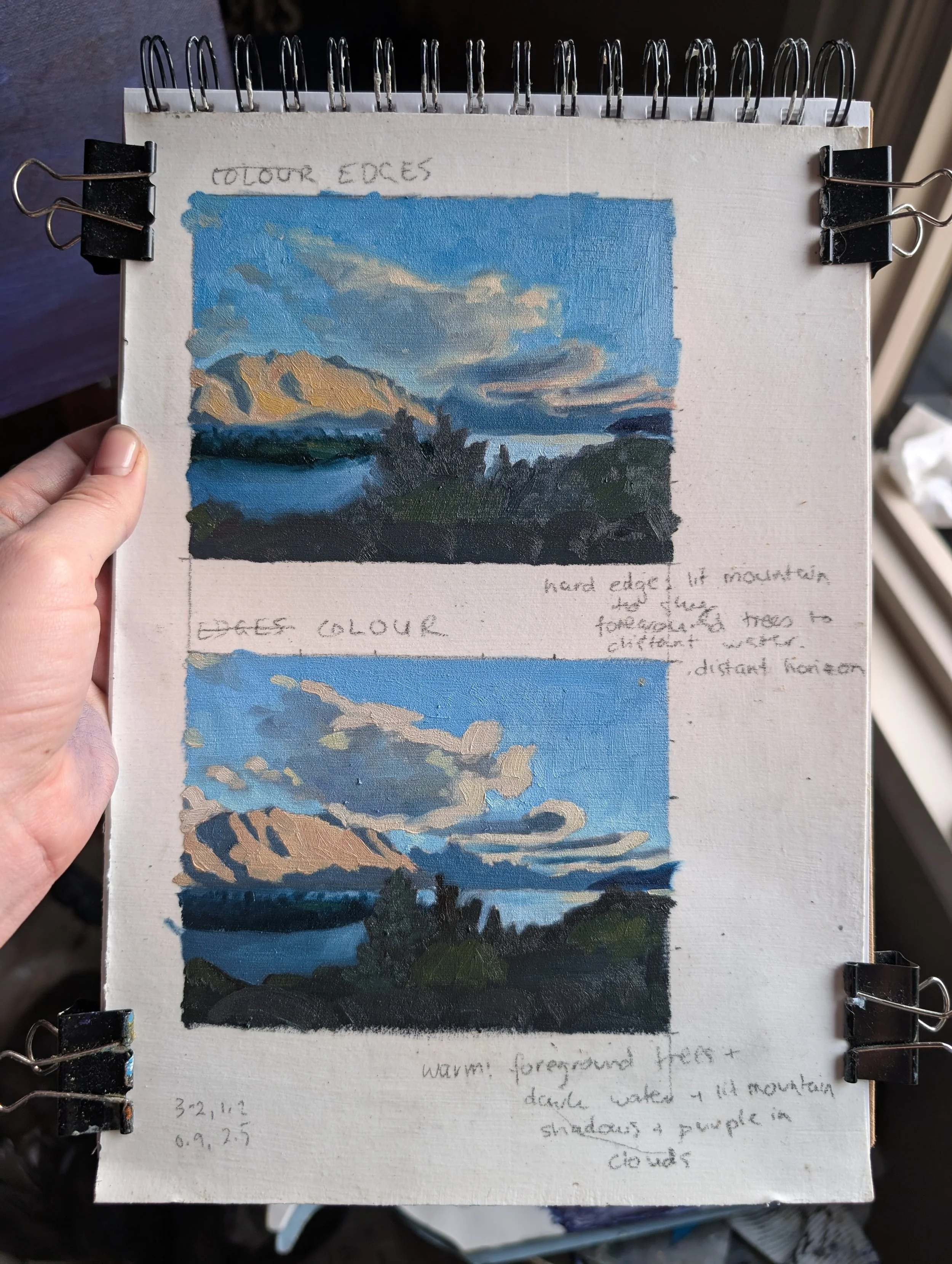
Next, I did two little colour studies focused on colour choices and edges.
The bottom painting is all about adding colour choices to the simplified shapes from the black and white studies. The foreground is a warm green, while the background becomes cooler to push it into the distance.
The top painting explores decisions on how the simplified shapes interact - with a soft, hard or lost edge. The hardest edge is on the top of the closest mountain as it’s my focal point.
The painting process
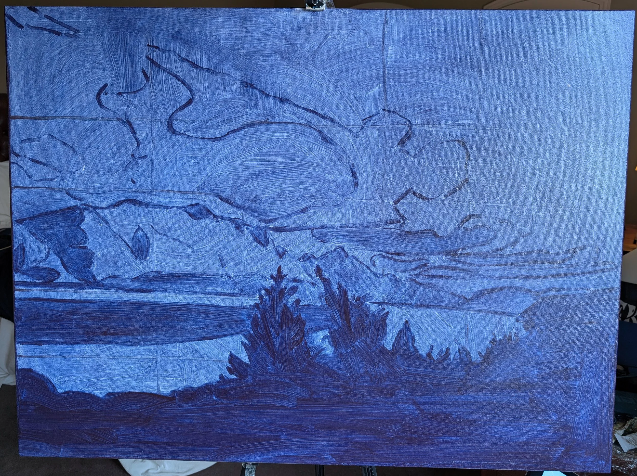
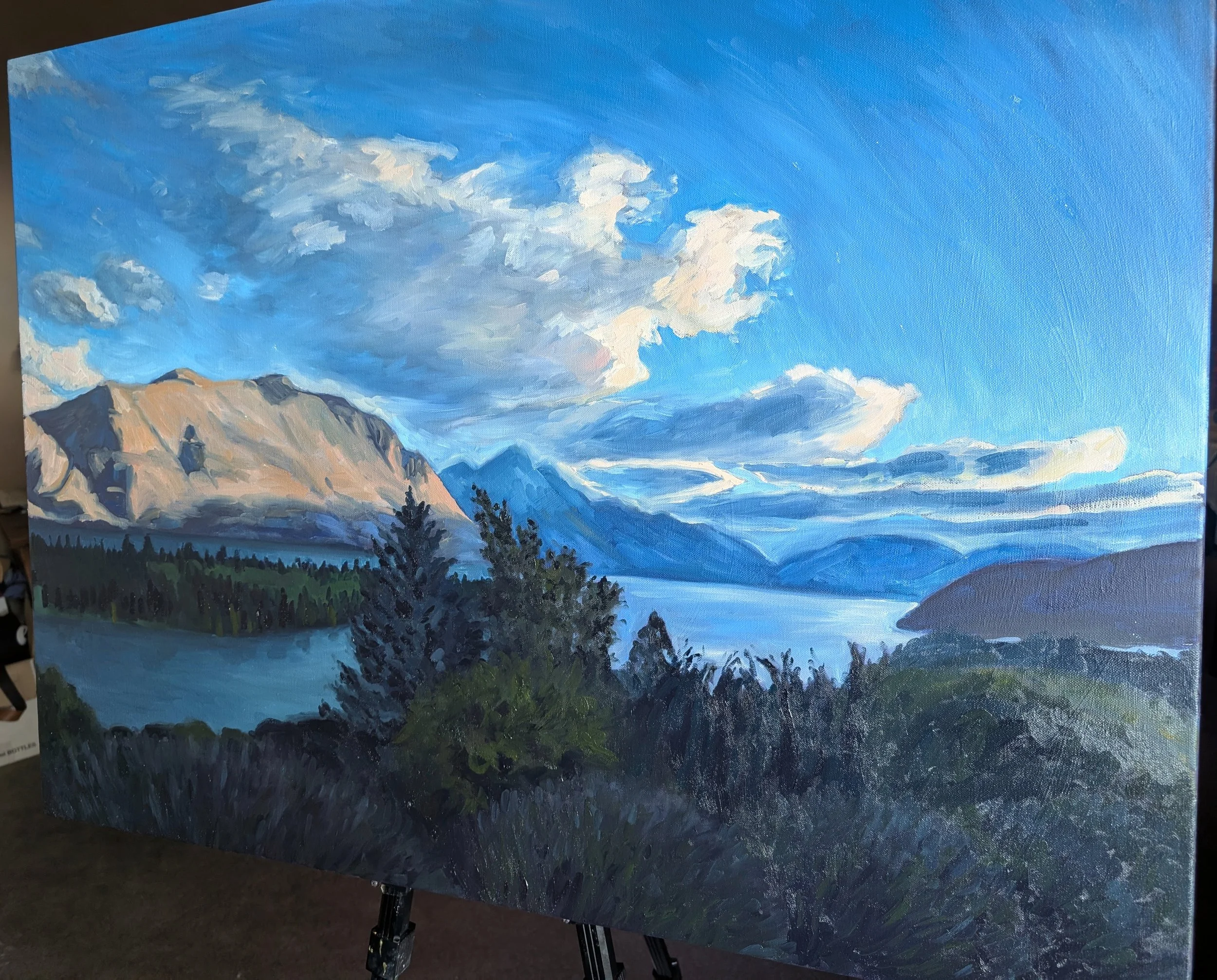
I primed the canvas with gesso painted in a dynamic circular motion to create movement and energy that comes through in the final piece. I chose to tone the canvas in a cool purple to embed the entire painting with that feeling of cold I was aiming for. In this photo you can see my drawing and how I’ve mapped out the big dark shapes.
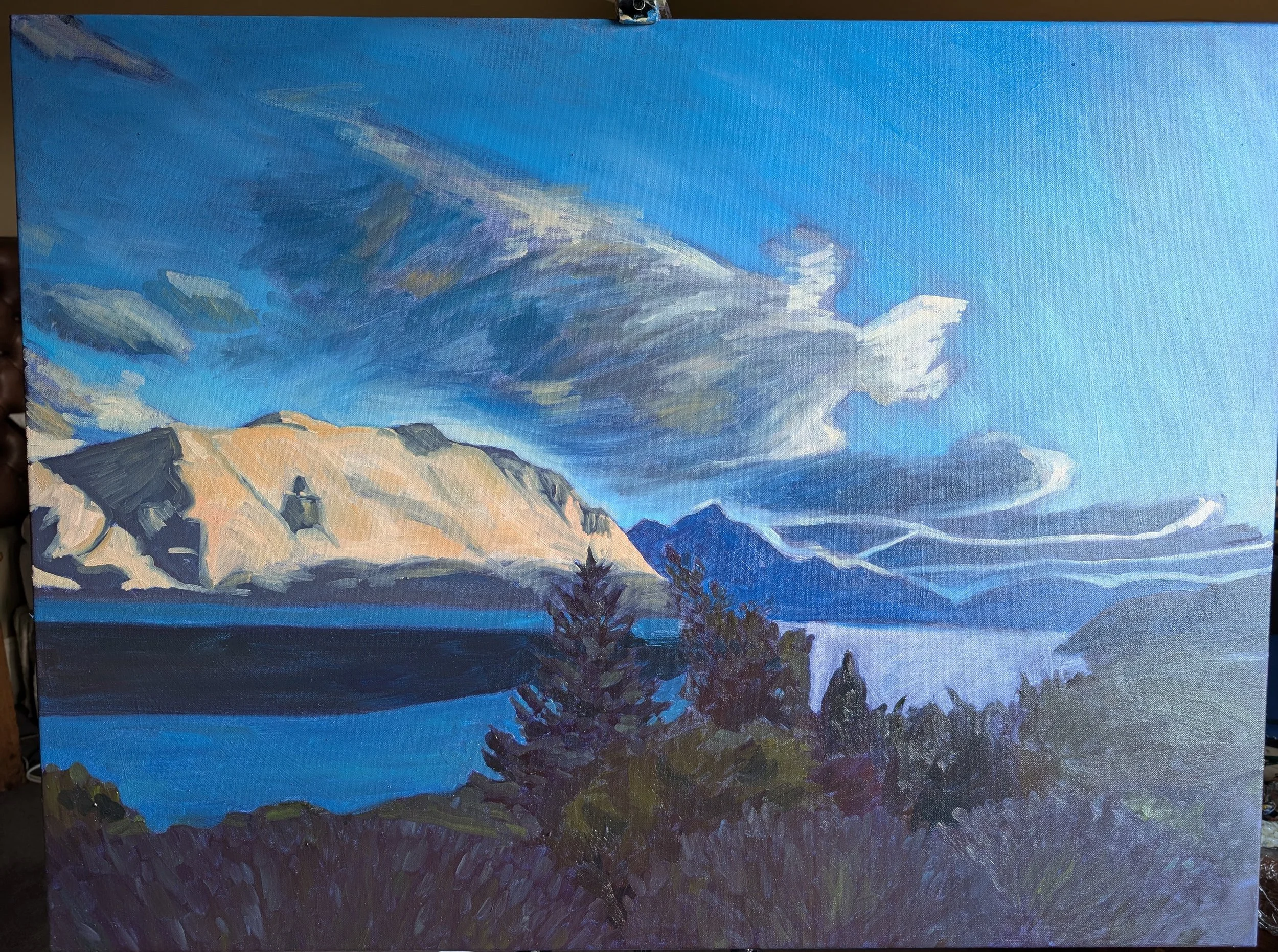
This is the first layer completed. I’ve used my studies to inform my colour choices and have started creating movement in the sky and clouds. From this point it’s much easier to judge values and colours against each other.
I started adding nuance within the shapes I had painted, all the time making sure I don’t break them up too much. I want to maintain the sense of the foreground plants as one dark mass so they don’t distract, but they also demand detail and differentiation from each other to be convincing- so it’s a balancing act
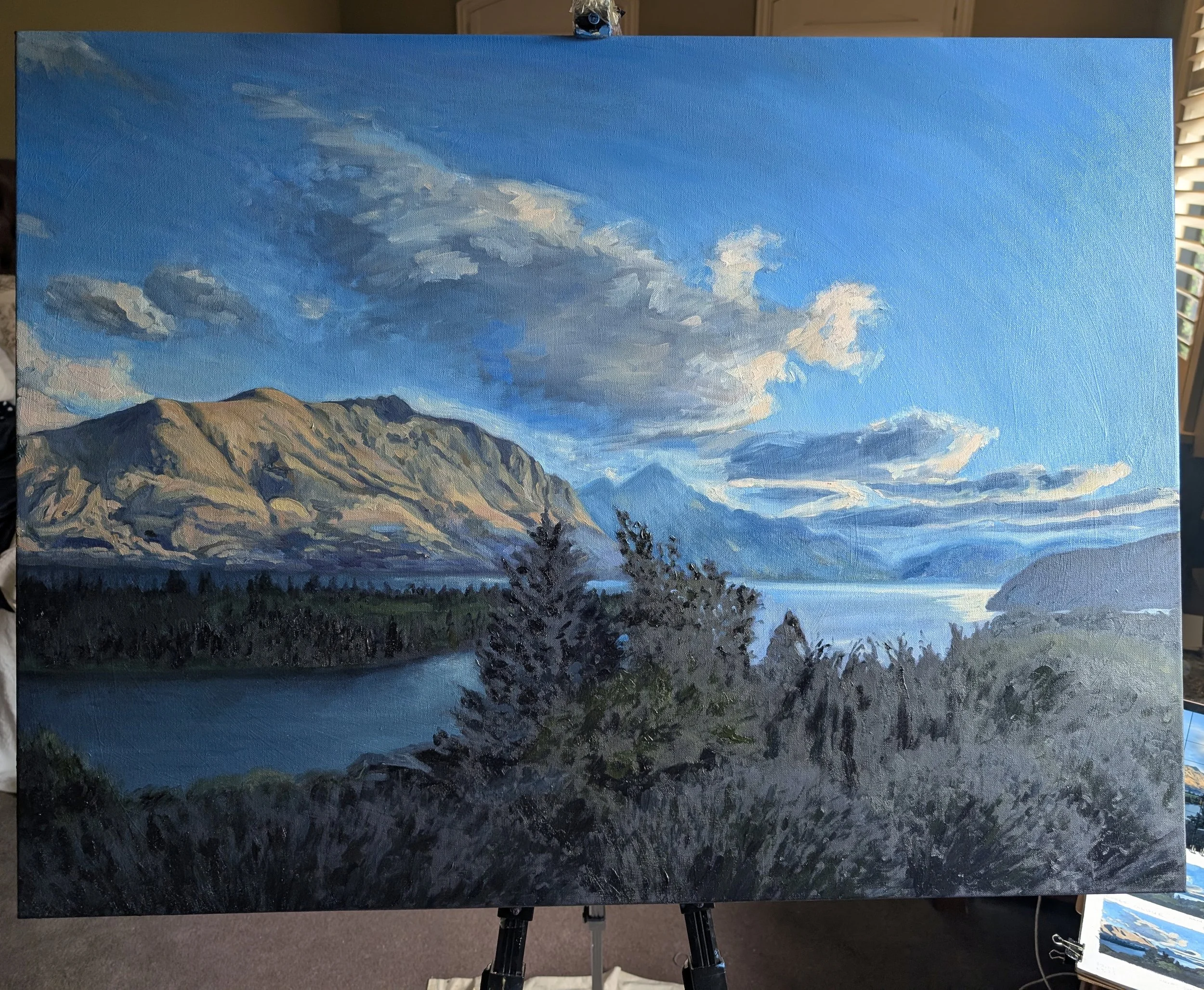
Here you can see the shadows I started adding to the mountain in shades of blue, purple and green. I loved identifying and layering these colours to give the mountain its form.
I really enjoyed building up the sunlit parts of the clouds to give them a glow. There are so many layers of different colours in the clouds, painted rapidly to give them a sense of movement and transience. I lightened the sky above the mountain to help draw the eye by making the top edge nice and crisp.
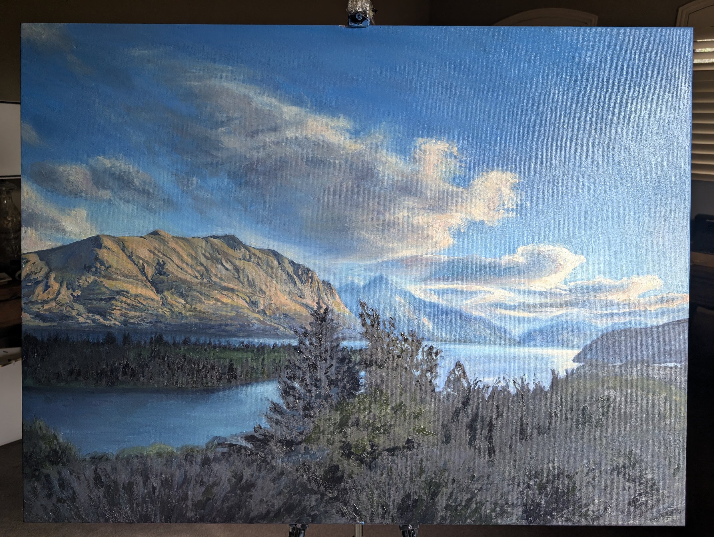
I double checked the horizon line to make sure it was straight, and realised I’d painted it slightly too low. So here, I’ve raised it and then worked on the light effects on the distant mountains as the sun hit their ridges.
I also spent a lot of time on the interaction between the foreground trees silhouetted against the water. While there’s a huge difference between the darkness of the plants and the bright sunshine hitting the water, I wanted the edges between the two to be soft to imply movement.
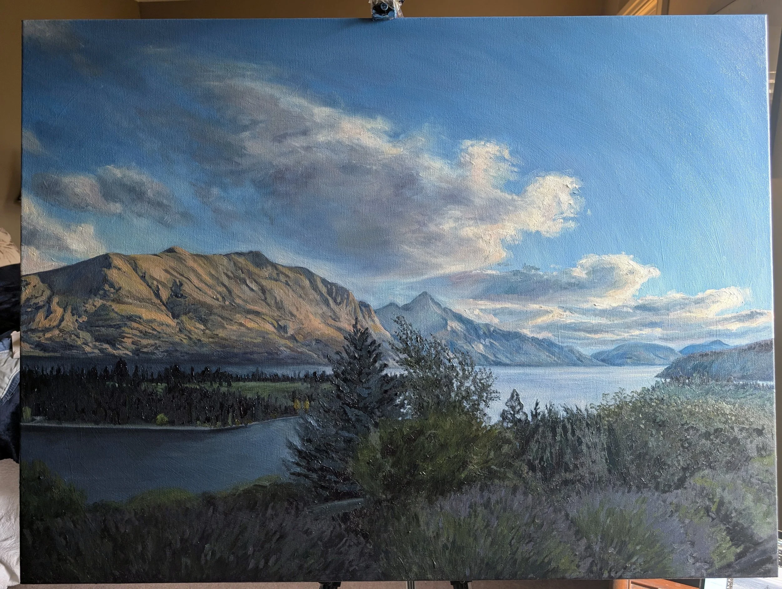
Finished!
“Last Light, Lake Wakatipu”, 102x76cm, oil on canvas.
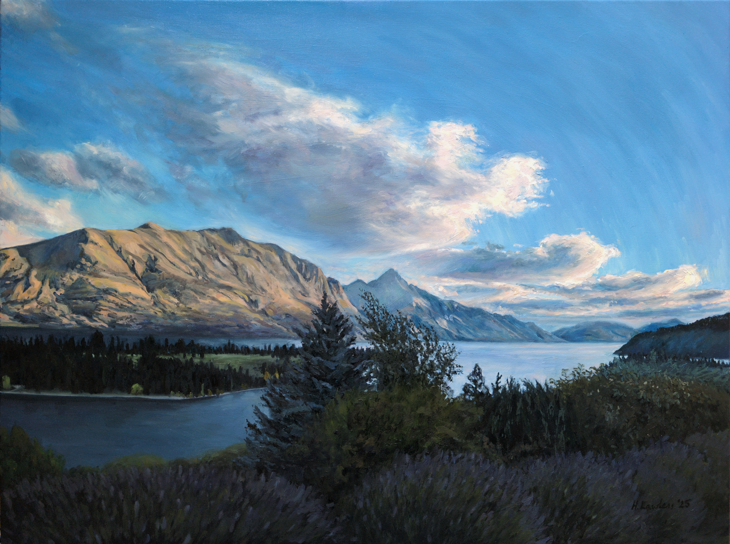
This was such a joy to paint. My largest painting ever - so far!
Details
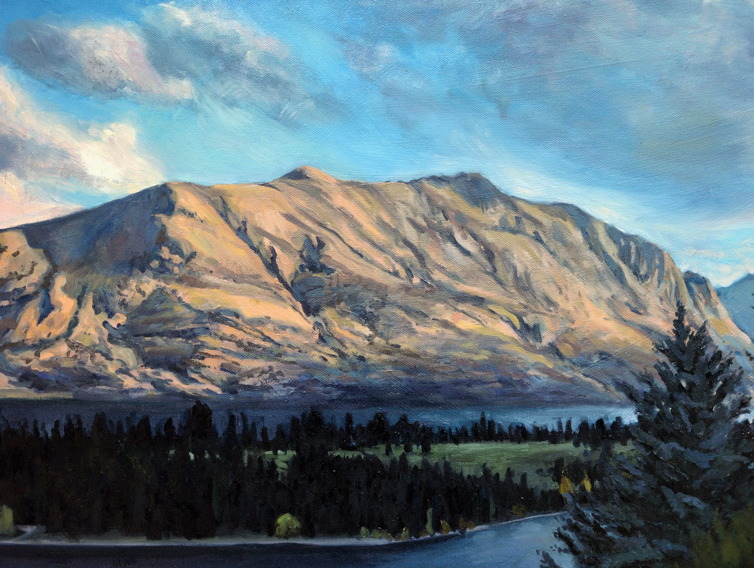
Here you can see the detail on the mountain, l layered so many colours to capture the beauty of it illuminated as the warmth recedes.
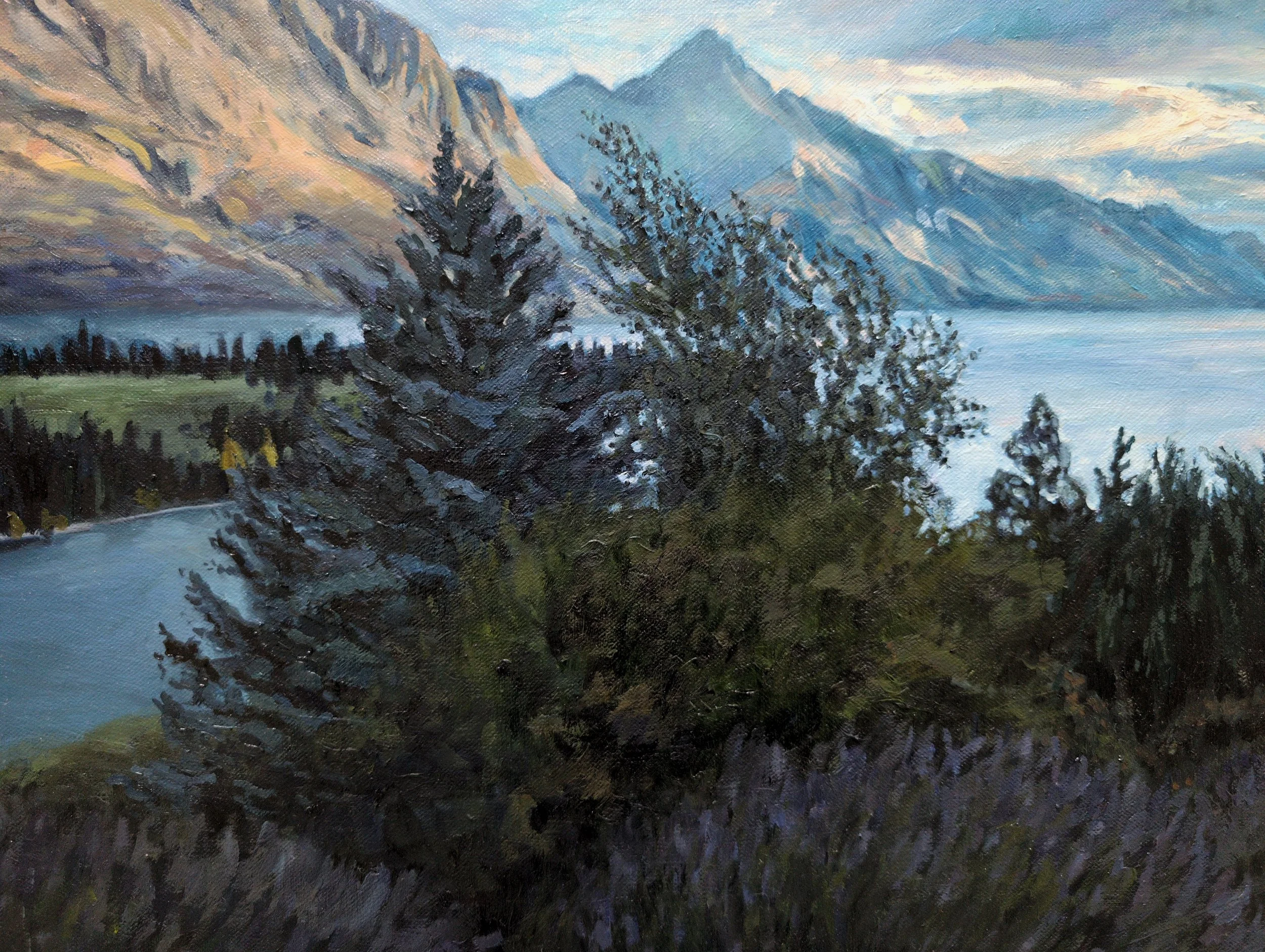
This is a close-up of the centred trees. I really enjoyed layering the dark greens and bright blues to achieve the slightly out-of-focus soft effect that makes it feel like they’re swaying in the breeze. Having these guys centred was an instinctive composition decision that I wouldn’t normally do, but I think them being ‘in the way’ prompts you to want to look past them and to the distant mountains.
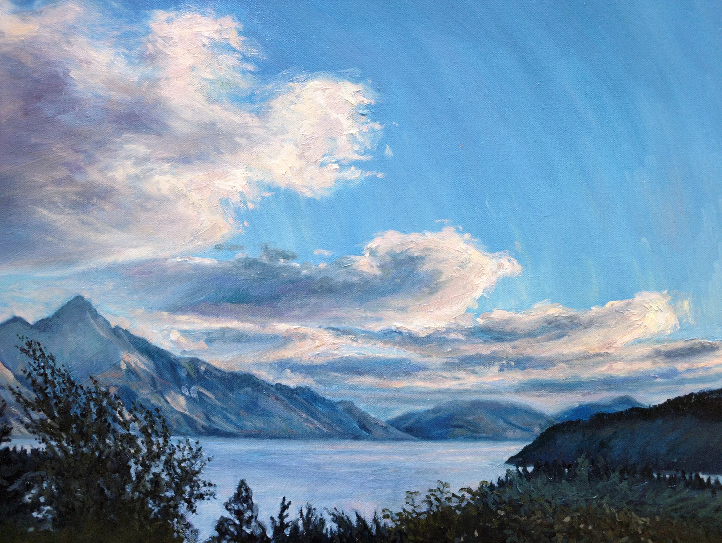
And here are the distant mountains and clouds. From this photo you can see how I’ve layered the paint in the clouds to create movement and illumination, with the sun filtering through the gaps.

Dusk over Lake Wakatipu in Queenstown, New Zealand.
I spent a wonderful week in Queenstown in April for my brother’s wedding. Other than indulging in many celebratory drinks, I spent the week admiring the breathtaking scenery. I was especially captivated by the way the sun lit up the mountains just before it dipped below the horizon.
In this painting I wanted to emphasise the finality of that glimpse of warmth, and how freezing it was in the shadows. And, I wanted my painting to make you feel how really, really cold it was, and how much you long for that warmth to return.
Read the story behind this painting →
Details
Medium: Oil paint on canvas
Size: 102 × 76 cm (before framing)
Framing: Premium custom framing included.
Shipping: Worldwide shipping included.
Your painting comes with:
What Comes with Your Painting: Story and Care Package
Premium custom framing to perfectly complement your painting, your style and your home.
A beautiful hardcover book detailing the story behind your painting
All preliminary sketches and paintings, so you own the entire story.
Peace-of-mind secure packing and international tracked shipping
Certificate of authenticity to verify your painting for generations
A cleaning and hanging kit to make caring for your painting straightforward
Some fun packs of playing and greeting cards featuring your painting
How to Buy
Each painting is custom framed and delivered with care, so I handle every purchase personally.
I’d love to thank you directly, discuss your framing preferences, and arrange a delivery time that suits you.
Click “Enquire to Buy” to get in touch. I’ll confirm availability, go over the framing and shipping details, and send a secure invoice if you’d like to proceed.
Newsletter
Subscribe to my newsletter if you’d like to hear the story behind my future paintings.