
Painting process | Shadows on the Tiber, Rome
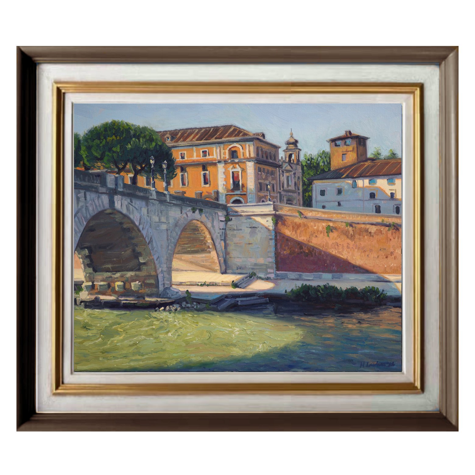
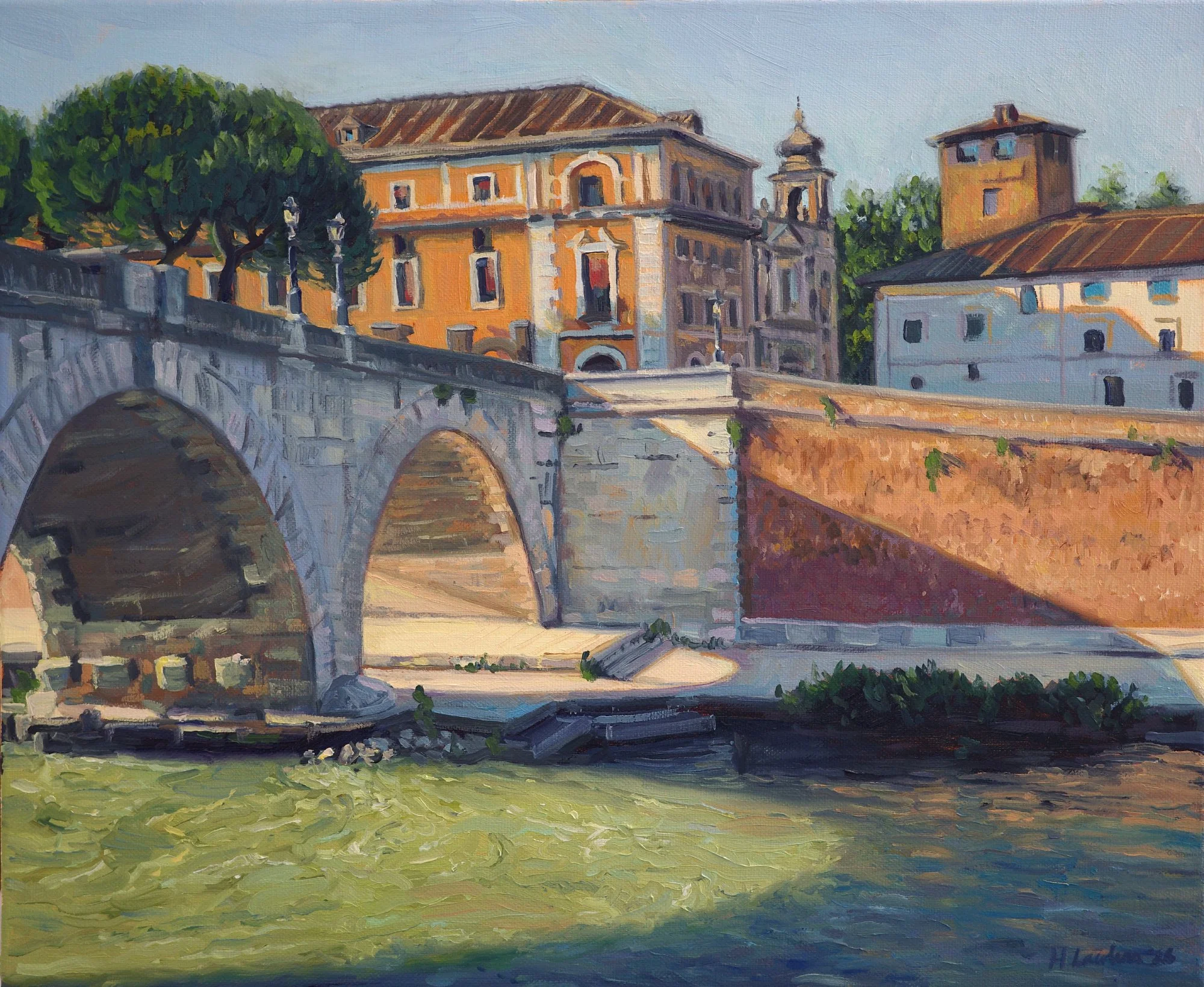
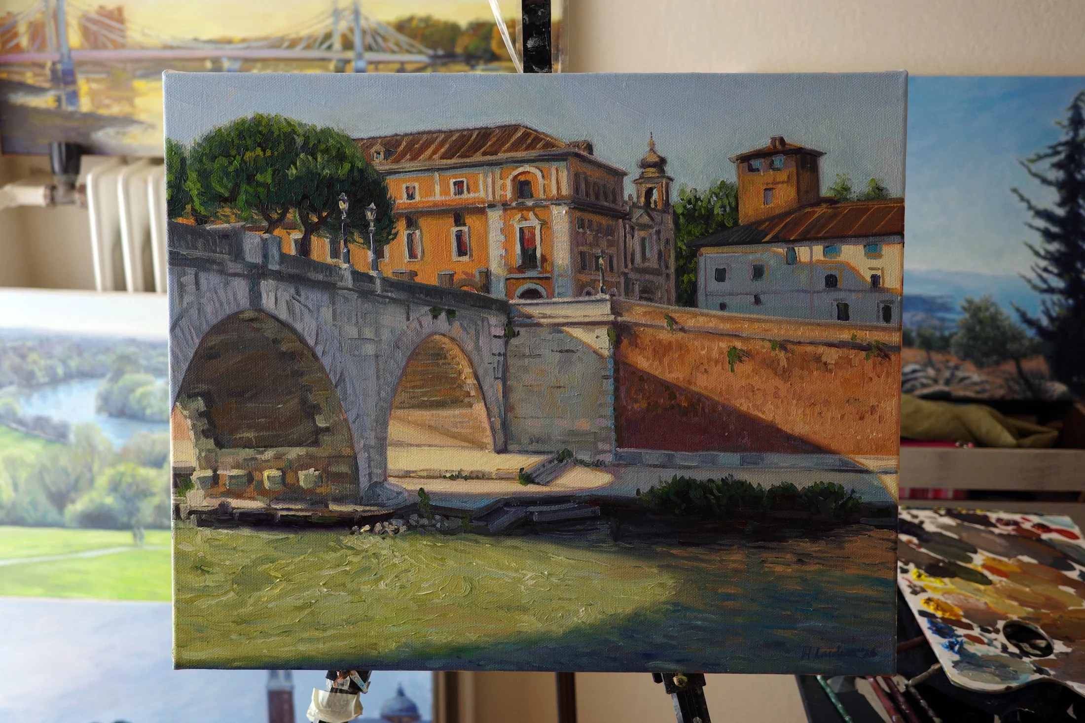
I went on a jaunt to Rome last year to visit the Vatican museums. After spending the morning admiring some of the most celebrated artworks in the world, I walked along the Tiber River and found myself inspired by the beautiful curved shapes of the bridges’ shadows. I was particularly drawn to the colours of blue, orange and green that it created on the water.
I wanted this painting to feel like a snapshot of that moment and to capture those big graphic shapes and intense light of the midday sun.
You can watch the full time-lapse of this painting by clicking the image above.
Preliminary sketches and studies
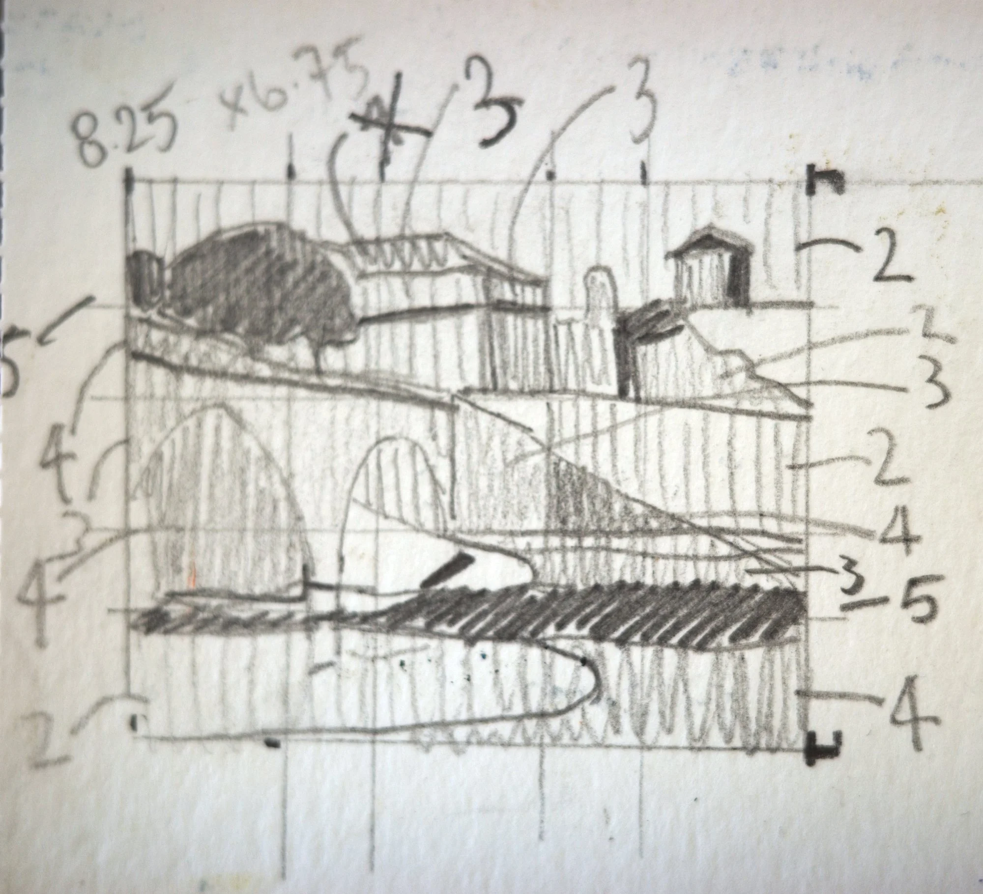
The view in front of me was much wider, but I wanted to strip it back to what mattered. I came up with this close-up, tight view of the scene, with the shadow dominating. I split the scene into big shapes, which gives it a bold graphic feel and tells you about the light, even with so little detail.
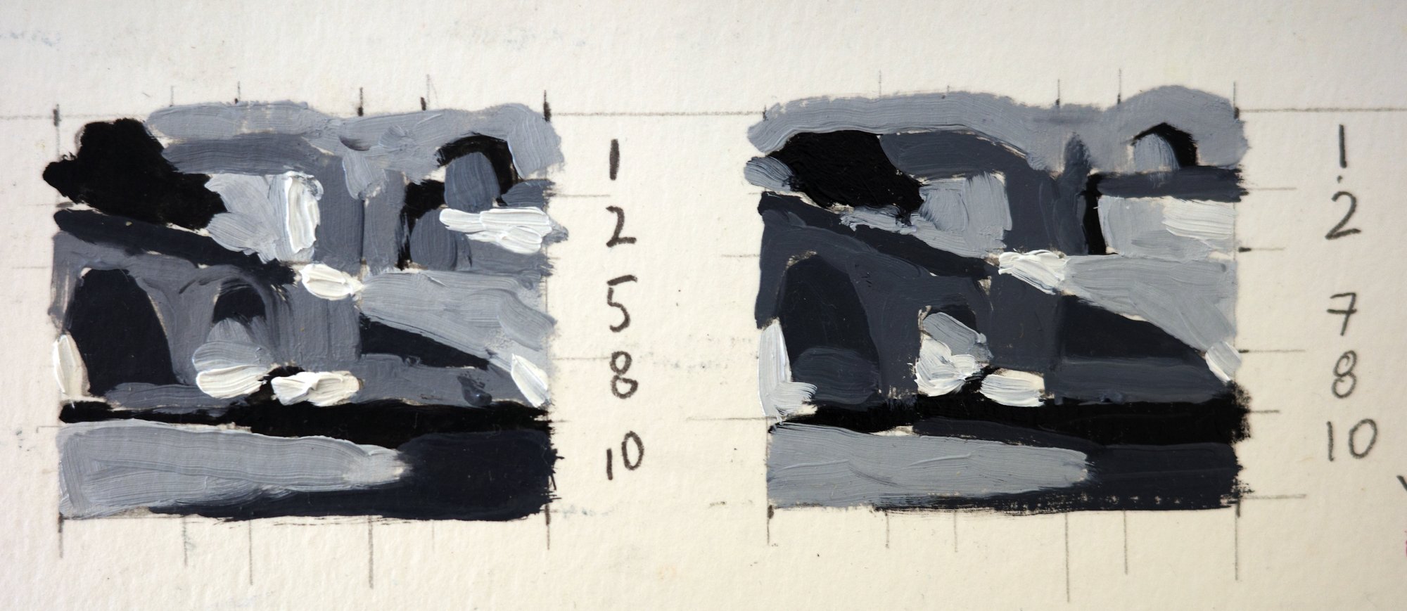
I then painted these small value studies to determine how light and dark the painting should be, to make the shadow cast from the bridge believable as it hits objects on different planes and that absorb light differently- like the water and the stone walls.
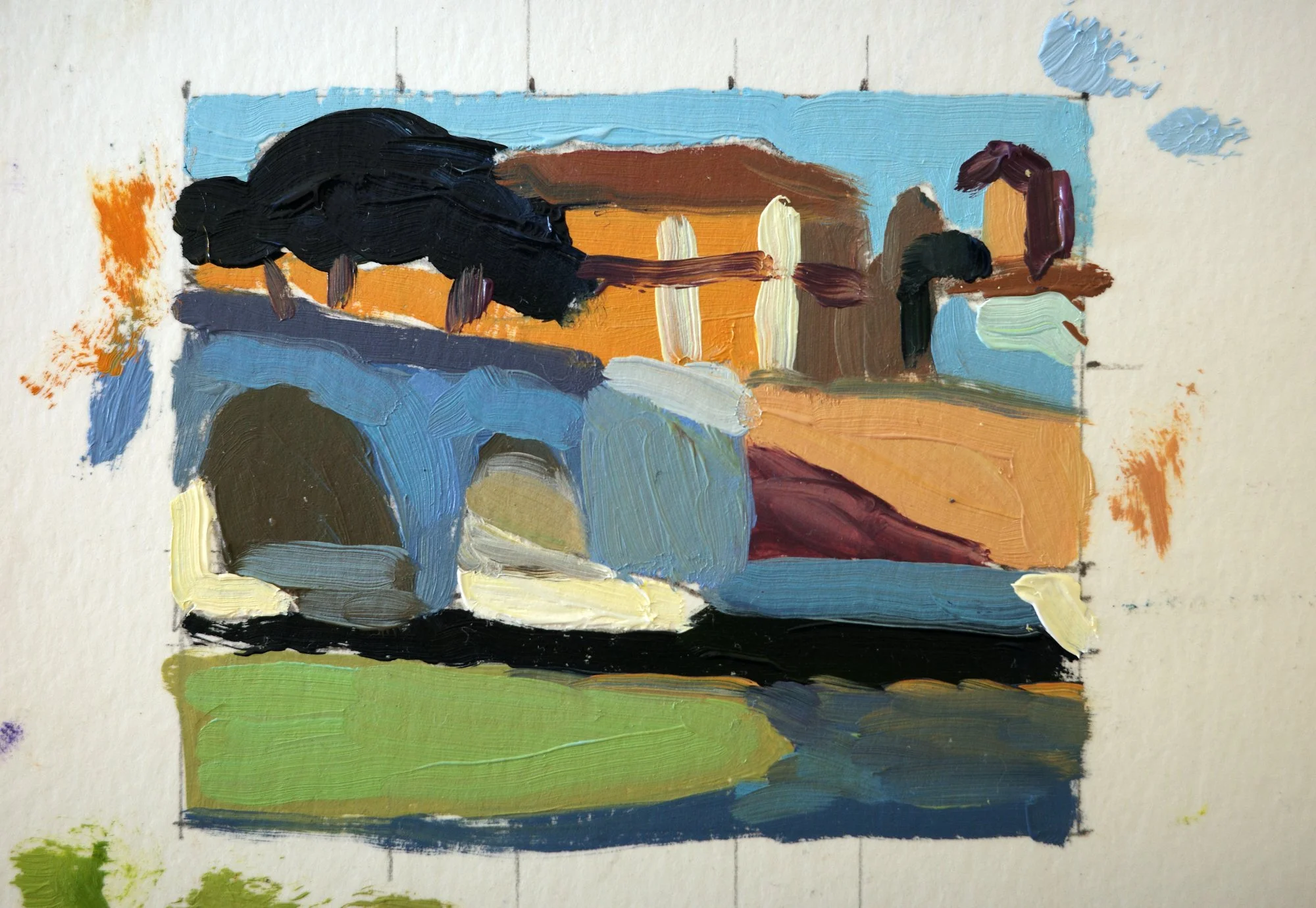
Finally, I did this small colour study. It’s interesting how shadows change the colour of an object, making it both cooler and darker. The bridge’s shadow is a different colour as it casts onto different materials, but also visually comes together as one big shape.
The painting process
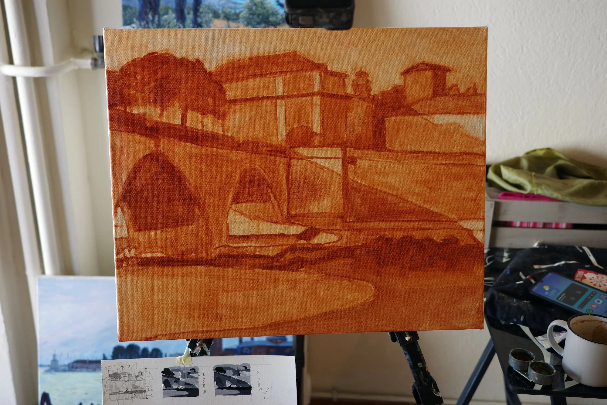
I started with an underpainting in burnt sienna, blocking in the composition based on my pencil and value sketches, while keeping the shapes big and the detail very low. I use this orange-brown for my underpainting to bring warmth and light into my painting from the very beginning, and to unify the whole piece with one colour.
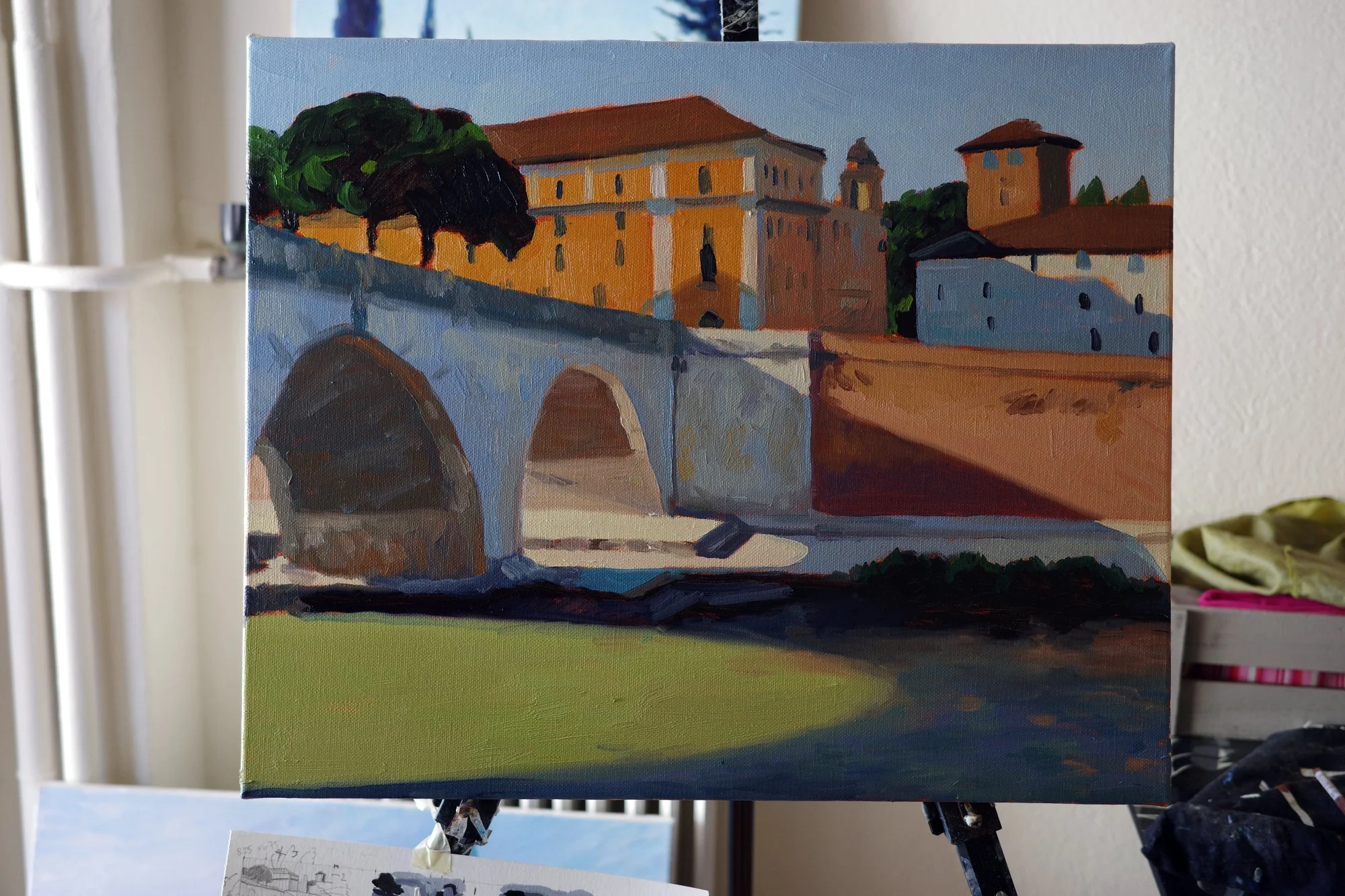
This is the painting blocked in with the first layer of paint. I based my colour choices on the study that I did, using it as the reference. Because I’ve worked in big, bold shapes of colour and value, the lighting is already convincing in the painting.
Getting the big relationships right early is what makes a painting work. The details only have something to sit on once the light and structure are convincing.
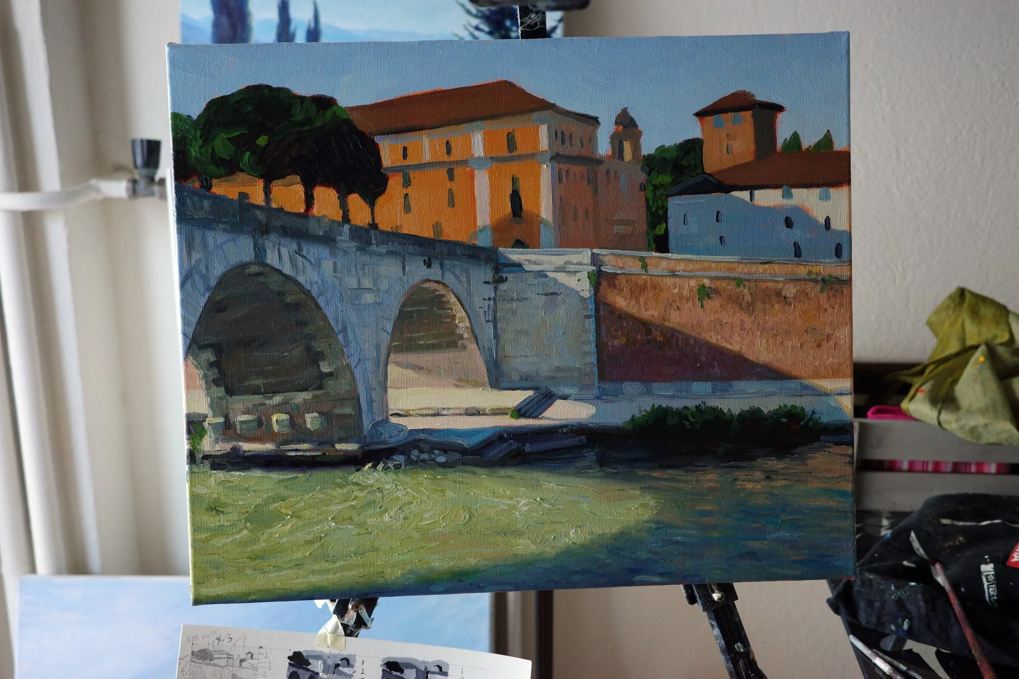
Next, I worked on bringing variation and texture into these shapes. I particularly enjoyed painting the ripples on the water to make it feel like it’s gushing under the bridge and through its shadow.
I paid careful attention to the edges of the shadow, which are softened and higher in chroma. I found how colour intensified around the edges of the shadow to be so beautiful. The shadow itself was cooler and darker, but where it met the sunlight the colours became unexpectedly rich.
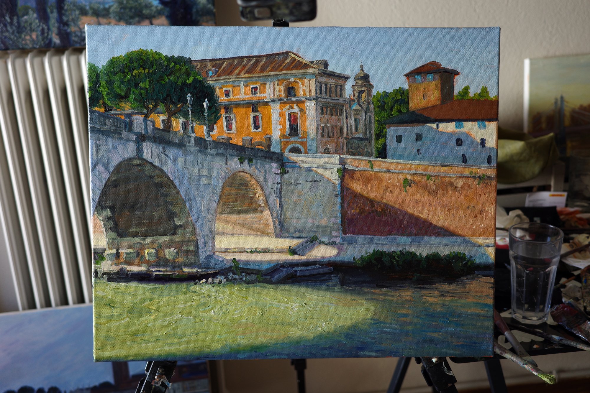
Finally, I worked on the background buildings and their intricacies. I wanted to paint them accurately, but without fussiness. This was easier said than done! I realised part way through that the perspective of the orange building wasn’t correct and had to correct its angle. But that allowed me to repaint it in a more confident manner the second time.
Finished!
"Shadows on the Tiber, Rome"
45 × 55 cm, oil on linen
I loved breaking this painting down into big graphic shapes of colour and value, and using them to capture the feeling of that bright, fleeting moment by the river.
Details
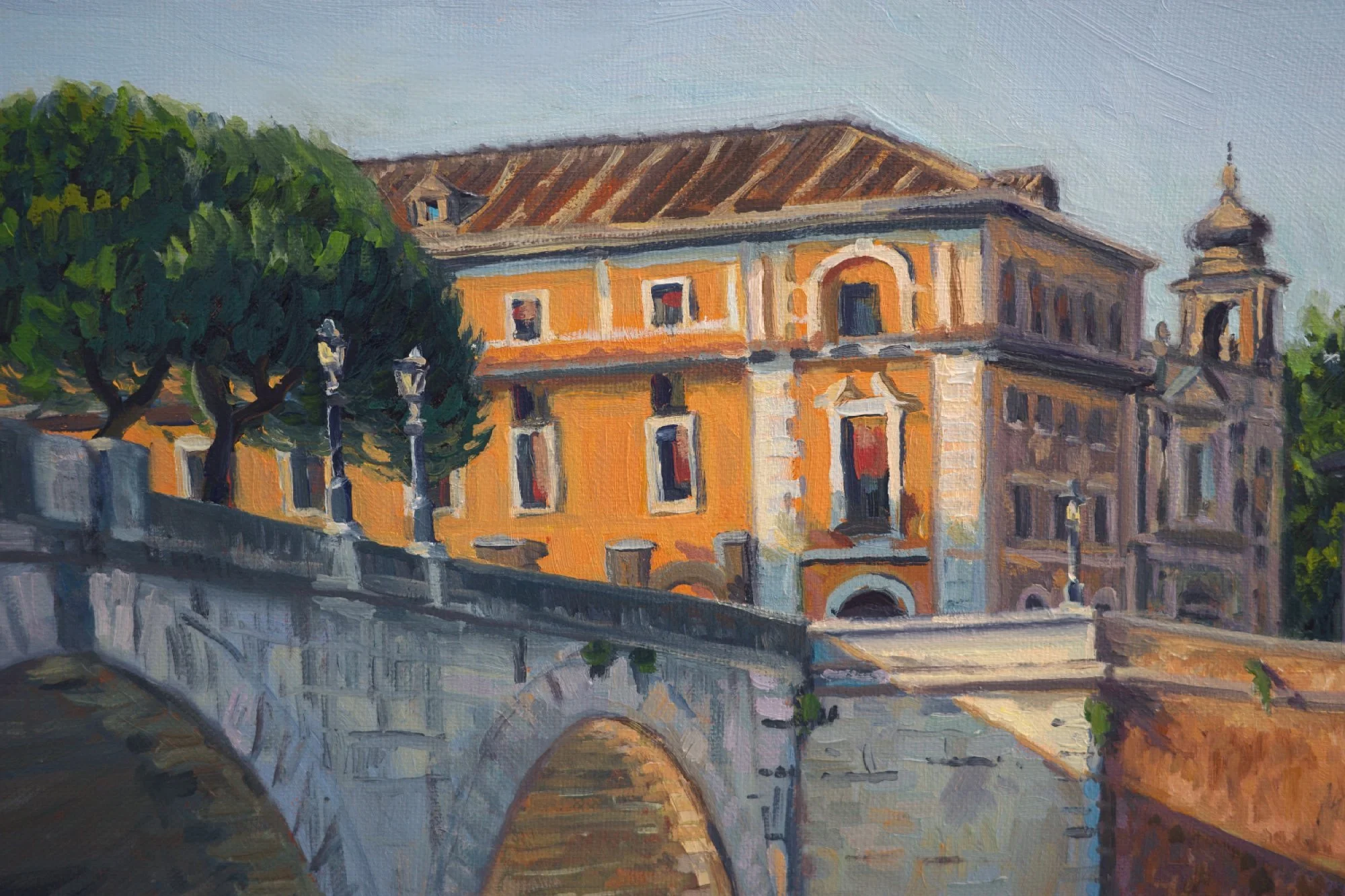
Here you can see the orange building, and how I painted the details of its windows and decorations. It took me a while to get the shadows and edges right to make them look like they’re sitting as part of the orange facade, rather than hovering in space. But at the same time, they’re fairly loose shapes with no truly straight lines. I wanted it to feel realistic but pushed into the background. You wouldn’t see or notice all of the intricate details in real life on a building that’s across a river and a street.
I particularly like the lamp posts and how impressionistic and characterful they are. I didn’t labour the brush marks here at all.
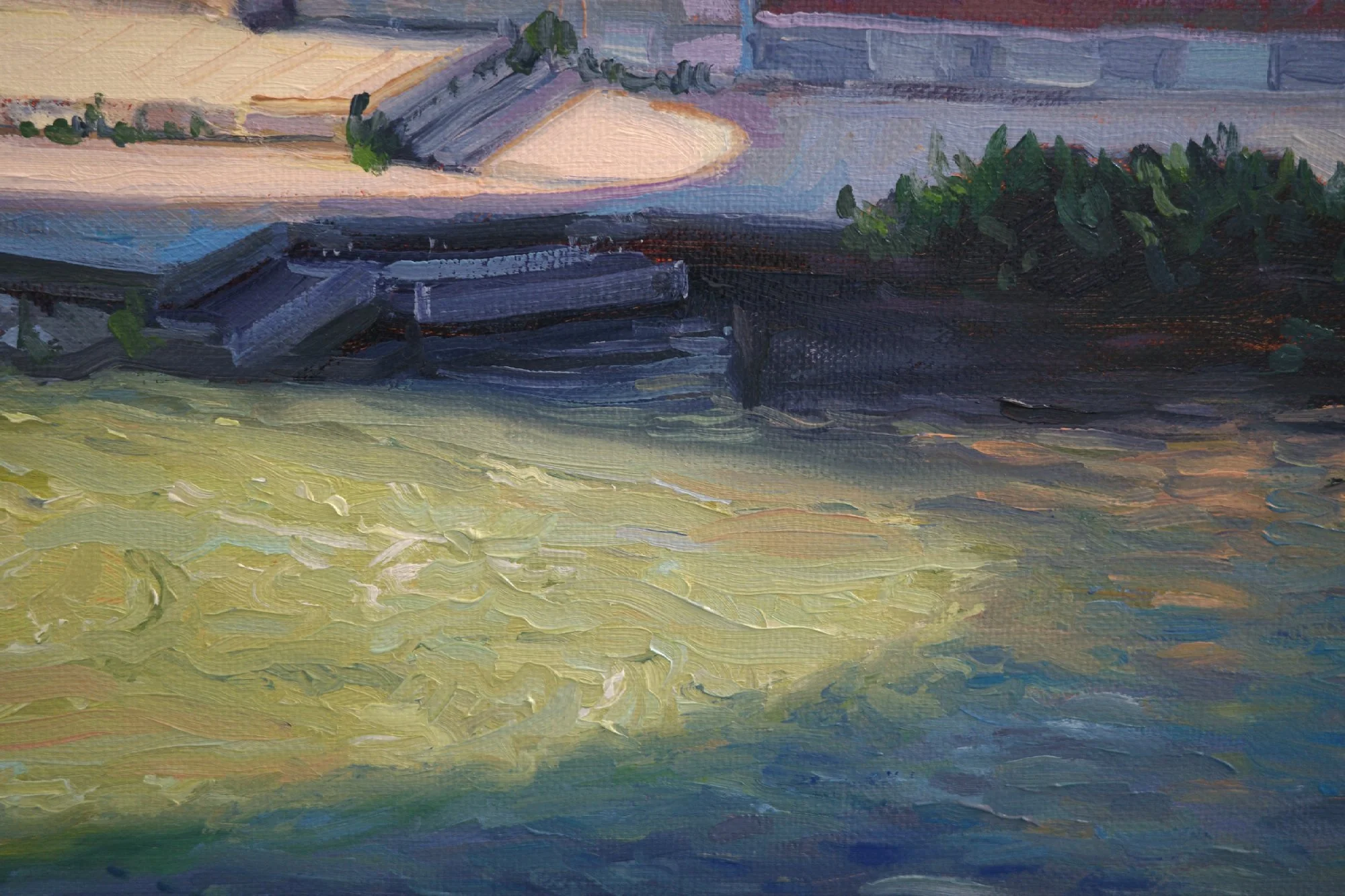
I painted the water quite instinctively. Close up, you can see the individual brush strokes of different shades of green and blue, and some reflected orange light from the surrounding walls. But from a distance, it gives that soupy, churning feeling to the surface of the water.
At the edge between the shadow and the lit part of the water, there was a deep emerald green where the shadow was still providing blue, but it was combining with the intense green of the river. I found that really beautiful to focus on and include.
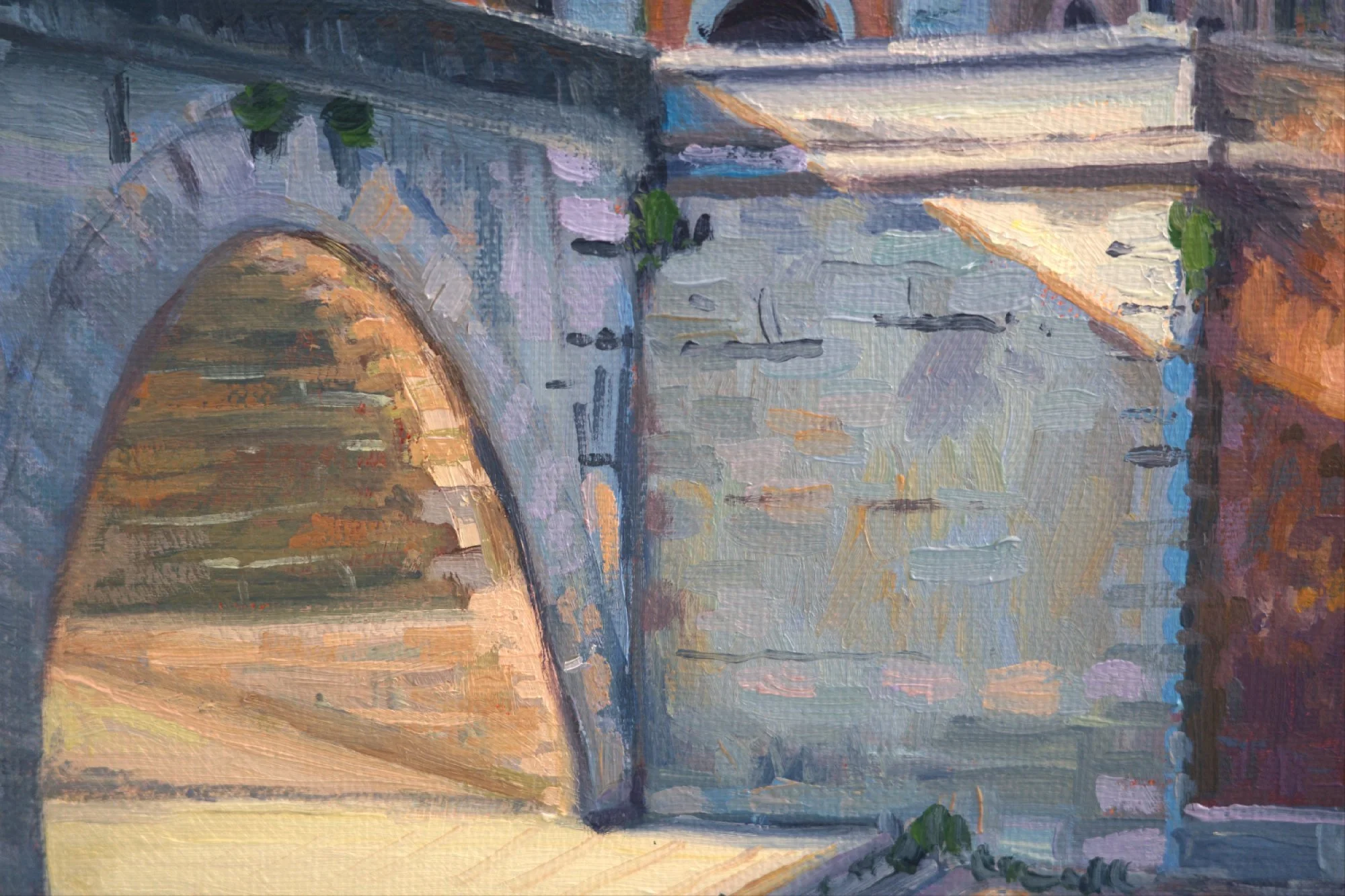
Here you can see how many colours I’ve used in the stonework, capturing the blue of the shadow, but also the orange, pink and purple of the reflected light. The edge of this cast shadow threw a strong orange that fascinated me to include.
I kept the edges of the individual blocks of stone implied rather than drawing in every line of grout, as the detail was unimportant to the scene. Knowing what to leave out is just as important as knowing what to include!
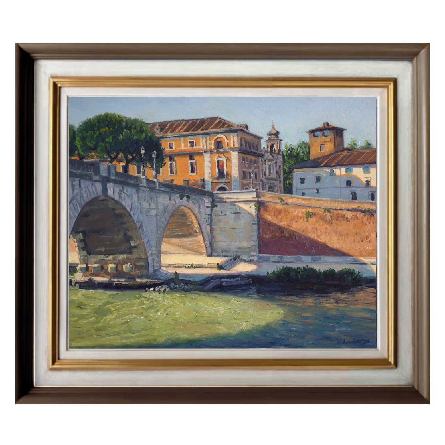
I went on a jaunt to Rome last year to visit the Vatican museums. After spending the morning admiring some of the most celebrated artworks in the world, I walked along the Tiber River and found myself inspired by the beautiful curved shapes of the bridges’ shadows. I was particularly drawn to the colours of blue, orange and green that it created on the water.
I loved breaking this painting down into big graphic shapes of colour and value, and using them to capture the feeling of that bright, fleeting moment by the river.
Read the story behind this painting →
Details
Medium: Oil on linen
Size: 45 × 55cm (before framing), 65 × 75cm (approx after framing)
Framing: Premium custom framing included.
Shipping: Worldwide shipping included.
Included With Your Painting
Your painting will arrive expertly framed and ready to hang. International shipping is included.
Discover Your Painting’s Story through a hardcover book documenting its creation, my original sketches and studies, and a signed certificate of authenticity.
How To Buy
Click “Enquire to Buy” . I’ll personally confirm availability, answer any questions, and send you a secure invoice.
Delivery & Returns
International delivery is included in the price. Your painting will be professionally packed and sent using a fully tracked service. Framing and shipping usually takes around 6–10 weeks after purchase, depending on the complexity of the frame design and the time of year. I will keep you updated fortnightly on the progress of the framing.
See your painting in your home. I know buying an original painting online is a big decision, particularly when you haven't been able to see it in person first. Once your painting arrives, you have 14 days to see it in your own home and make sure it's right for you.
