
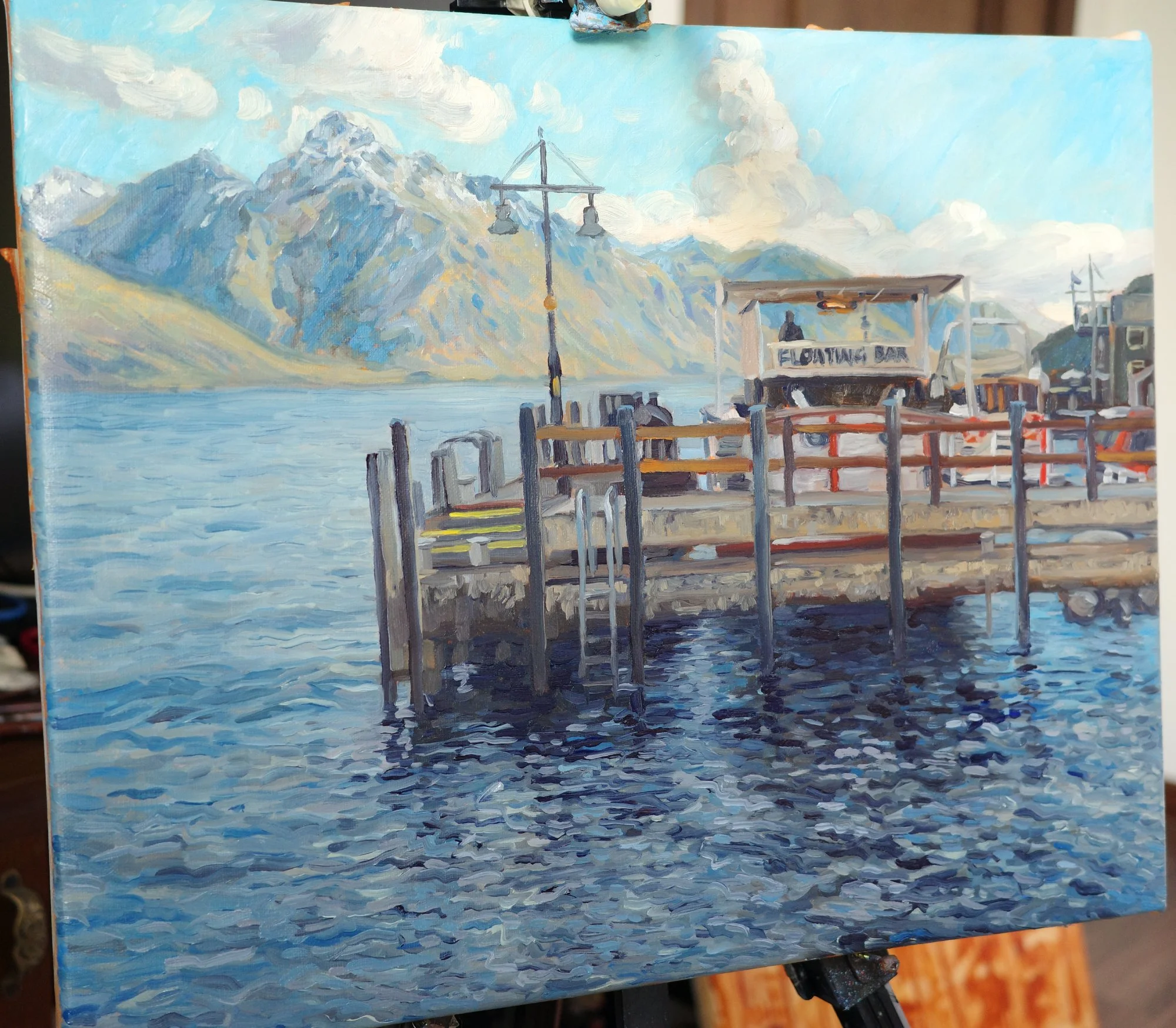
Painting process | It’s Five O’clock in Queenstown
I was walking along the lakefront in Queenstown on an icy autumn afternoon, when I spotted this scene. I instantly saw a painting in the contrast between the rigid structure of the wharf and the natural movement in the water and mountains.
The “floating bar” sign felt oddly amusing to include in a serious oil painting, and the lone figure gazing out to the mountains was intriguing. I wanted this painting to capture the cold light of the day, but also feel inviting, like you’d fancy joining him up there for a pint.
You can watch the full time-lapse of this painting by clicking the image above.
Preliminary sketches and studies
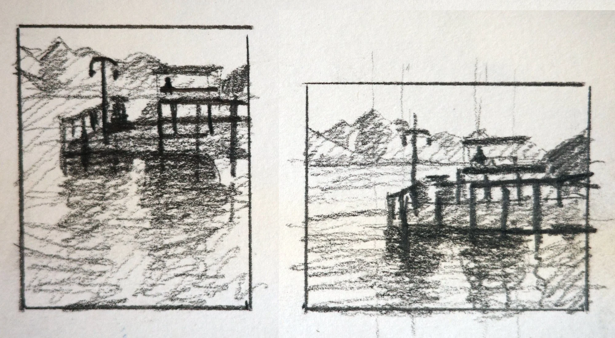
I started by experimenting with both portrait and landscape compositions. I decided the landscape orientation worked best to mimic the horizontal lines of the wharf and horizon.
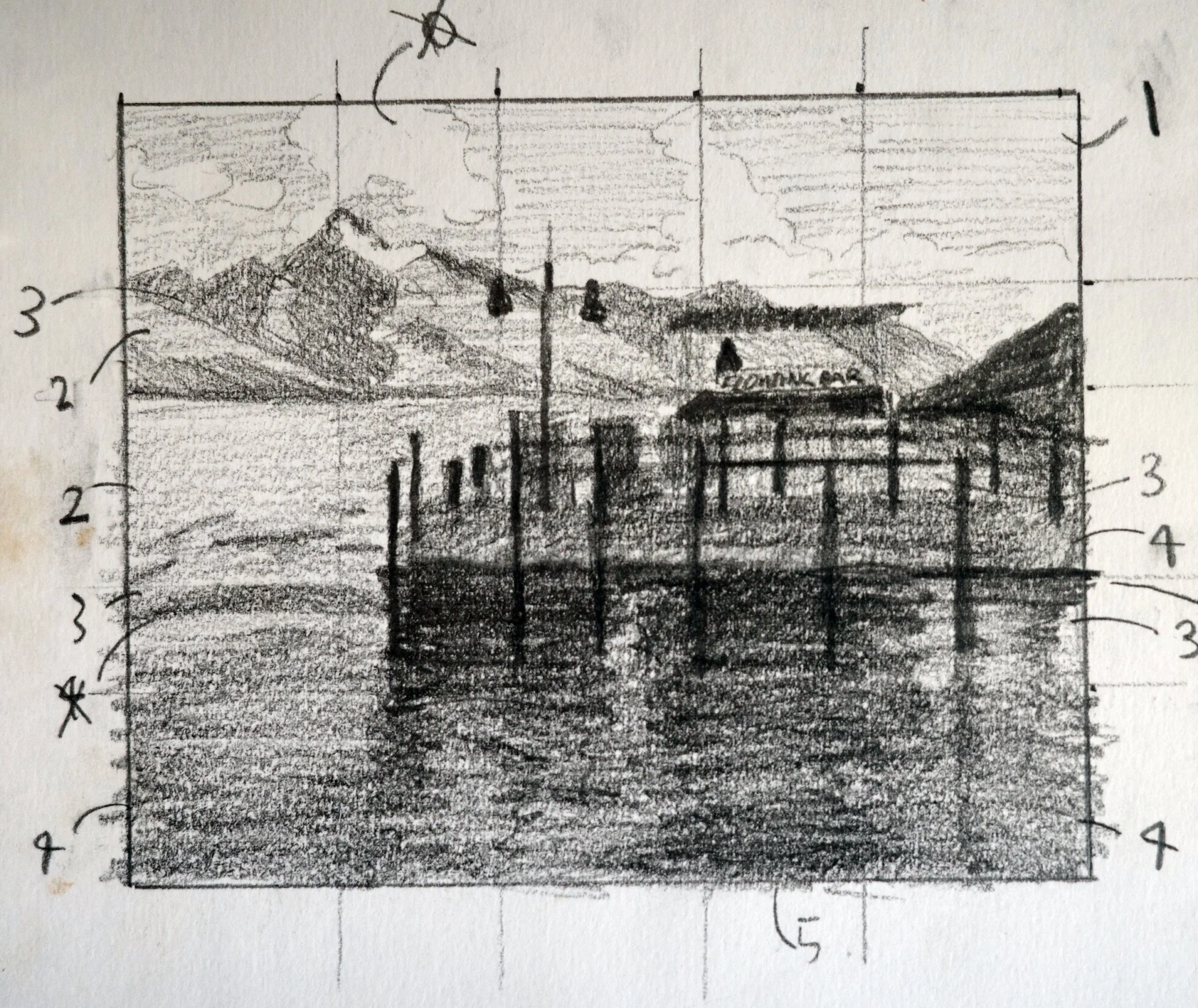
I then did this larger pencil sketch to lock in the composition and values.
To make the figure the focal point, I placed him at the intersection of the horizon and a vertical line created by the water reflection, wharf pylons and the cloud above. I specifically designed the shapes of the clouds to create this line. I added a diagonal line in the mountainside that leads the eye directly to the figure.
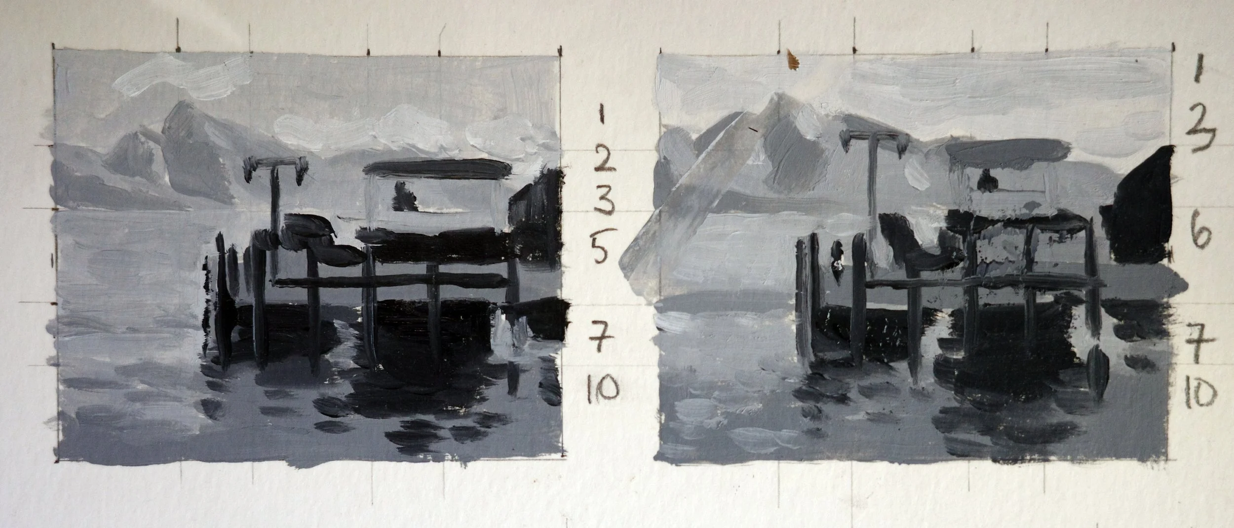
Next, I painted these two small studies to decide on the value scale. I kept the darkest values in the foreground to pull the wharf forward and create depth.
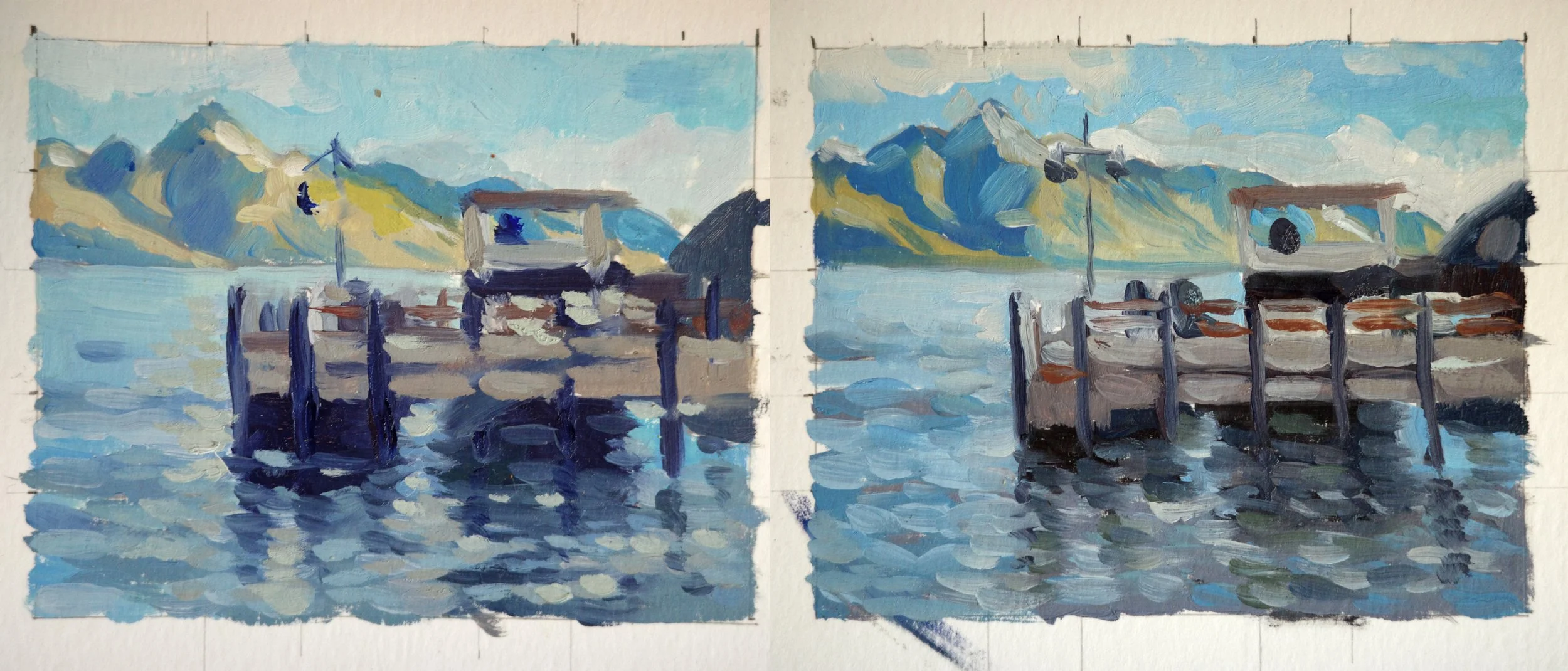
Finally, I painted these two small colour studies.
I decided to push the oranges in the scene to complement the blues.
I experimented with the colour of the darkest value, whether it should be more blue-purple or a neutral-green.
The painting process
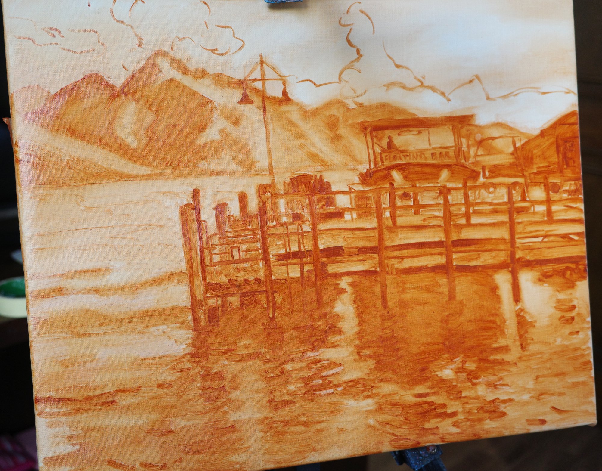
I drew the composition onto the canvas using just burnt sienna paint. This is a new, slower approach for me to start my paintings. I'm paying a lot more attention to the drawing and mapping out the values at this stage. I find this part frustrating because I’m itching to get to the colour already. But patience pays off. It makes the next stages flow without needing to correct the drawing.
The sense of light is already working because I stayed true to the values I had established in my sketches. I actually didn't touch the clouds or sky after this point, keeping it fresh with movement.
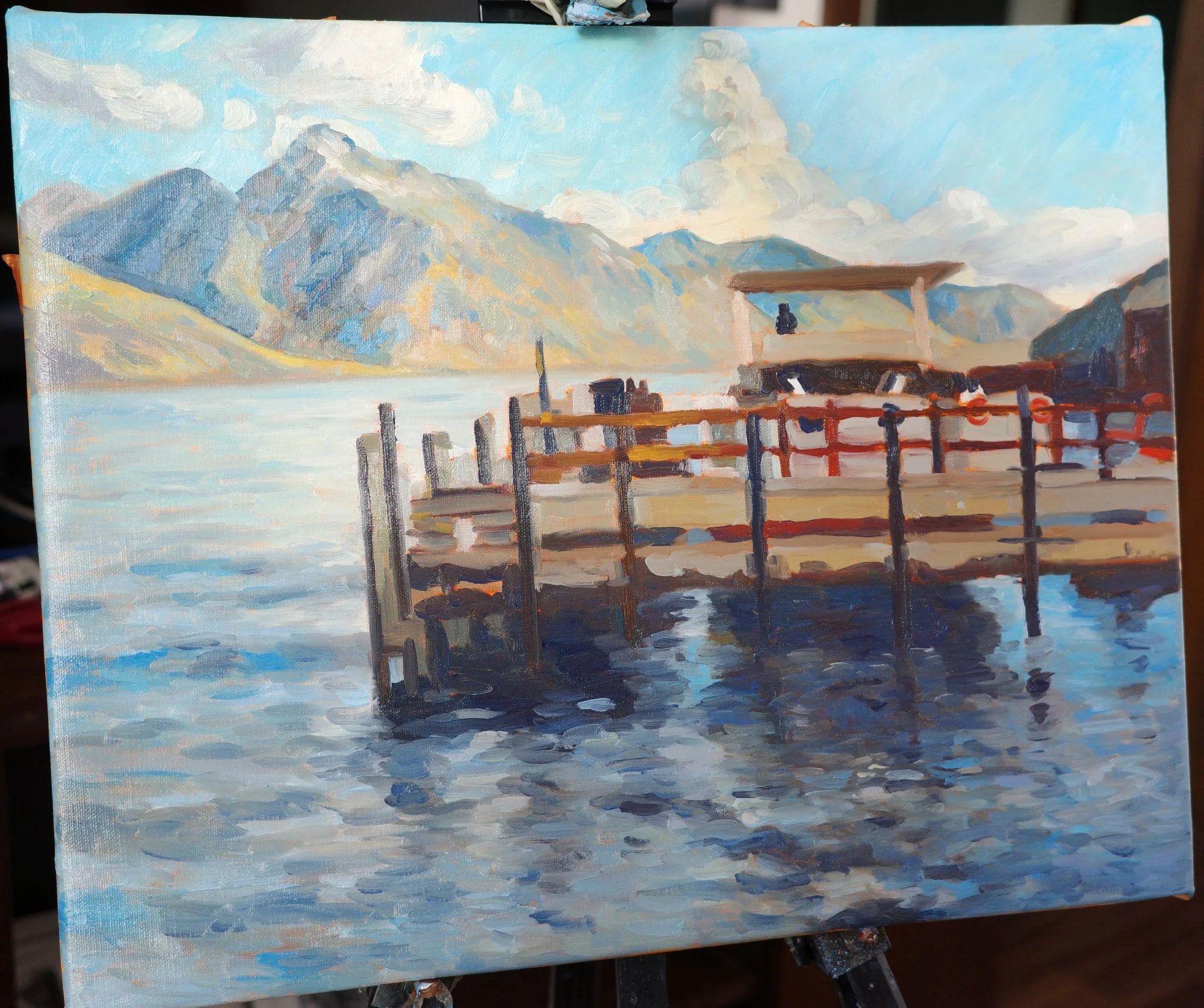
Next, I focused on the foreground water. I built up the layers of darks and lights to create movement and the illusion of reflections.
Painting water is so much about careful observation and layering of values. It looks odd at first, but perseverance is rewarded.
I used variations in colour, texture and value to separate the overlapping shapes in the wharf, which had started to feel a bit jumbled. I pushed the chroma of anything that had even a hint of yellow or orange, to complement the blues.
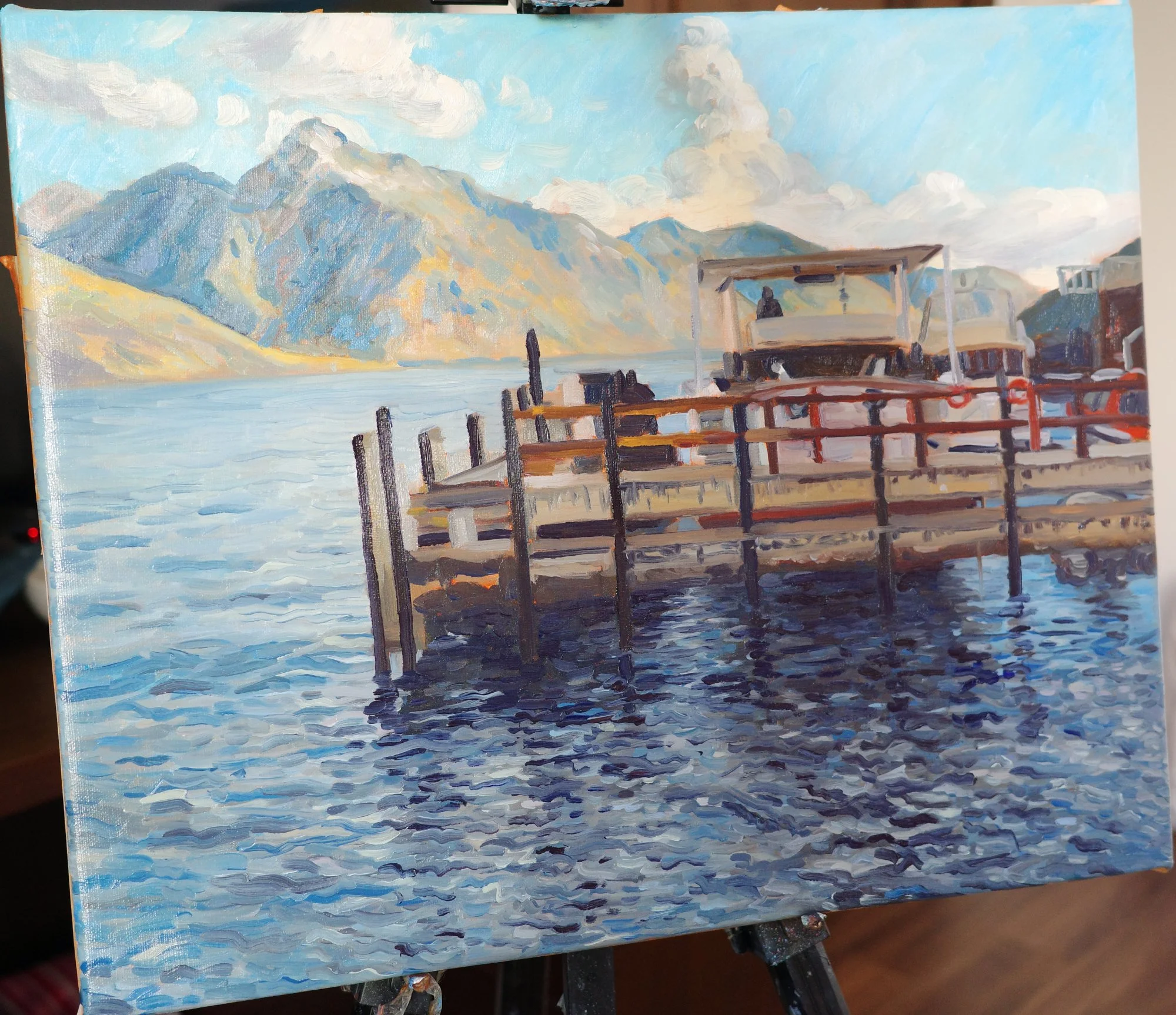
At this point I left the painting to dry for a few days before coming back to refine texture, clean up edges, and add a few extra details.
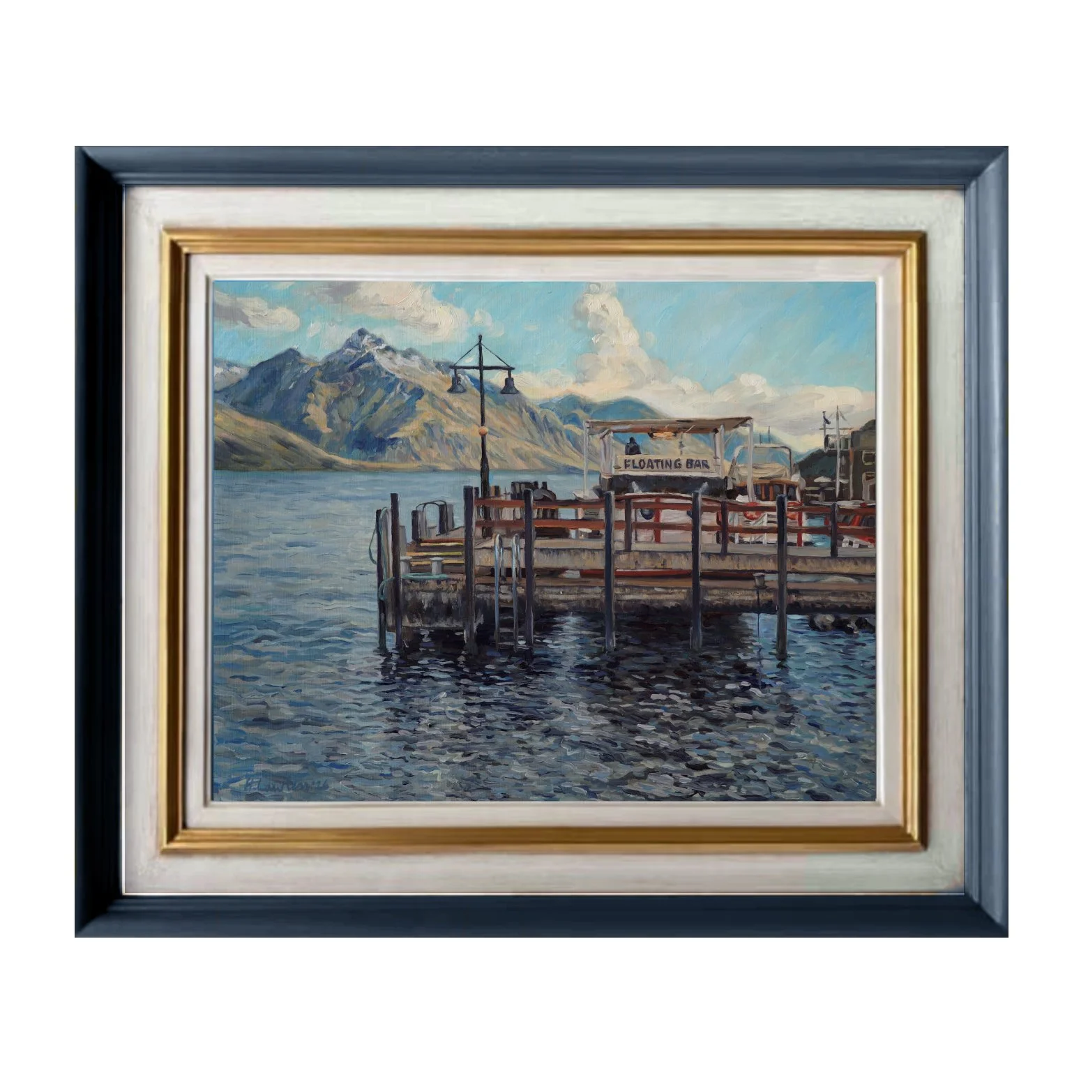
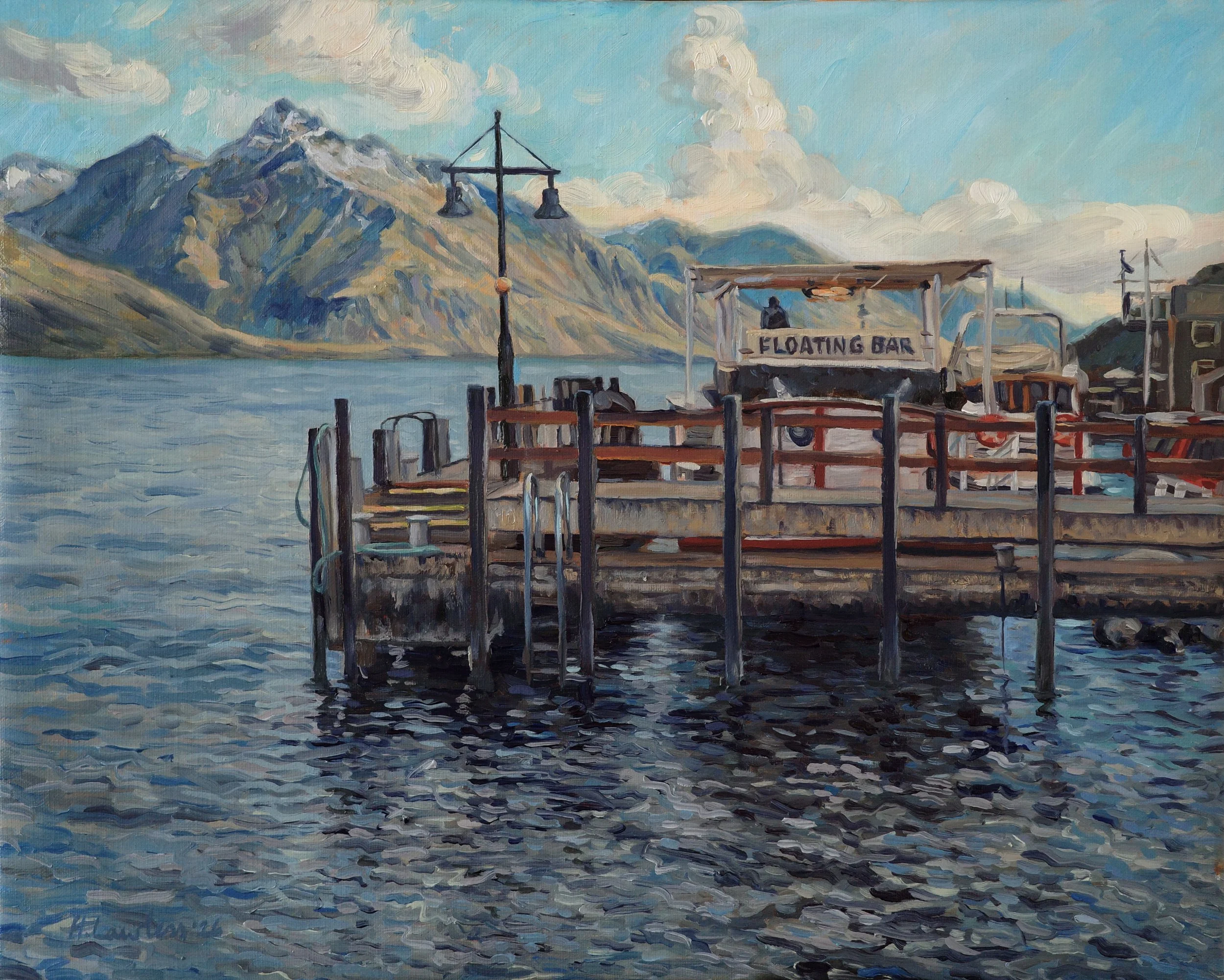
Finished!
"It’s Five O’clock in Queenstown"
50 × 40cm, oil on linen
I loved the challenge of painting subtle, soft evening light while still pushing the colours in a natural feeling way. It feels cold and subdued, but still full of colour.
Details
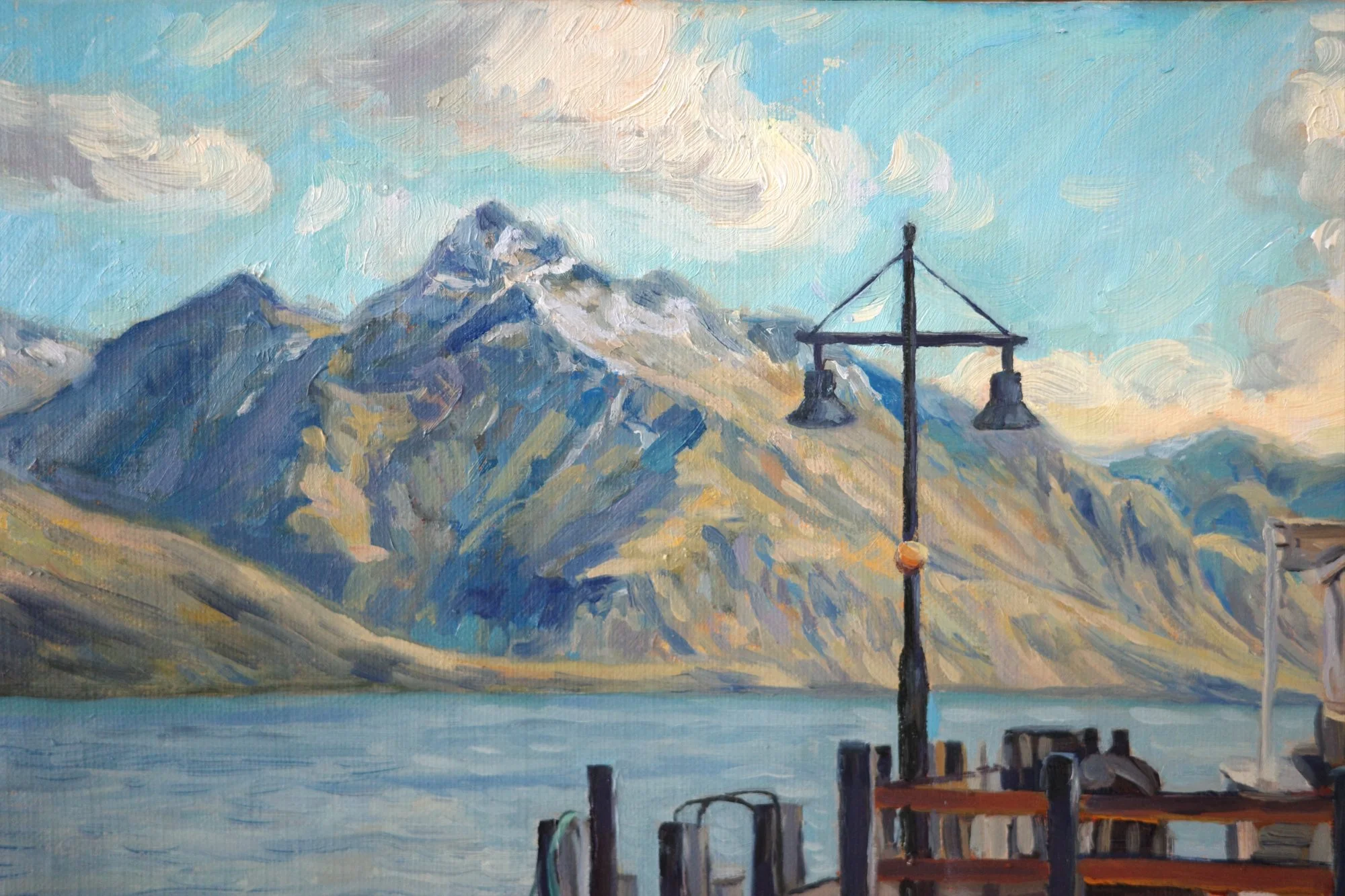
One of the last things I did in this painting was to soften the edge of the distant mountains against the sky.
I included the first snowfall on the mountain peak to emphasise just how cold the day was. You can see how spontaneous the clouds feel, as if they’re whipping across the sky. I painted them once and didn't touch them again.
There are so many distinct colours in the mountains but it reads as coherent and accurate because the values are correct.
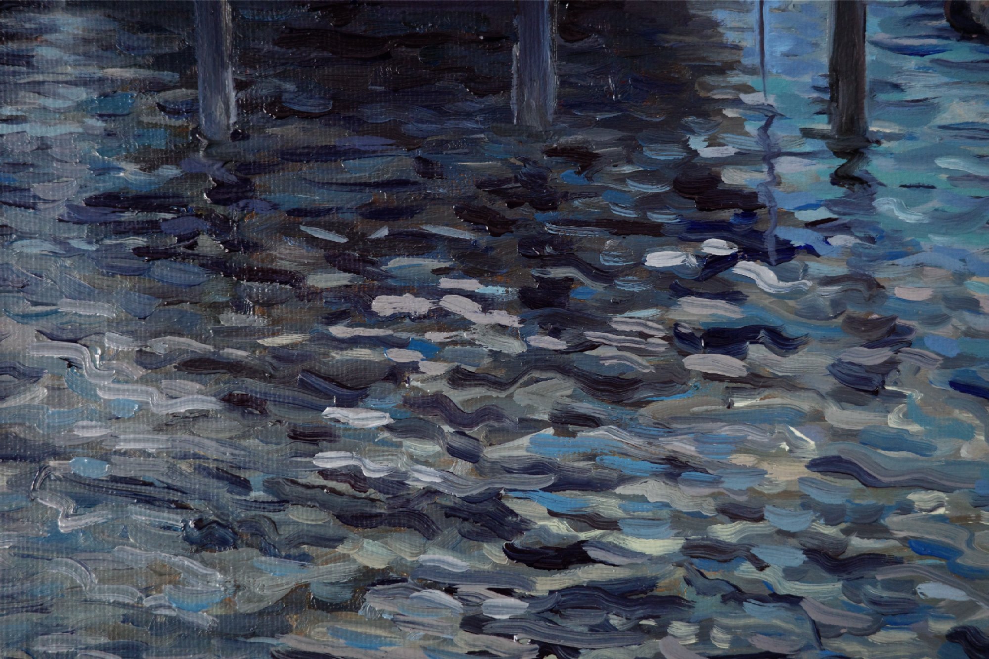
I really enjoy painting water. It's a rare moment of almost abstraction in my work. I get to capture light but also transparency.
Close-up, you can see all the almost messy brushstroke layers of different colours. But if you stand back, they combine to become one surface of water. So I have to step back constantly while painting.
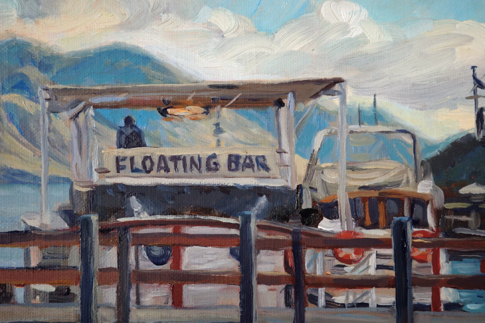
I aggressively simplified the wharf and boats. I removed any elements that didn't add to the sense of place. But I kept anything that was red or orange because I wanted these to create the colour unity in the painting.
This painting is now available in my new collection, At the End of the Day.

I was walking along the lakefront in Queenstown on an icy autumn afternoon, when I spotted this scene. I instantly saw a painting in the contrast between the rigid structure of the wharf and the natural movement in the water and mountains.
The “floating bar” sign felt oddly amusing to include in a serious oil painting, and the lone figure gazing out to the mountains was intriguing. I wanted this painting to capture the cold light of the day, but also feel inviting, like you’d fancy joining him up there for a pint.
Click here to see the process behind this painting
Details
Medium: Oil on linen
Size before framing: 50 × 40cm
Approx. size after framing: 70 × 60cm (depending on design)
Included With Your Painting
Your painting will arrive expertly framed and ready to hang. International shipping is included.
I also include a ‘Story and Care’package to help you display your painting beautifully, look after it easily, and share the story behind it.
It includes:
Premium handmade and hand-finished custom framing
A beautiful hardcover story book documenting the inspiration and creation of your painting.
Original sketches and studies
Signed certificate of authenticity
Curated hanging and care kit and guide
Custom greeting cards
Custom decks of playing cards
Fully insured worldwide shipping
How To Buy
Click “Enquire to Buy” and fill in the form. I’ll personally confirm availability, answer any questions, and send you a secure invoice.
Delivery and Returns
Framing and delivery typically takes around 12–14 weeks, depending on the design and time of year.
I offer a 90-day money-back guarantee. You can read more here.