
Painting process | Winter Light on the Pimlico Grid

Living in Pimlico, I always loved how the sun casts unexpected pastel colours across the white terrace houses. It’s always surprising, as the tones and patterns change depending on the weather and time of year. It’s such a beautiful effect, especially on a bright winter’s day when the sun is low and strong and catches through the bare trees.
I chose to push those colours in this painting, and I had so much fun pinpointing and then enhancing them. It’s as much a celebration of colour and light as it is a painting of a London street scene.
You can watch the full time-lapse of this painting by clicking the image above.
Preliminary sketches and studies
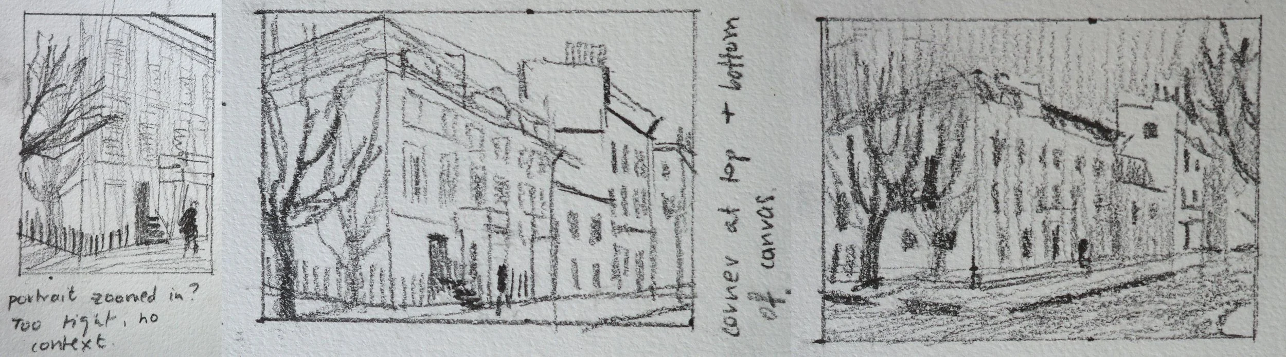
I started by trying out a few different compositions. I decided to zoom out slightly and go with the sketch on the right, so I could get more sky and road in for contrast.
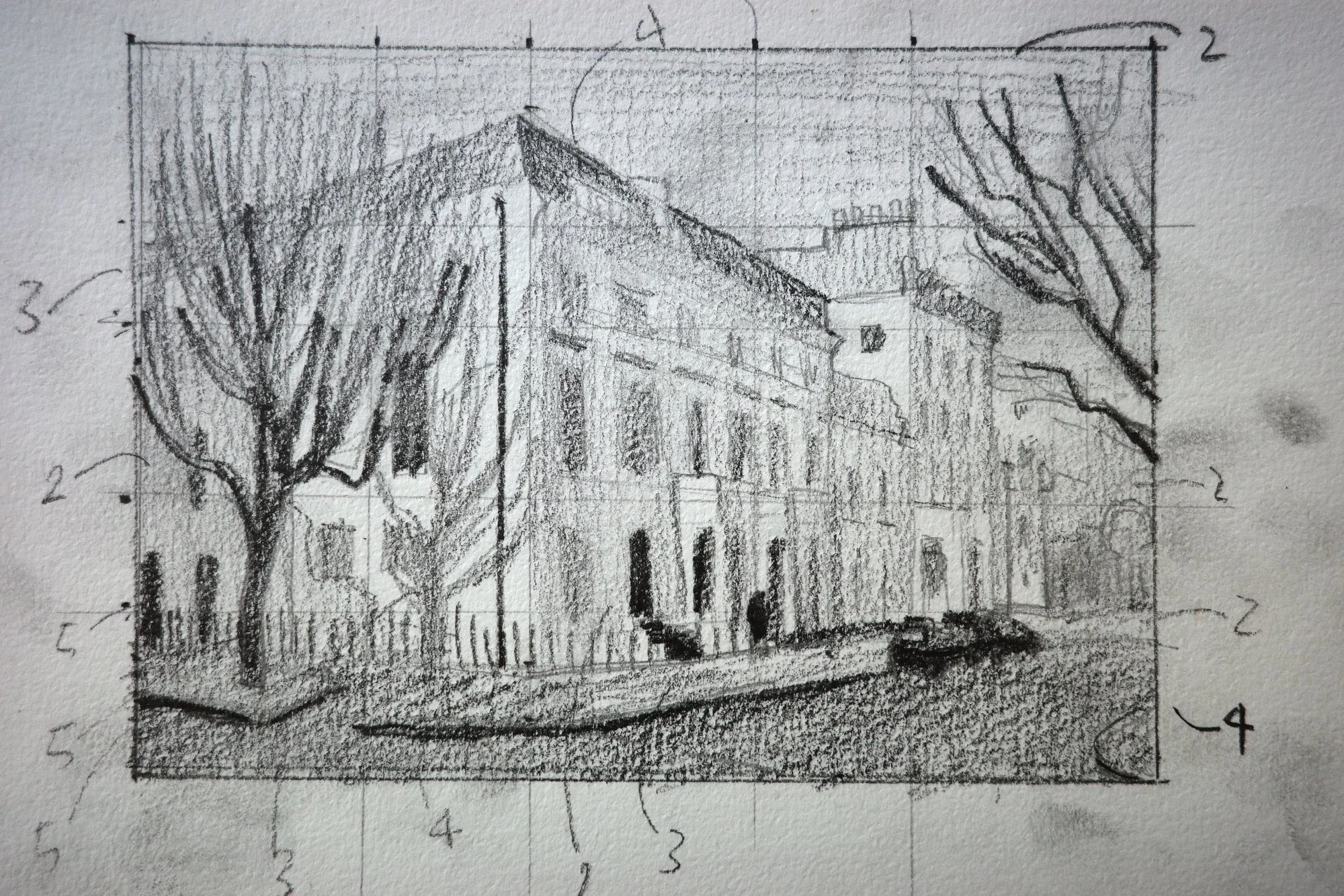
I then did this sketch to cement the composition and work out the value hierarchy.
I decided to make the sky the same value as the dark side of the buildings. This compresses the value masses slightly, making the highlights stand out even more against the darker sky.
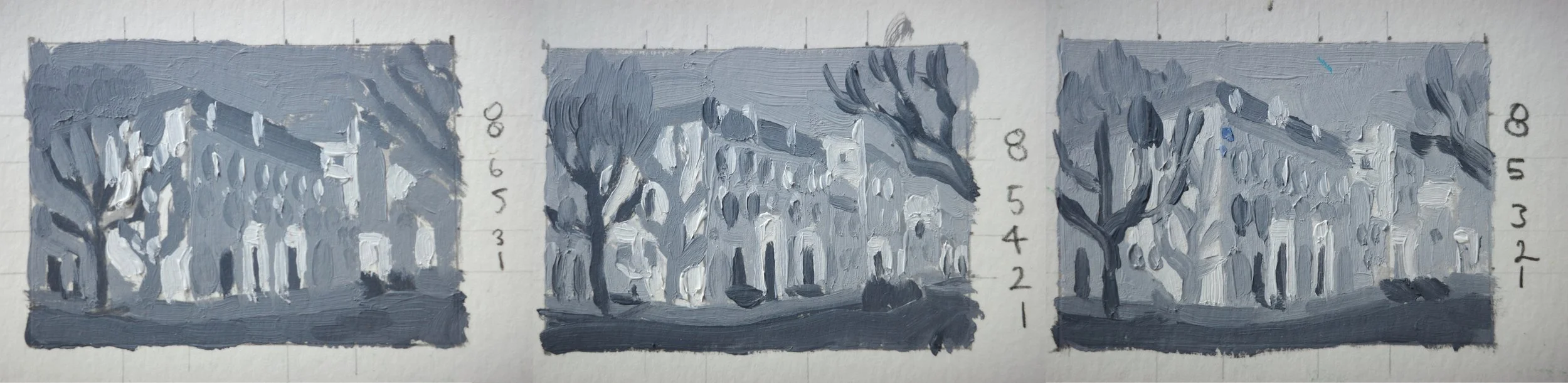
Next, I painted these three little value studies to work out where the darks and lights sit on a value scale. Getting the values right is what makes this kind of low winter light feel believable.
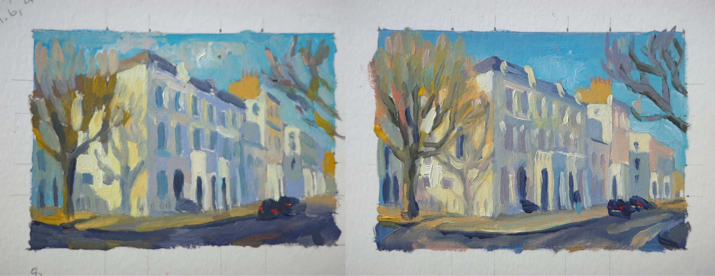
Finally, I started adding colour in these small simplified paint sketches. The consistent hints of orange on the trees, brickwork and cars, create balance through the painting. I particularly wanted to enhance the beautiful complementary opposite purple-yellow and blue-orange colour combinations in the scene.
I experimented with adding clouds but decided to keep the sky clear so as not to distract from the details in the foreground.
The painting process
I spent a few hours drawing out this composition to make sure I got the perspective right and relationships between the value shapes correct. This is extra important when painting buildings so the structure holds together and the perspective feels convincing.
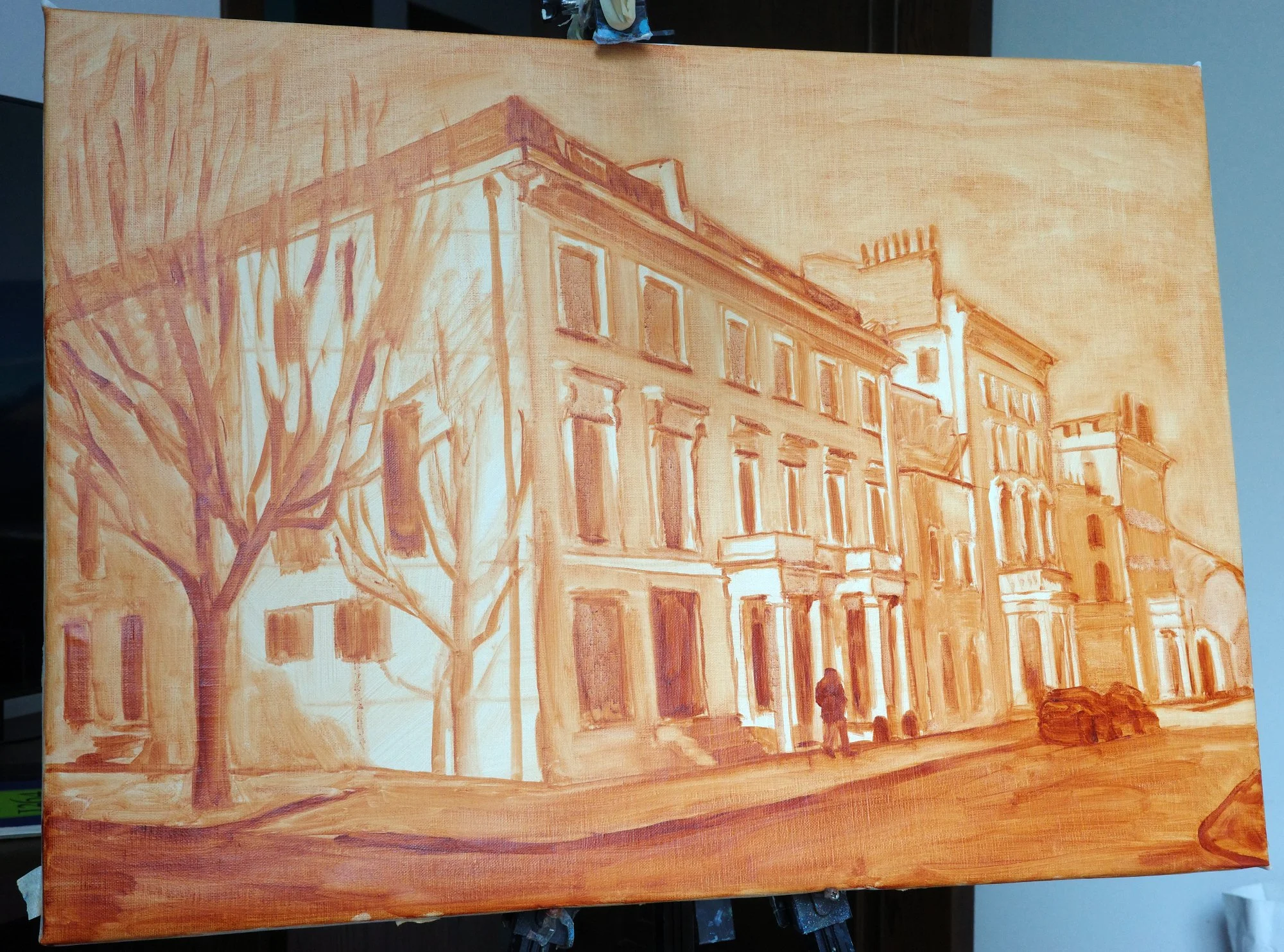
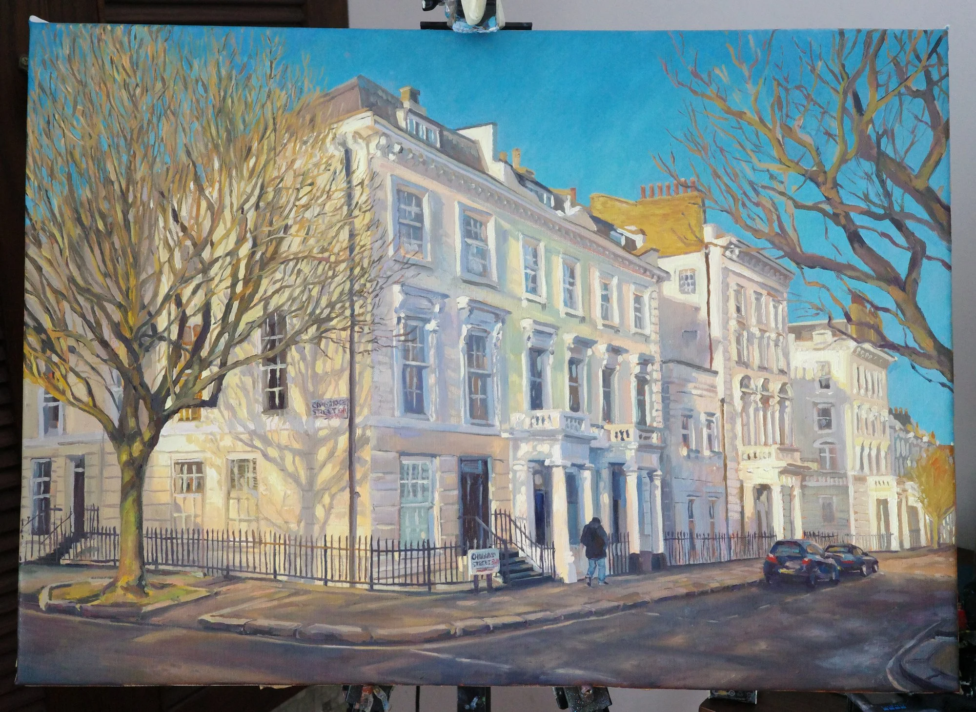
Here’s the painting fully blocked-in. It’s loose, but the bones are there, enough for the light to already work.
Here, I’ve started to bring the light into the painting, where it catches the edges of windowsills, stairs, porticos and roofs as it filters down the side of the building. This starts to create depth and texture across the surface.
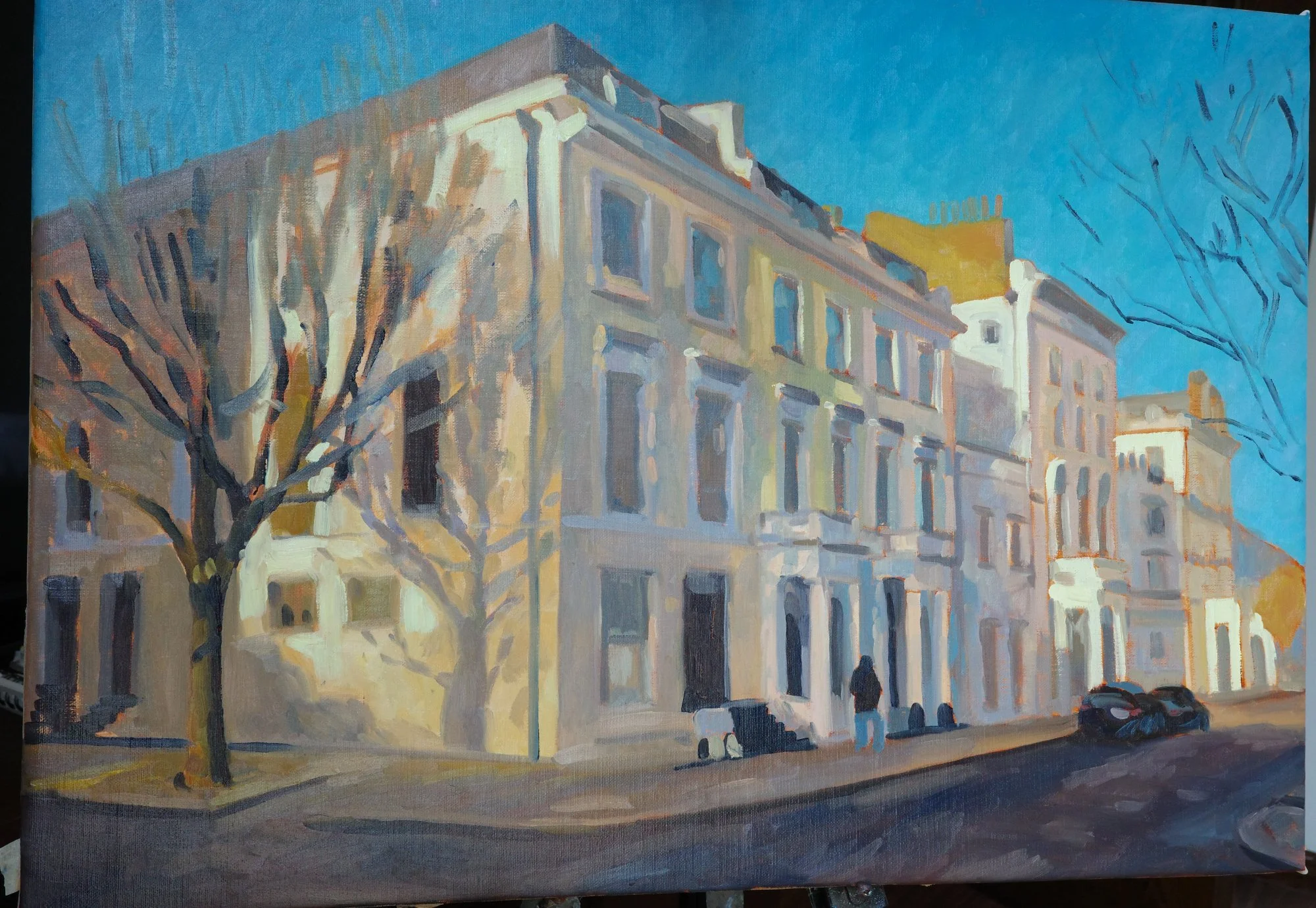
Next I put a lot of time into the tree to create the illusion of the mass of twigs, which are necessary for the shadows to make sense. I painted in the mass of branches and then cut back into them with background colours.
The light hitting the branches and trunk is warm golden-orange and green, while its shadow is cool blue and purple.
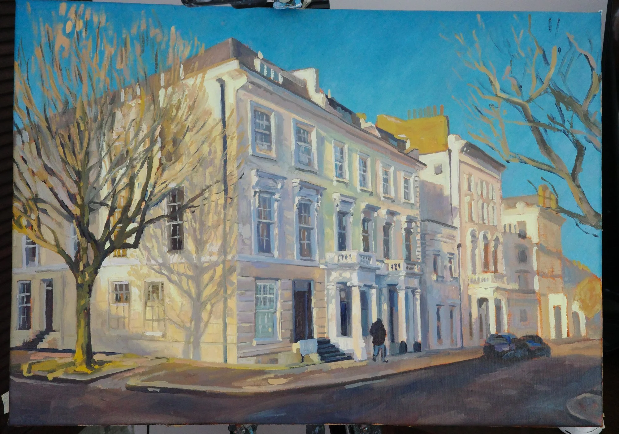
Finally, I worked on the road, and how the light reflects off its slightly damp surface. I layered purples and oranges to create the mottled effect. I added the road lines in blues and yellows, softening the edges to make them sit into the road surface believably.
I also finished painting the background buildings, fading the detail out to mimic how our eye sees into the distance. I love the characterful chimney shadow cast across the next building.
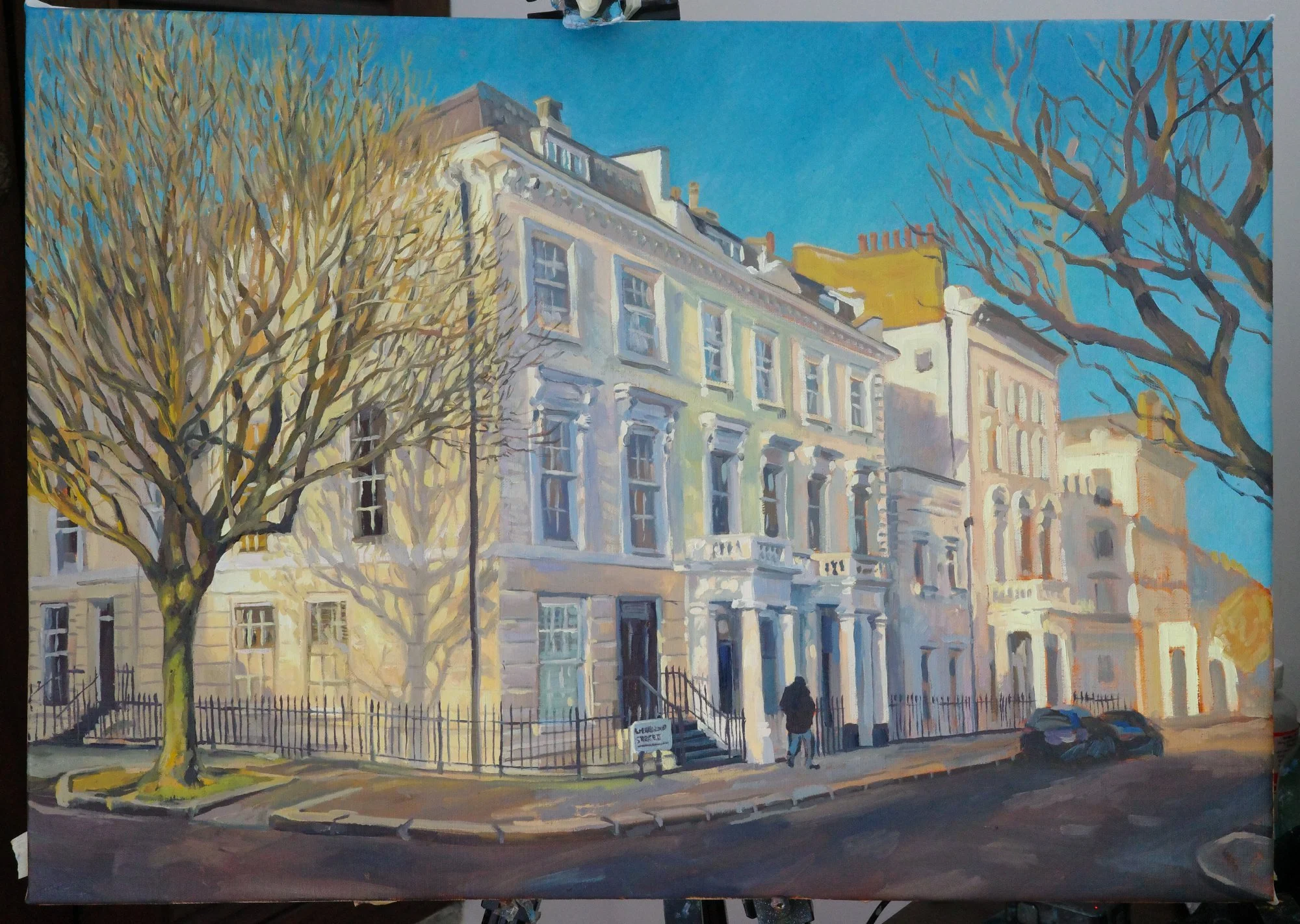
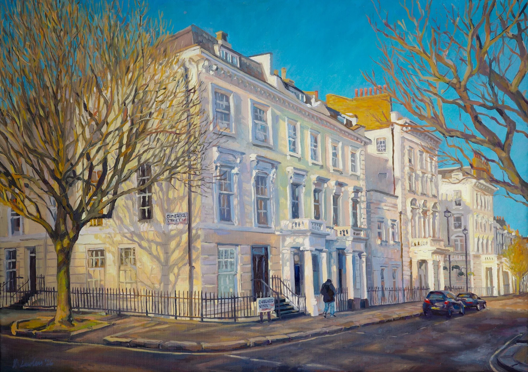
Finished!
"Winter Light on the Pimlico Grid"
70cm x 50cm, oil on linen
I loved mixing so many colours in this painting. I think it helped to create a glowing sense of light. The chroma is turned up, but it still feels like Pimlico on a winter’s afternoon. I’ll definitely be taking this joyful use of colour into my future work!
Details
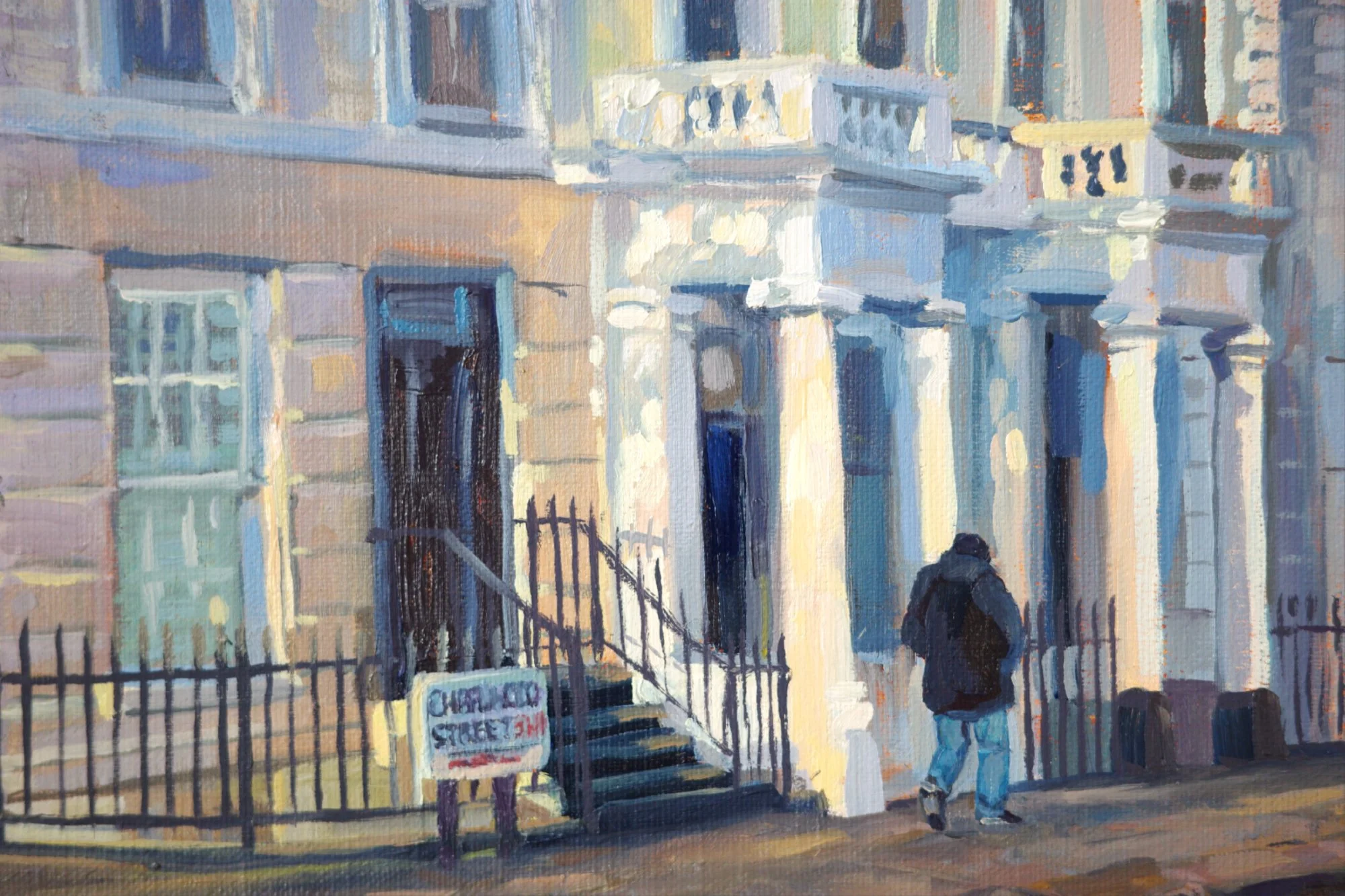
I focused on painting the light catching on the details of the building, rather than the details themselves. You can see that here where the light hits the edge of the windowsill and dapples over the portico.
I love how the shadow colour changes from a lilac to orange across the building. This creates beautiful colour contrast while describing the surface of the building as it varies across different materials and texture.
Painting the little street sign was a challenge I don’t think I had the right brushes for, but I got it right after a lot of back and forth. I wanted the text to be readable but not obvious.
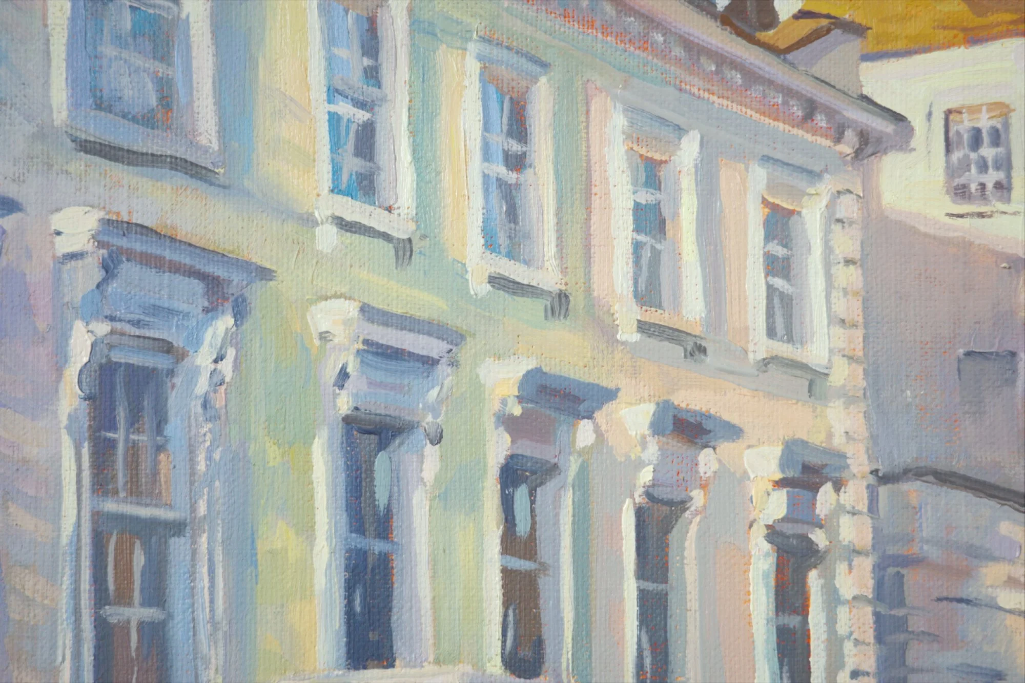
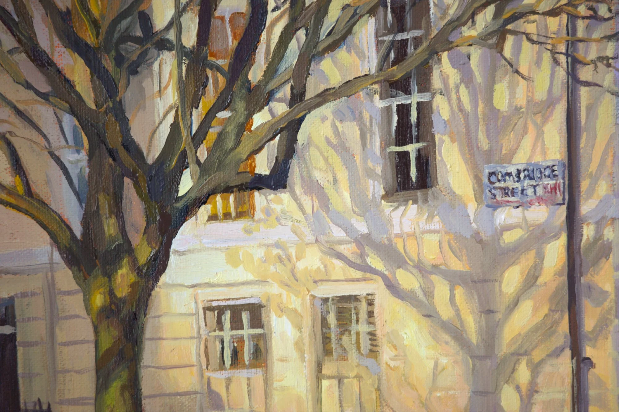
The pastel houses are an enhanced depiction of how I see colour. The shadows are different for each building, but always a cooler, bluer version of the highlights.
I didn’t overthink this, or fiddle with it much, which I think has helped it to maintain its freshness and life. The lines aren’t perfectly straight and I haven’t drawn every detail. This captures the impression of light hitting the building, rather than describing every surface precisely.

This painting is now available in my new collection, At the End of the Day.

Living in Pimlico, I always loved how the sun casts unexpected pastel colours across the white terrace houses. It’s always surprising, as the tones and patterns change depending on the weather and time of year. It’s such a beautiful effect, especially on a bright winter’s day when the sun is low and strong and catches through the bare trees.
I chose to push those colours in this painting, and I had so much fun pinpointing and then enhancing them. It’s as much a celebration of colour and light as it is a painting of a London street scene.
Click here to see the process behind this painting
Details
Medium: Oil on linen
Size before framing: 70 × 50cm
Approx. size after framing: 90 × 70cm (depending on design)
Your painting comes with more than just the artwork itself
It will arrive ready to hang, beautifully framed, and with my story and care package.
I’ve designed this package to help you display your painting beautifully, look after it easily, and connect with the story behind it.
It brings together the artwork, its story, and everything you need to care for it, in a way that I hope feels thoughtful and complete.
It includes:
Custom framing, thoughtfully designed to suit both the artwork and your space
A hardcover story book telling the full story behind your painting, its inspiration and the process behind it.
All preliminary sketches and studies, so you own the entire creative journey, not just the finished work
Secure international shipping, with full tracking and protection throughout
A signed and dated certificate of authenticity, ensuring provenance for years to come
A curated hanging kit, in a leather roll with elegant tools I’ve sourced from around the world
My printed ‘hanging and care guide’, to make everything easy and straightforward
A set of custom greeting cards so you can share your painting with your loved ones
Two custom decks of playing cards, to show your painting off to your friends and family.
How to Buy
Click “Enquire to Buy” to get in touch. I’ll personally confirm availability, answer any questions, and guide you through the next steps.
If you’d like to go ahead, I’ll arrange everything with you directly and send a secure invoice.
Each painting is custom framed and carefully prepared to order, so framing and delivery typically take around 12–14 weeks, depending on the design and time of year.